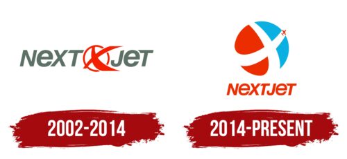
The Nextjet logo speaks of purposeful flight, a passion for the sky, and care for passengers. It reflects the carrier’s tireless dedication and readiness for rapid professional growth in the regional and international aviation services markets.
Nextjet: Brand overview
Founded in 2002, Nextjet, a Swedish regional airline, lasted until 2018. The airline first took to the air in December 2002 and initially acted as a contract carrier for major European airlines with a modest fleet of SAAB 340 and SAAB 2000 aircraft.
2005, the company switched to scheduled flights, offering regional routes to Sweden and Scandinavia. The main hubs for its operations were Stockholm-Arlanda and Gothenburg airports. In the following decade, Nextjet expanded its services to more than 25 European and domestic destinations and earned the title of Sweden’s largest regional airline. It carried more than one million passengers annually.
However, by 2018, Nextjet’s financial situation deteriorated due to mounting losses and debts. In May 2018, after 15 years of operation, the airline was forced to declare bankruptcy and cease all transportation. At its closure, Nextjet had a fleet of 18 airplanes and employed more than 400 people. Its closure left a significant void in regional air service in Sweden.
Meaning and History
What is Nextjet?
This was a Swedish regional airline based in Stockholm, known for specializing in serving routes to small towns and remote regions of Sweden. The company operated a fleet of turboprop aircraft, including the Saab 340 and ATP, allowing it to operate on short runways in small airports efficiently.
2002 – 2014
The Swedish company focused on flight, conveying this in every detail of its unique emblem. Specifically, this is suggested by:
- Slanted letters aimed at continuous forward movement.
- A circle symbolizes the completed cycle of each flight and encompasses the entire planet.
- A bird with outstretched wings, resembling a maneuvering airplane.
All of this is inherently present in the Nextjet logo, as the carrier, which at the time had only a couple of aircraft, aimed to demonstrate its vast capabilities, skill, and professionalism to the world. The emblem helped in this endeavor, as the company confirmed the concept embedded in it with real actions, leading to its growth.
Almost the entire space is dedicated to the name, so potential customers become accustomed to it, easily read the inscription, and quickly remember it. The letters are a mix of upper and lower case, yet they look harmonious and cohesive, as both types of glyphs are the same size. The text is colored dark gray and is sans-serif, hinting at the accessibility of services for all interested parties.
Between “Next” and “jet” is a red ring with a white center. It serves multiple functions: replacing the globe, symbolizing the sun, and reflecting the circle of the airline’s responsibilities. In the center is an abstract airplane in the middle of a sharp turn, depicted not upright but sideways. This hints at flawless piloting skills and the high professionalism of the staff.
The airline used a rich red color to highlight the central figure and create a visual focus. It perfectly balanced the neutral white background and stood out boldly. Red symbolizes passion and a drive for leadership. At the same time, white represents purity and successful beginnings, fitting perfectly with the worldview of a young and ambitious company dreaming of a successful career.
2014 – today
Nextjet’s logo featured a distinctive symbol resembling a child’s ball and an Xbox emblem. It consisted of a circle of four multicolored triangles—two red and two blue—separated by wide white stripes forming a stylized “X.” From the center of this “X,” a miniature airplane rises upward. Below this symbol, the airline’s name is written in red, italicized letters. The font is unique, with the letter “T” having unusual cutouts and both uppercase “E”s resembling lowercase letters.
The design elements of the logo were intentional. The white-striped “X” symbolized intersection and interconnection, highlighting the airline’s extensive network. The ascending airplane added dynamism, reflecting the airline’s focus on aviation. The distinctive cutouts on the “T” and the lowercase appearance of the “E”s made the brand memorable.
The bold, multicolored triangles reflected a vibrant and dynamic identity. The interplay of red and blue against the white stripes drew attention and created a sense of movement and energy. This color scheme and geometric design gave the logo a modern and playful feel.
The italicized font for the name enhanced the sense of motion and speed, key attributes in aviation. The unconventional “T” and “E” designs added creativity and uniqueness, setting Nextjet apart from its competitors.
The miniature airplane rising from the “X” signified flight and upward progress, subtly conveying the airline’s mission to connect destinations and elevate travel experiences.


