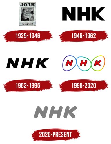
NHK Logo underwent a significant simplification in 2020, which saw the removal of its original ornate elements, leaving only the lettering in the emblem. Now displayed in the same strong, curved sans-serif typeface, the italicized letters convey a sense of forward momentum, symbolizing assurance and advancement. The main hue of this visual representation is a subtle light gray, although monochrome variants are utilized to adapt to different backgrounds and requirements.
The transformation of the emblem signifies the logo company’s desire for clarity and simplicity in its brand representation. By discarding the additional ornamentation, the focus is solely on the name, emphasizing directness and transparency. This streamlined approach mirrors the brand’s commitment to delivering straightforward and reliable content.
The typography, in its robust and rounded form, manifests strength and stability. Being italicized, it creates an impression of dynamism and forward movement. This resonates with the brand’s progressive nature and its continuous strides towards betterment.
As for the chosen color scheme, the muted light gray communicates sophistication and modernity. It also offers a sense of neutrality and balance, which is central to the logo platform’s ethos. The versatility of the logo, seen in its monochrome variants, underscores the brand’s adaptability, further cementing its reputation as a progressive entity.
The meaning of the NHK emblem, with its minimalist design, bold typography, and muted color palette, underlines the brand’s ongoing commitment to simplicity, confidence, and continual progress.
NHK: Brand overview
| Founded: | 29 November 1924 |
| Founder: | Government of Japan |
| Headquarters: | Shibuya, Tokyo, Japan |
| Website: | nhk.or.jp |
The Japan Broadcasting Corporation, globally recognized by its acronym NHK, holds the esteemed position of being Japan’s leading public broadcaster. Birthed in the early 20th century, NHK’s inception was well-aligned with the advent of radio broadcasting technology in Japan, making it a pioneering force in the Japanese media industry.
In its initial years, the public broadcaster primarily focused on radio broadcasting. With the passage of time, the expansion into television and digital media platforms followed, encapsulating a broader audience base. The corporation now boasts a comprehensive media offering, including radio, television, and online services, reaching households not just in Japan but globally.
Meaning and History
NHK’s brand identity can be encapsulated in the phrase ‘trust and quality.’ The corporation’s primary commitment is towards the public, delivering unbiased news and high-quality entertainment. This commitment to integrity and honesty in broadcasting has helped it win the trust of millions of viewers and listeners over the decades.
The design elements associated with NHK also speak to its brand identity. The logo, a combination of three stylized letters, is simple yet instantly recognizable. This simplicity reflects the brand’s commitment to straightforward, reliable broadcasting. Meanwhile, the use of the color blue in its logo symbolizes stability and reliability, further reinforcing the brand’s core values.
NHK’s identity is deeply rooted in its commitment to the public and its devotion to reliable broadcasting. Through a century-long journey, it has cultivated a unique identity that resonates with its audience, both in Japan and worldwide. It is a name that is synonymous with reliable information and high-quality programming, with its brand identity beautifully intertwining these core values.
What is NHK?
NHK, or Nippon Hoso Kyokai, is Japan’s national public broadcasting organization. It was founded on November 29, 1924, by the Government of Japan and is headquartered in Shibuya, Tokyo. As the largest broadcasting organization in Japan, NHK offers an array of radio, television, and online services. It operates multiple TV and radio stations, both domestically and internationally, providing news, entertainment, culture, and educational programs. Known for its commitment to quality programming and journalistic integrity, NHK has significantly influenced the development and evolution of broadcasting in Japan and beyond.
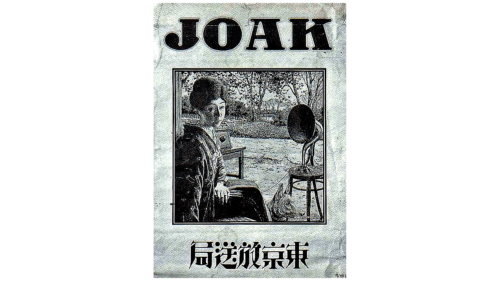
1925 – 1946
1946 – 1962
1962 – 1995
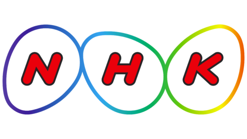
1995 – 2020
2020 – today
NHK color codes
| Neon Gray | Hex color: | #808080 |
|---|---|---|
| RGB: | 128 128 128 | |
| CMYK: | 0 0 0 50 | |
| Pantone: | PMS Cool Gray 8 C |


