The Nick Jr. Productions logo visualizes the channel’s slogan, which consists of three words: “Grow, Learn, and Play.” It shows that the worlds of adults and children are inextricably linked and that older ones support the younger ones in their development, literally leading them through life, teaching, and educating.
Nick Jr. Productions: Brand overview
| Founded: | 1993 – 2009 |
| Founder: | Nickelodeon |
| Headquarters: | United States |
Meaning and History
The emergence of Nick Jr. Productions is associated with a series of upgrades to children’s television programs. The channel resulted from one such improvement, as its eponymous “twin” exists, revived in 2014 under an abbreviated name. It began in 1988 when Nickelodeon decided to create a program for preschoolers. He named it: took the beginning of his name, “Nick,” and added the indication “Jr,” that is, “junior.” Thus, he achieved three goals at once:
- confirmed that the project belongs to him;
- made it clear that he is the senior in the group of channels;
- outlined the target segment of viewers (young children).
In 1993, a rebranding took place with a change of emblem. After the network transitioned to Paramount Media Networks in 2009, the company carried out modernization, which resulted in the emergence of a parallel educational program, now under the new owner. But the TV channel’s logo has always remained highly recognizable to a children’s audience, as it features two symbolic figures – an adult and a child.
What is Nick Jr.’s Productions?
Nick Jr. Productions is an American TV channel for younger children (including preschoolers up to six years old). It emerged in its current form in 1993 as a division of the Nickelodeon Group. In the winter of 2009, it became part of Paramount Media Networks. Its head office is located in New York.
1993 – 2000
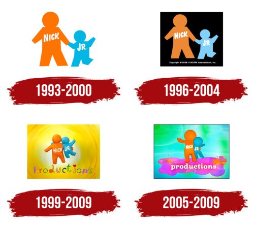
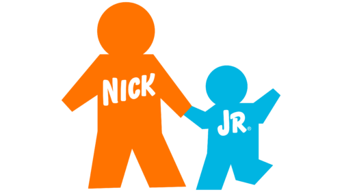
The Nick Jr. Productions logo is graphical. It consists of large and small human silhouettes. The figures immediately recognize an adult (presumably a parent or teacher) and a preschool-age child. The tall person is colored orange. He is holding hands with a child, leading him, providing necessary support, and instilling confidence. The small figure is made of blue. Both are marked with the words “Nick” and “Jr.” The inscriptions are arranged diagonally, colored white, and are made in the upper-case grotesque font.
1996 – 2004
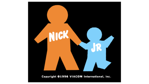
The figures of an adult and a child differ in color: one is dark orange, the other – light blue. This is a parent (teacher, caregiver) leading a child, holding his hand. The movement is indicated by the distinctively bent leg of the small silhouette: the preschooler seems to be stepping. The background turned from neutral white to contrasting black. An animated version of the Nick Jr. Productions emblem appeared during this same period.
1999 – 2009
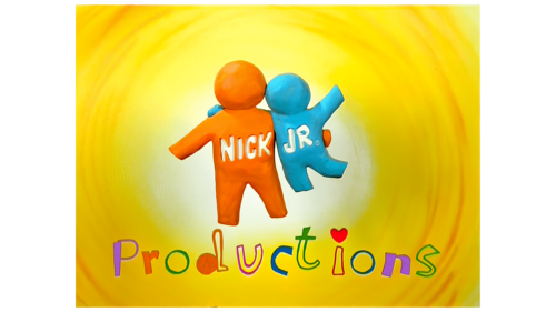
After the redesign, the logo became very friendly, bright, and welcoming. It gained colorfulness, which made it positive to attract more children’s attention. The black background is gone – yellow is used instead, with concentric circles resembling a view of a spiral from above. The center is lighter than the edges, indicating a gradient.
In the middle are the figures of an adult and a child, but this time the parent (teacher) does not hold the child by the hand but seems to be carrying him in his arms. The silhouettes acquired texture and became three-dimensional. Under them appeared the word “Productions” appeared, executed in a playful style – with jumping letters, thin contours, and a red heart above “i” instead of the usual dot.
2005 – 2009
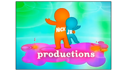
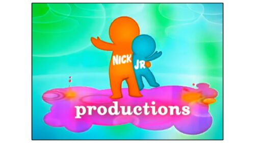
Another variant of the Nick Jr. Productions logo is executed in azure color with local admixtures of green. They serve as a background for two silhouettes – a large orange and a small blue. This time the adult also raises his hand, like a child. Moreover, their hands look almost realistic – with a thumb. The legs look real, too, because the designers made the human figures more believable. The adult and child stand on a pink cloud, in which yellow and purple spots are reflected. Below them is the inscription “Productions,” typed in white font in lower case. All letters are rounded, streamlined, and of the same size.
Font and Colors
One of the latest fonts in the children’s channel’s logo is Oxtail Black with grounded, rounded letters. A typeface reminiscent of Expressway Cd Sb has been chosen for inscriptions on figures. A unique font with bouncing contour glyphs is used in one of the versions.
The emblem palette is characterized by brightness and diversity. Orange and blue are present in all versions. Depending on the period, they are complemented by yellow, azure, green, black, pink, and violet.
Nick Jr. Productions color codes
| Dark Orange | Hex color: | #ff9101 |
|---|---|---|
| RGB: | 255 145 1 | |
| CMYK: | 0 43 100 0 | |
| Pantone: | PMS 151 C |
| Blizzard Blue | Hex color: | #03c7e4 |
|---|---|---|
| RGB: | 3 199 228 | |
| CMYK: | 99 13 0 11 | |
| Pantone: | PMS 3125 C |
| Electric Blue | Hex color: | #6af6f8 |
|---|---|---|
| RGB: | 106 246 248 | |
| CMYK: | 57 1 0 3 | |
| Pantone: | PMS 3265 C |
| Malachite | Hex color: | #03dc4b |
|---|---|---|
| RGB: | 3 220 75 | |
| CMYK: | 99 0 66 14 | |
| Pantone: | PMS 354 C |
| Fluorescent Pink | Hex color: | #fd52f5 |
|---|---|---|
| RGB: | 253 82 245 | |
| CMYK: | 0 68 3 1 | |
| Pantone: | PMS 807 C |
