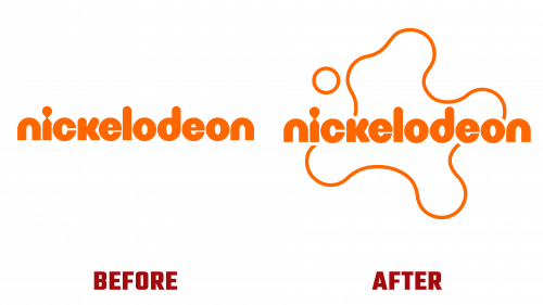
Nickelodeon, the beloved network, has rolled out a sweeping rebranding initiative, the first comprehensive revision in 14 years. Teaming up with creative agency Roger, the network has given a fresh twist to its iconic “Splat” logo, carefully retaining its nostalgic resonance with audiences.
The rebranding exercise aligns with Nickelodeon’s longstanding commitment to its youthful viewers while ensuring its prominence in a rapidly evolving market. The revamped Splat logo, the emblem of Nickelodeon’s identity, now resides within a canvas of bright colors and sleek graphics, symbolizing the network’s enduring mission of nurturing creativity and the exuberance of youth.
Alongside Nickelodeon’s in-house team, Roger’s influence spans far beyond the primary brand. They have contributed to shaping product designs, enhancing resort experiences, and finessing the brand’s presence across various digital and SVOD platforms.
Aricco, a spokesperson for the project, affirmed that the ambition was not merely to contemporize the brand but also to uphold Nickelodeon’s distinctive allure. This fine balance of rejuvenation while preserving the brand’s core elements— its quirky humor, love for chaos, and celebration of childhood— is subtly reflected in the new visual language.
Guided by Terry Lee and Braden Wheeler from Roger, the task was cultivating a versatile identity that would mirror Nickelodeon’s wide-ranging creative facets. Wheeler acknowledged the complexity of crafting a unified design language spanning all of Nickelodeon’s channels, allowing room for “revisionism, randomness, and irreverence.”
To surmount this challenge, a circular grid system was deployed to breathe new life into the Nickelodeon logo. This inventive technique encouraged the generation of harmonious shapes, effortlessly tying together the different elements of the brand.
The rebranding introduces a motion language, a confluence of traditional cel animation and modern 3D design. When fused with bold and neat typography, this combination brings forth a contemporary yet nostalgic atmosphere, echoing Nickelodeon’s heritage.
The new color scheme takes inspiration from Nickelodeon’s iconic orange tone, now enriched with gradients of purples, yellows, and pinks, recharging the brand with a renewed vibrancy. The typography, featuring ROC Grotesk and Neue Plak, infuses Nickelodeon’s nonconformist DNA into the design, offering ample opportunities for future growth.
A major component of the rebranding strategy is the impending makeover of Nick Jr., set for launch in September. The revamp will usher in fresh graphics, animated idents, and a lively new color palette across its digital and linear channels. The network’s revitalized orange Nickelodeon logo will take center stage, aiming to captivate and entertain its young audience.


