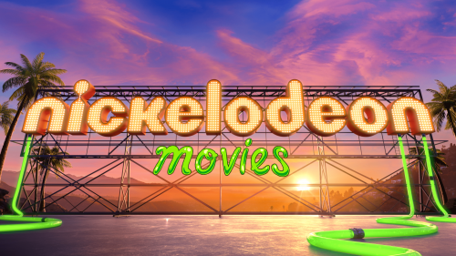
The Nickelodeon Movies logo is vibrant because it is associated with children’s content. It is executed in a liberated style yet appears as a classic sign. Its extraordinariness embodies the world of childhood, characterized by vividness capable of making an indelible impression.
Nickelodeon Movies: Brand overview
Meaning and History
The original owner of the film production division Nickelodeon Movies was Viacom. It then transferred to Paramount Global and intensified its activities, focusing on diverse content for a children’s audience. Its creative portfolio includes many artistic works, including “Harriet the Spy” (the debut film), “Good Burger,” “The Rugrats Movie,” and others. They were released at one-year intervals, starting in 1996. Of course, the intros for them were made in the style of the parent channel: with bright but understandable design, the well-recognized orange “Nickelodeon” inscription, and the neon-green “Movies” addendum.
What is Nickelodeon Movies?
Nickelodeon Movies is an American film production company and animation studio. It belongs to the Nickelodeon channel, on the basis of which it releases all its works. Paramount Pictures conducts filming. This artistic division of the famous children’s channel emerged in 1995 and is managed from its headquarters in Los Angeles.
1996 – 1998
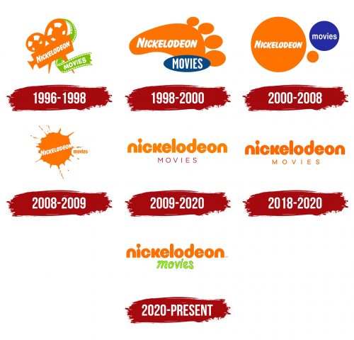
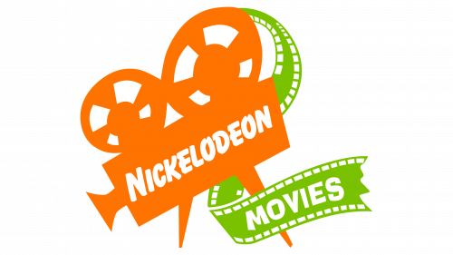
This emblem is based on the Nickelodeon logo, created by Tom Corey and Scott Nash in 1984. The original concept allowed for the image’s appearance to change – the main thing was to maintain the orange color and rounded font. The Nickelodeon Movies logo is also a variation of such a transformation: designers gave it a form indicating the company’s connection to film production.
The main part of the space is occupied by an orange vintage movie camera with two large reels on top. The first part of the brand name is written on it, set in Balloon Extra Bold font and slanted diagonally. To the right, a green film unwinds. It contains the word “Movies,” executed in Ad Lib font.
1998 – 2000
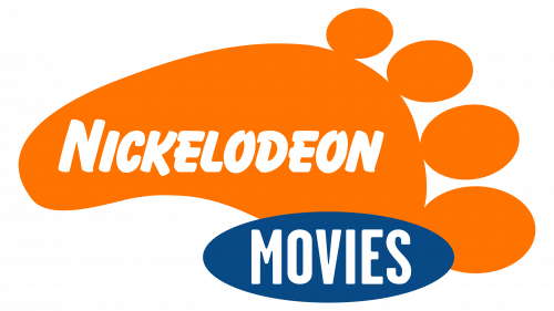
After the transformation, the movie camera turned into an orange left footprint. It creates a sense of magic and uniqueness because the artists depicted four big toes on the sole, prompting thoughts about who could have left such a mark. The word “Nickelodeon” is still written in the proprietary Balloon Extra Bold font and painted white. For “Movies,” a new unknown sans-serif font is used with vertically elongated letters. The second part of the name is at the bottom in a blue oval. This logo occasionally appeared in trailers for movies and cartoons.
2000 – 2008
The emblem consists of three circles reminiscent of soap bubbles or planets – symbols of boundless imagination. They vary in color and size. On the left is a large orange sphere with the word “Nickelodeon,” and on the right is a blue one with “Movies,” set in Helvetica Bold font.
2008 – 2009
A large orange blot resembles paint or ink splattered in all directions. It is associated with creativity and expression. Inside the splatter is the first word of the company’s name, positioned diagonally, as in the 1996 emblem. The second part of the inscription is on the right. It is set in a modified Extra Condensed font and consists entirely of lowercase letters.
2009 – 2020
In 2009, the cable network Nickelodeon updated the wordmarks of all its divisions and channels to make them uniform, as the old versions did not match on a single business card. The common element became the orange word “Nickelodeon,” set in lowercase letters. Designer Eric Zim used a special font for it, unofficially called Litebulb. It is a geometric grotesque with a round shape, similar to a modified ITC Bauhaus. It features an unusual letter “i”: it looks like a sharpened pencil pointed upwards and connected to a round dot. In the film production company’s logo, there is also a bottom line – the word “Movies.” It is written in thin Gotham Book font and colored burgundy.
2018 – 2020
The font of the second word was changed to Galano Grotesque. Consequently, it became the same orange as the “Nickelodeon” brand inscription. The new design can be seen in trailers for several films, including “Wonder Park” (where it appeared for the first time) and “Playing with Fire.”
2020 – today
Nathan Love created a cinematic intro featuring a reworked Nickelodeon Movies logo. The first word is written in the usual orange color, while the second consists of handwritten neon-green letters. This version debuted in 2020 in the trailer for “The SpongeBob Movie: Sponge on the Run.”
Font and Colors
Since 2009, an individual font based on ITC Bauhaus and unofficially known as Litebulb Bold has been used for the name of the film production company. Its creator is Eric Zim. In 2020, another custom typeface was added, styled as a handwritten inscription with separated letters. Both words are set in lowercase and have rounded glyph shapes.
The color palette includes the traditional Nickelodeon network orange shade – PMS Orange 021. The bottom line is colored in neon green and outlined in dark green lines. Their combination creates an atmosphere of positivity and sets the mood for watching interesting films.
