


![]() Nicktoons (United States) Logo PNG
Nicktoons (United States) Logo PNG
The Nicktoons logo symbolizes its affiliation with Nickelodeon and is associated with the channel’s animated series. It reflects the playful and vibrant character of the channel’s content. Moreover, the emblem conveys a friendly atmosphere, as the brand’s target audience is children.
Meaning and History
![]()
Nicktoons has sometimes been referred to as “TV” and “Network” because the channel has undergone several rebrandings. It was renamed several times, including in 2003, 2005, and 2009. These events have affected its logos, symbolizing a bright atmosphere and a fun pastime. Colorful word marks always included the inscription “Nicktoons” in one form or another. Designers used optimistic colors and stylized fonts to attract the attention of the main viewers, children.
What is Nicktoons?
Nicktoons is a channel that showcases Nickelodeon animated series and other content for children. Its main office is in New York, and its broadcast area covers the entire United States. It was launched on May 1, 2002, after which international versions began to appear: for the United Kingdom, Germany, Turkey, Poland, South Africa, and other countries. Paramount Media Networks owns the channel.
2002 – 2003
![]()
On May 1, 2002, Nicktoons TV began its story. Then its logo was presented and designed in the Nickelodeon style. In the background is a large dark blue circle with a radial gradient. It serves as the basis for characters from popular animated series, depicted not in detail but as an orange silhouette. The use of popular images enhances the emblem’s connection to the channel’s content and increases brand recognition.
In the center is the white word “NICK” in Balloon Extra Bold. Underneath are the yellow “toons” with bouncing letters. The white “TV” is a separate figure shaped like a TV screen. This part of the text is done in the Helvetica Neue Condensed Heavy typeface.
2003 – 2004
![]()
In April 2003, the channel was renamed. Having lost the “TV” prefix, it adopted a new logo featuring the orange word “NICKTOONS,” set in the Balloon Extra Bold font. Here, the inscription is placed in a blurred white spot with a thin orange outline, the same as on the Nickelodeon emblem in 1998. The developer of this design is OCDC.
2004 – 2005
![]()
Designers recolored the outer contour in blue and filled the inner part with spots of the same shade. As a result, the base resembles an amoeba or spilled water. The wordmark became dark blue, but the shape of the letters did not change.
2005 – 2009
![]()
September 2005 brought new changes: the channel was relaunched as Nicktoons Network and began to use a logo with a corresponding inscription. The first word is traditionally set in the Balloon Extra Bold font, and for the second, designers chose Trade Gothic Standard Bold Extended. The phrase is divided into two lines and placed at the bottom. Above it is a stylized globe with parallels and meridians. The right half of the globe is smeared with paint, which flows not down but sideways, contrary to the laws of physics. All elements are once again painted in bright orange. Illustrator Chip Wass and the creative agency Exopolis participated in the creation of this emblem.
2009 – 2014
![]()
In 2009, the Nickelodeon cable network underwent a major rebranding, which affected all its channels. TeenNick, Nick Jr., Nicktoons (the word “Network” was removed from the name), Nick at Nite, and Nickelodeon began using logos with a similar design. This decision was made after their emblems ended up on one business card and did not match.
Eric Zim and the Hippie House studio developed a series of original wordmarks, translating the letters into lowercase and focusing on “Nick.” In the case of Nicktoons, this part of the inscription is colored orange, and “toons” is in red. The word uses a set of individual glyphs, unofficially called Lightbulb.
2014 – 2016
![]()
Sibling Rivalry Studio changed the logo, recoloring the last five letters in neon green. This version was presented on May 5, 2014.
2016 – 2024
![]()
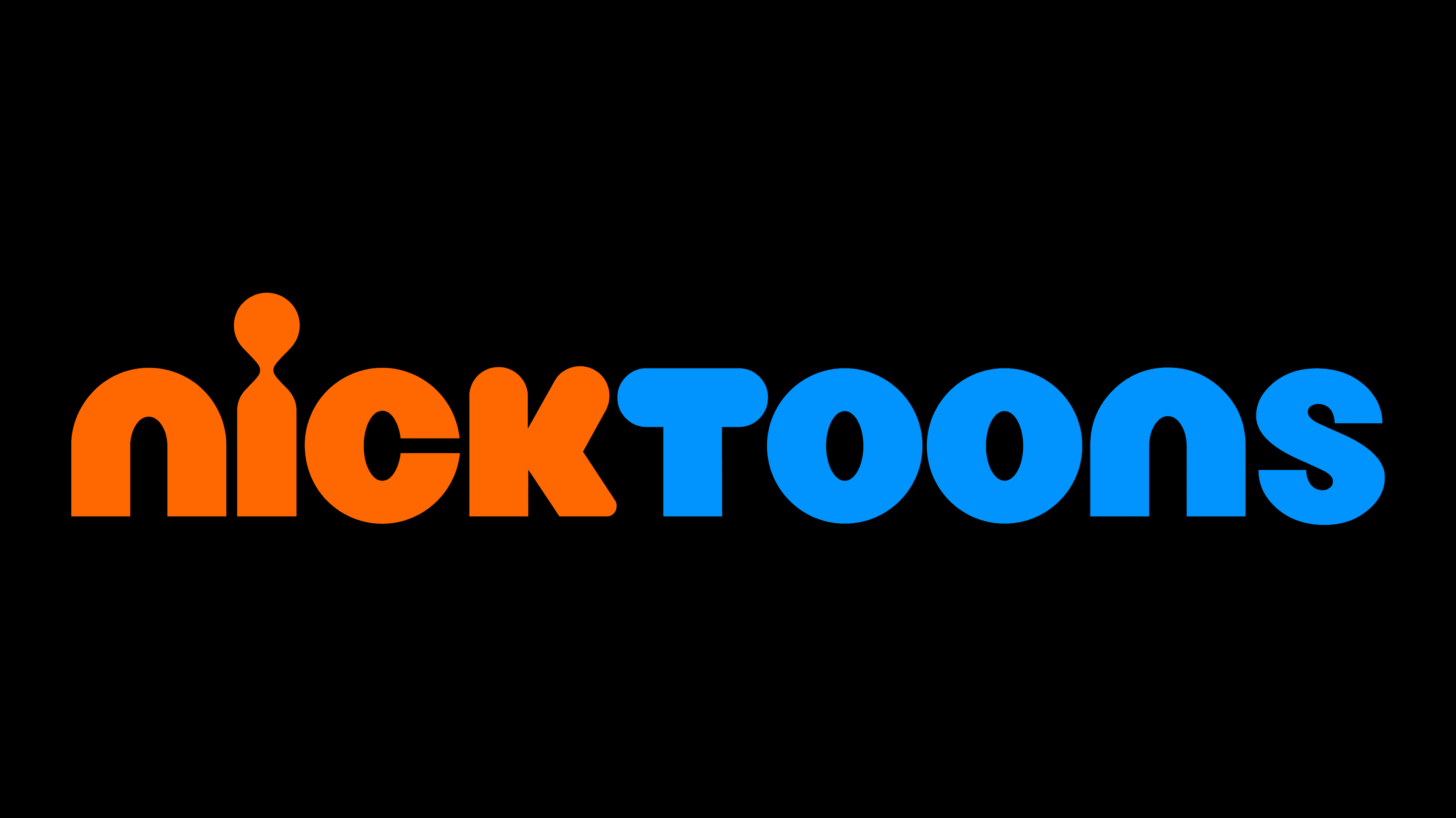
In 2016, the creative firm Sibling Rivalry Studio again transformed the “Nicktoons” inscription into orange and blue. The new color improved the perceived contrast of the logo against a light background. The font remained the same.
2024 – today
![]()
Font and Colors
The channel name is written in lowercase, but some look like uppercase. The “i” has a vertical line and a dot connected by a thin neck, making it look like a small human figure. The wordmark is custom-made and contains glyphs with individual designs (unofficially named Litebulb). Nickelodeon and its channels use them as a unifying element of branding.

The word “Nicktoons” is painted in bright colors, a characteristic of Nickelodeon.
- Orange is associated with energy, joy, and friendliness. It helps create a positive mood.
- Blue symbolizes calm, reliability, and trust. It reflects the quality of the content.
Their combination creates a vivid visual impression that attracts viewers’ attention.