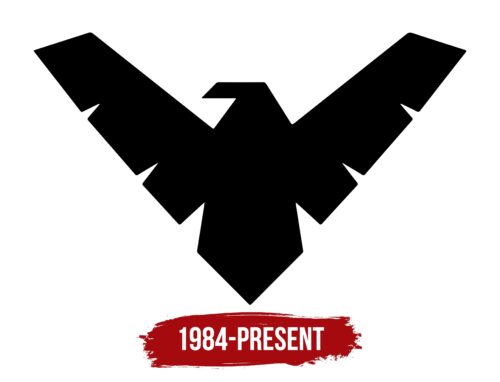
The rigid Nightwing logo speaks to the superhero’s unshakeable stand against evil and injustice. It indicates his unapproachable nature, determination, fearlessness, and readiness to come to the rescue at any moment. The restrained color is a testament to fearlessness, and the original shape is proof of individuality.
Nightwing: Brand overview
| Founded: | July 1984 |
| Founder: | Marv Wolfman, George Pérez |
| Headquarters: | United States |
| Website: | dc.com |
Meaning and History
When Grayson assisted Batman in the fight against evil, he did not have a constant emblem. A personal logo for Nightwing came later – in 1984. That’s when he gained high status as an independent character who, according to the legend, led the Teen Titans. George Pérez and Marv Wolfman were responsible for detailing his appearance, character, occupation, and behavioral line. They conceived the idea of a strict sign with a stern bird, which the young man wore on his chest.
The evolution from Robin to Nightwing was gradual, as he was a teenager at the start of his superhero career. His costume was called “disco” due to its blue color with golden sparkles. And there was no bird on it yet. It was depicted later, on the grown-up character: at the end of the 90s of the last century, he was dressed in a black body with a dynamic blue bird, which became his main identifying sign.
What is Nightwing?
Nightwing is one of the leading superheroes of the DC Comics universe. In 2013, he was among the top 5 best characters, embodying Richard John “Dick” Grayson, who until that time had been Batman’s assistant. This image gained independence in issue 44 of Tales of the Teen Titans, where he debuted in 1984. George Pérez and Marv Wolfman visualized him.
1984 – today
The bird is abstract: it has no tie to any particular family of avians. However, it outwardly resembles the hawk genus’s members, including not only hawks but also eagles (as a suborder). Their features can be recognized in the proud outline of the head, the powerful beak, the wide wingspan, and the large tail. Yes, all of the above are depicted in the Nightwing logo. The elements are enhanced by even and smooth lines, precise angles, and standardized features of the body and plumage.
A pair of massive wings are lifted upwards as if the predator is preparing to take off or stretching its muscles. The figure is characterized by geometric construction and is based on the shape of a triangle. It is manifested in everything: in the notches, the tops of the wings, the beak, the tail, and in the overall composition. Even the head is not devoid of some triangularity if you visually “cut off” the beak. There are many sharp angles and not a single rounding. The imposing inaccessibility of the superhero is well complemented by the black color. It is believed that it is a mix of several colors.
Font and Colors
The Nightwing logo is non-textual: it’s an image of a bird on the superhero’s costume, so there are no inscriptions in the sign. The personal palette consists of blue (used in comics and films) and black (applied in all other cases), signifying an uncompromising fighter against evil.
Nightwing color codes
| Black | Hex color: | #000000 |
|---|---|---|
| RGB: | 0 0 0 | |
| CMYK: | 0 0 0 100 | |
| Pantone: | PMS Process Black C |


