 Nine Network Productions Logo PNG
The Nine Network Productions logo represents a television network that owns various TV channels. It has a universal design because it plays on the brand name. Recognizable colors and shapes make the emblem unique.
Nine Network Productions: Brand overview
| Founded: | 16 September 1956 |
| Founder: | Frank Packer |
| Headquarters: | North Sydney, New South Wales, Australia |
| Website: | 9now.com.au |
Meaning and History
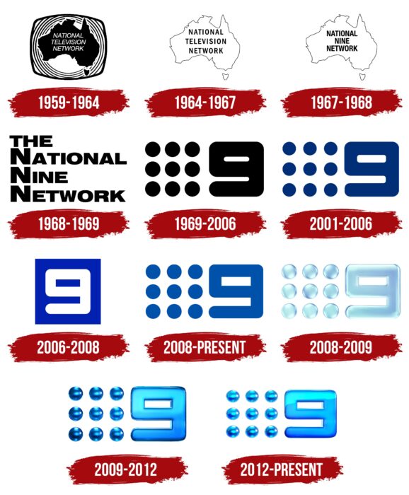
Nine Network Productions used to have other names, but all but the very first of them necessarily included the number nine. The fact is that the history of this television network began in 1956 with the creation of a radio station, which was designated by the call sign TCN-9. Together with NWS-9, QTQ-9 and GTV-9, it became the basis for the future Nine Network. Therefore, it is not surprising that the television network brand from Australia became famous for the Big Nine logo. For the first time, such a distinctive sign was adopted in 1969. Subsequently, it changed several times before it received a modern design.
What is Nine Network Productions?
Nine Network Productions is a television network owned by the Australian media company Nine Entertainment Co. Pty Ltd. It ranks second in the country in popularity, second only to the Seven Network. Its first station began operating in 1956.
1959 – 1964
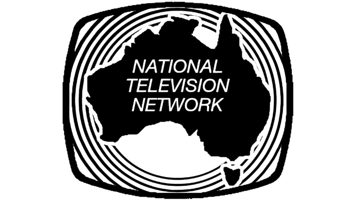
The National Television Network is considered one of the predecessors of the Nine Network. It appeared in 1959 after the merger of several stations. Her name was presented in the logo’s center and divided into three centered lines. The words consisted of thin cursive letters in upper case. The designers created a black background in the shape of Australia for the white lettering. The silhouette of the continent was outlined in white around the edge and surrounded by many concentric rings. At the same time, all elements were inside a rectangle with rounded sides, clearly imitating a TV screen.
1964 – 1967
Everything disappeared except for the Australian continent and the inscription “NATIONAL TELEVISION NETWORK.” The logo developers have changed the font, making the letters straight and thicker. At the same time, the brand name became black, and the base behind it was repainted white and acquired a dark outline.
1967 – 1968
After the company’s renaming, against the backdrop of the Australian continent, its new name appeared: “NATIONAL NINE NETWORK.” The font has not changed, but the letter spacing has been reduced.
1968 – 1969
The designers simplified the logo of the TV network: they removed the outline of Australia, leaving only the inscription. At the same time, the article “THE” appeared above the words “NATIONAL NINE NETWORK.” All four lines were left justified. Glyphs have become wider and bolder. Overall, the font resembled Foundation Sans Black Extended by FontSite Inc. The initial letters “N,” located one below the other, has been enlarged.
1969 – 2006
The most famous emblem of Nine Network Productions appeared in 1969. Its first black and white version was used until 2006 – it remained even after the television network was renamed in 1987 and became known as Nine Network Australia. The graphic sign contained a large number 9 on the right side. And on the left were nine small circles, lined up in three rows of three circles each. Brian Sadgrove designed this logo.
2001 – 2006
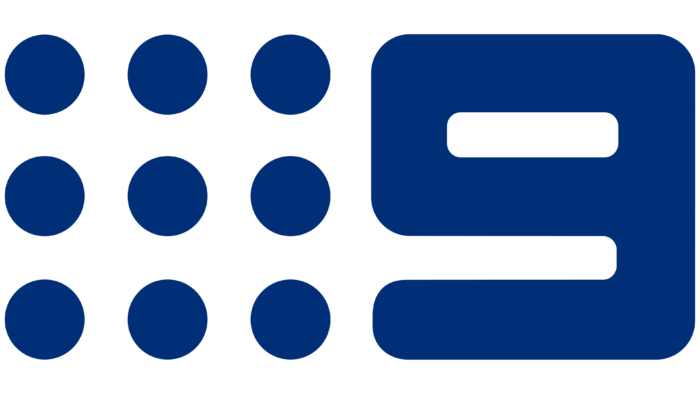
In the early 2000s, the Australian network symbol changed again. It was updated by the film production and design company Velvet mediendesign from Munich. Studio staff reduced the dots and slightly narrowed the lines that made up the number 9. In addition, they replaced the black with a dark blue.
2006 – 2008
In 2006, the Nine Network celebrated its 50th anniversary and, at the same time, introduced a “holiday” logo designed by Bruce Dunlop Associates. It contained a bright blue square with a large white nine inside.
2008 – today
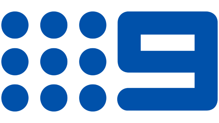
After another rebranding, the network returned nine small circles to the emblem, lined up on a 3×3 grid. They, as before, are located to the left of the number 9. And the designers removed the square so that it does not interfere. The blue color has become a little lighter.
2008 – 2009
Darwin, Brisbane, Melbourne, and Sydney have used a 3D version of the Nine Network logo with a silver blue gradient for two years. Because of the highlights and shadows, all the elements seemed voluminous.
2009 – 2012
The designers kept the 3D effect but changed the color to dark blue. The lightest part of the gradient was in the upper right corner.
2012 – today
In 2012, the nine balloons and the number next to them were repainted. They remained three-dimensional, but now blue dominates the palette. There are also many white reflections, which makes the surface of the elements appear glossy.
Font and Colors
Nine Network Productions is easily recognizable by the emblem that reflects its name. Predictably, this graphic sign contains the number 9, which the entire visual brand identity is built around. But the designers found another unusual solution, adding the nine with an appropriate number of small circles. They are what ultimately make the logo unique.
Judging by the shape of the number 9, no particular font was used for it. It’s most likely a glyph with a custom design. It consists of wide lines with rounded corners. There are no other inscriptions on the emblem.
The nine and the miniature circles depicted next to it seem voluminous due to the gradient. The basis of the color scheme is blue in different shades. There are also small white spots that create a visual effect of gloss and shine.
Nine Network Productions color codes
| Aqua | Hex color: | #1ffeff |
|---|---|---|
| RGB: | 31 254 255 | |
| CMYK: | 88 0 0 0 | |
| Pantone: | PMS 3275 C |
| Deep Sky Blue | Hex color: | #00b9ff |
|---|---|---|
| RGB: | 0 185 255 | |
| CMYK: | 100 27 0 0 | |
| Pantone: | PMS 306 C |
| Neon Blue | Hex color: | #0947fe |
|---|---|---|
| RGB: | 9 71 254 | |
| CMYK: | 96 72 0 0 | |
| Pantone: | PMS 2736k C |
| Midnight Blue | Hex color: | #061c6d |
|---|---|---|
| RGB: | 6 28 109 | |
| CMYK: | 94 74 0 57 | |
| Pantone: | PMS 2748 C |
