The perfect combination of shape and color – that’s what sets the Ninja Turtles logo apart from the emblems of other media franchises. It’s balanced in form and content, accurately characterizing the main heroes who have gained popularity among thrill-seekers.
Ninja Turtles: Brand overview
| Founded: | 1984 |
| Founder: | Kevin Eastman, Peter Laird |
| Headquarters: | United States |
Meaning and History
When the fighting turtles flickered on the pages of comics, their creators immediately pondered a worthy identity. Naturally, they opted for suitable textures and shapes so that just one look at the logo would clarify who is being referred to. But if the famous heroes initially popularized comics, the cartoons began promoting their characters after a while (in 1987). Due to their fame, they were turned into toy figures, for the sale of which advertising was required to attract the target consumer segment – children. And the best thing for them is a cartoon. Spectacular, dynamic, fascinating.
What is Ninja Turtles?
Ninja Turtles is an American media franchise based on four turtle superheroes. Its origins lay in a satirical comic released by Mirage Studios. The founders of this company and creators of the warrior turtle images were Kevin Eastman and Peter Laird, who invented them in 1984. The combat team of evil fighters includes Raphael, Donatello, Michelangelo, and Leonardo. Its full name is Teenage Mutant Ninja Turtles or TMNT.
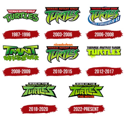
1987 – 1996
The logo uses textures that convey the rough skin of turtles. The media franchise’s name is written in such letters. At the same time, they are rounded and have no sharp points. Glyphs are placed very close to each other to demonstrate the close friendship of the main characters and the importance of support. The green inscription is arched and randomly dotted with small strokes of varying lengths.
Above it is a red trapezoidal ribbon with the white phrase “Teenage Mutant Ninja.” It’s typed in an upper-case geometric sans serif font. The letters seem to be magnetically attracted to the center. This effect was achieved through a slight sideways twist. All elements are individually outlined with a black line.
2003 – 2006
The Ninja Turtles logo began to show a trend toward spikes, angles, and sharp points. Most likely, this was dictated by the type of bladed weapons used by the turtles: katana, ninja-to, kusarigama, and sai. Their blades are well represented in all the letters of the word “TURTLES,” done in capital letters. The inscription is colored in two shades of green and placed on a dark background, which nicely accentuates the glyphs. Above is a black trapezoid with the first half of the name – “Teenage Mutant Ninja.” It’s colored in a vibrant red, adding an edge and tense energy to the emblem.
2006 – 2008
A unique element was introduced to the standard design of the logo – a blue curved line in the shape of a boomerang. It reaches the letter “S” with its wide end and starts above the black stripe, behind which its tip peeks. The band features the capitalized chiseled font word “FAST FORWARD.”
2008 – 2009
The logo uses the abbreviation TMNT with a chaotic accumulation of letters at the bottom, which is the slogan “Back to the Sewer.” The letters in it are rounded, light olive, outlined with a thin black line. The upper inscription consists of large glyphs in a geometric style painted in a green gradient. The caps of the side “T”s are elongated: they cover the two central symbols.
2010 – 2015
The Ninja Turtles logo regained spikes and barbs reminiscent of the blades and edges of the heroic turtles’ weapons. It is a replica of the 2003-2006 emblem. The only difference is the orange “Nickelodeon” inscription, typed in lowercase letters and placed above the black trapezoid.
2012 – 2017
A square sans serif font is what sets this logo apart. Also noteworthy is the green neon spectrum color with uneven black dots and small dashes. The letters are massive, monolithic, and closely interconnected. They are so tightly packed that there is no free space between them. Shadows and a black outline have been added to the glyphs, and a “random” streak of bright green paint adds a sense of realism. The upper inscription is the first half of the media franchise’s name, stylized as geometric shapes. Overall, the emblem looks like graffiti on a wall.
2018 – 2020
The logo style drastically changed: the era of aggressive design began. The word “Turtles” looks like a mosaic – it seems to be assembled from cut stones, given the necessary shape. Therefore, the lower part of the emblem looks like a chunk. In addition, it has sharp chips on the edges, resembling thin spikes. This is additional protection and simultaneously a weapon for an attack. The designers relieved the green color of the gradient, leveled it, and softened it with a yellow glow on top and the left edge. They made the phrase “Teenage Mutant Ninja” understandable and smooth, and above it, they placed the inscription “Rise of the,” typed in slightly flattened white letters.
2022 – today
After the release of the next cartoon, the Ninja Turtles logo hasn’t changed much. Designers modernized it by enhancing its color. As a result, green became lighter and got a yellow tint concentrated in the middle and at the edges. Below, under the ragged black background, is a red inscription, “The Movie,” typed in uppercase letters.
Font and Colors
The logo is textual, so much attention is paid to the fonts. The fonts are predominantly businesslike, strict, and custom-made. The image of the turtles dictates their individuality, the texture of their skin, and their shells. That’s exactly what the authors of the emblems tried to convey.
In this case, color is inextricably linked to the style of the letters, so the predominant color is green in several shades. It’s well balanced by yellow and contrasted with black. The franchise’s identity includes white, red, blue, and orange.
Ninja Turtles color codes
| Kelly Green | Hex color: | #6abf00 |
|---|---|---|
| RGB: | 106 191 0 | |
| CMYK: | 45 0 100 25 | |
| Pantone: | PMS 802 C |
| Dandelion Yellow | Hex color: | #eddb00 |
|---|---|---|
| RGB: | 237 219 0 | |
| CMYK: | 0 8 100 7 | |
| Pantone: | PMS 3945 C |
| Black | Hex color: | #000000 |
|---|---|---|
| RGB: | 0 0 0 | |
| CMYK: | 0 0 0 100 | |
| Pantone: | PMS Process Black C |
| Coquelicot | Hex color: | #ff3c00 |
|---|---|---|
| RGB: | 255 60 0 | |
| CMYK: | 0 76 100 0 | |
| Pantone: | PMS 1655 C |


