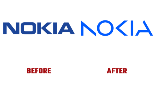
For the first time in 60 years, Nokia has revised its development strategy, deciding to focus on technologies that help the world act together, so phones are gone from its priority. That’s the brand’s goal. As a result, a revamped logo was unveiled at Mobile World Congress Barcelona in late February 2022 that no longer evokes associations with cell phones.
As President Pekka Lundmark said, the new logo represents Nokia’s current identity as it is now: with love for digital transformation and unbridled energy. In doing so, the designers drew on the old symbol, adapting it to modern conditions. Work on the corporate identity was entrusted to longtime partner Lippincott Studio.
- The logo was simple but dynamic, reflecting the change in corporate strategy and the shift of the company’s focus.
- Although the familiar font is a thing of the past, it is still recognizable because the individual letters were simply cropped.
- A more geometric and abstract lettering design shows the brand’s evolution but does not take away from its historical heritage.
The author of the new icon has made it so that the lettering still reads “Nokia.” But it will only do so when the letters are in the right order. And separately, they look like abstract geometric shapes. In addition, “N,” “O,” and “K” have become bold for use in all types of content.
Despite doubts about legibility, the brand name is still easy to guess because the glyphs have a familiar shape. And some have even retained it, either completely or in a slightly altered form, such as the “A” without half of the bar.


