The Nokia logo symbolizes continuous development, stability, and high technology, ensuring recognition today. The fish depicted on the brand’s first logo reflected the essence of the Nokianvirta River since it was the river that gave the company its name.
Nokia: Brand overview
| Founded: | 12 May 1865 |
| Founder: | Fredrik Idestam, Leo Mechelin, Eduard Polon |
| Headquarters: | Espoo, Finland |
| Website: | nokia.com |
Nokia is a Finnish manufacturer of telecommunications equipment and consumer electronics. According to official figures, the company was founded in 1865, when Fredrik Idestam opened his first pulp mill. However, Nokia Corporation appeared much later – in 1967, after the merger of three companies:
- Suomen Kaapelitebdas Oy (power and telephone cables)
- Suomen Gummitehdas Oy (galoshes and other rubber products)
- Nokia Ab (electricity, forestry)
Meaning and History
Some of Nokia’s logos used to belong to the companies that founded it. Perhaps that is why they look so illogical: many symbols have nothing to do with mobile and telecommunications devices.
What is Nokia?
Nokia is an international corporation based in Finland, with its headquarters in Espoo. Established in 1865, the company has been involved in various types of businesses, starting as a paper and pulp manufacturer and eventually becoming a leading mobile phone manufacturer. Today, it is one of the largest players in the field of information technology and communications, ranking third in the world for the production of network equipment.
1865 – 1898
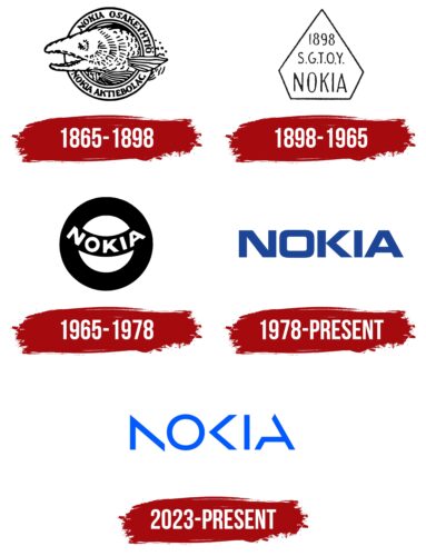
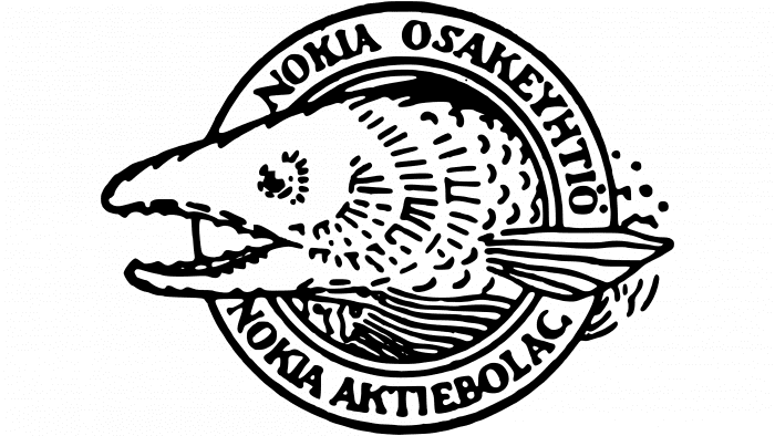
The first emblem was used by Nokia Ab, which first was engaged in pulp processing, and then switched to power generation. The trademark was round like a seal. Its shape was broken only by a fish that peeped out of the ring. Most likely, it was salmon from the Nokianvirta river, on the banks of which the city of Nokia is located. The drawing was complemented by the inscriptions “NOKIA OSAKEYHTIO” and “NOKIA AKTIEBOLAG.”
There were two versions of the logo in parallel. The first is blurry, with jagged lines and detailed fish scales. The second one has clear contours and a minimalistic salmon image.
1898 – 1965
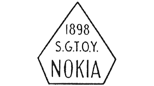
In 1898, the company switched to rubber and electrical products manufacturing, merging with several factories. The Nokia logo underwent a drastic change. It contained the inscription “1898 S.G.T.O.Y. NOKIA,” where the abbreviation with dots after each letter stood for the name Suomen Gummitehdas Osakeyhtiö (Finnish Rubber Factory). The text was executed in simple thin glyphs without serifs and was located inside a pentagon with an elongated top.
1965 – 1978
The emblem, adopted in 1965, once belonged to the Suomen Gummitehdas Oy rubber factory. As he specialized in tire manufacturing, the brand name consisted of a black ring. It was crossed by a semicircular strip of the same black color as the inscription “Nokia.” Interestingly, in this context, the word did not mean the Nokia corporation, but the city where the enterprise was located.
1978 – today
The Nokia logo with the dark blue inscription is one of the most recognizable in the world. It contains the brand name written in bold letters without serifs. This font, known as Nokia Pure, was designed by designer Dalton Maag. The blue color used in the wordmark has several meanings.
- On the one hand, it is associated with technology, modernity, reliability, and quality.
- On the other hand, it symbolizes safety and tranquility, emphasizing the company’s overall philosophy.
2023 – today
In 2023, Nokia radically changed its logo to no longer be associated with mobile phones. For nearly a decade, the company has been developing other business areas – primarily, the production of telecommunications equipment. The iconic dark blue color in the main emblem version has become lighter, which is likely related to the desire to attract the attention of potential clients. The chosen shade embodies freshness, energy, and innovation.
The letter “O,” which previously resembled a square, now has the shape of a round ring. This symbolizes wholeness and universality. The other glyphs look minimalist because they lack standard elements. The “N” is missing the vertical line on the right side, the “K” is missing the left vertical line, and the “A” is missing a diagonal fragment in the upper left corner. This design not only gives the logo dynamism and modernity but also indicates openness and non-standard solutions.
Nokia: Interesting Facts
Nokia started as a paper mill in Finland in 1865 and has become famous for making mobile phones.
- Nokia started making Paper in 1865. This shows that they’ve been able to change and keep going through the years.
- Early Mobile Phones: They helped make mobile phones popular. In 1987, they made one of the first mobile phones you could carry around.
- Top Phone Maker: In the early 2000s, Nokia made more mobile phones than any other company. Their phones were tough, worked well, and had cool new features.
- Famous Ringtone: The Nokia ringtone is well-known. It came from a piece of music by Francisco Tárrega, and Nokia made it sound like an old video game.
- Snake Game: The game Snake, which first appeared on Nokia phones in 1998, became popular. It is a simple but fun game.
- Focused on Phones: By the 1990s, Nokia mainly made equipment for phone calls, which helped it become a leader in mobile phones.
- Smartphone Pioneer: In 1996, Nokia released what some people think was the first smartphone. It had a big screen and a keyboard.
- The Nokia 3310: Released in 2000, this phone sold very well because it was strong, lasted a long time on a charge, and had Snake II. They even made a new version in 2017.
- Switch to Windows Phone: In 2011, Nokia worked with Microsoft to improve smartphone performance using Windows.
- Bought by Microsoft: Microsoft bought part of Nokia in 2014. But Nokia didn’t leave phones behind. Through a deal with HMD Global, Nokia now makes Android phones.
- More than Phones: Nokia also develops technology for phone networks, including new 5G networks and the Internet of Things, which connects everyday items to the Internet.
Nokia has changed a lot since it started. They’ve made many different products but are known for their mobile phones. They’ve had good and bad times but are still a big technological name.
Font and Colors
The Nokia brand name has evolved continuously since 1978. A version close to the modern one appeared in 1992. At the same time, the slogan “Connecting People” was adopted. The designers redesigned the letters using the original Nokia Sans font. The next modernization took place in 2006: it touched the palette. The final version was presented in 2011. It lacks the famous slogan, so the name of the company immediately catches the eye.
In 2011, not only did the “Connecting People” label disappear – the redesign sent the Nokia Sans font into the past, replacing it with the Nokia Pure. A simple sans serif font reflects the calm nature of the manufacturer.
As for the palette, the company tries to stick to blue. She uses light and dark shades to showcase her corporate image.
Nokia color codes
| Safety Blue | Hex color: | #124191 |
|---|---|---|
| RGB: | 18 65 145 | |
| CMYK: | 88 55 0 43 | |
| Pantone: | PMS 287 C |
