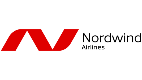
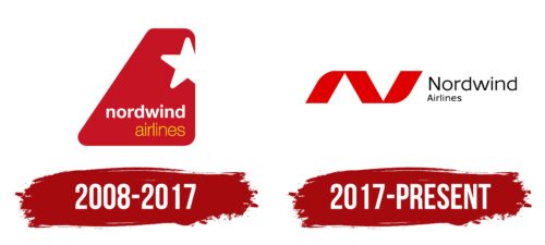
The Nordwind Airlines logo depicts the dynamics of takeoffs and landings, with the initials of the company’s name encoded within. Simple symbols reflect the aspiration for heights and downward descents, as the brand emblem resembles a roller coaster.
Nordwind Airlines: Brand overview
Nordwind Airlines LLC (Russian: OOO Severny Vet, Latinized: Nordwind) has attracted travelers’ attention since its founding in Moscow.
In 2008, Nordwind Airlines began operating with a modest fleet of two airplanes, exclusively serving Russian tourists seeking the sun-drenched shores of the Mediterranean and Indian Ocean.
Nordwind Airlines quickly gained a reputation as a reliable and loyal airline, which allowed it to expand its operations beyond Russia.
Striving to provide the highest quality of service, Nordwind Airlines operates a fleet of Boeing and Airbus aircraft.
Nordwind Airlines has been ahead of its competitors for over a decade, prioritizing safety, customer satisfaction, and sustainable development.
Meaning and History
What is Nordwind Airlines?
Established in 2008, Nordwind Airlines has become one of Russia’s leading air carriers. Based at Moscow’s Sheremetyevo Airport, the airline started its operations with three Boeing aircraft. It subsequently expanded its fleet significantly to cater to the growing number of passengers. During its formative years, the airline focused mainly on international charter transportation. Currently, the brand is evolving, embracing change, and providing quality service to its passengers.
2008 – 2017
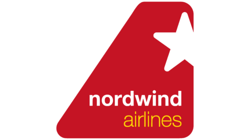
The Nordwind Airlines logo features a part of an airplane’s tail fin with a livery resembling an irregular trapezoid. The corners of this geometric figure are fully rounded, indicating the company’s loyalty to passengers and its commitment to ensuring their safety and providing impeccable service during flights. In reality, such a design negatively impacts the aircraft’s aerodynamic characteristics and is inaccurate.
The logo is predictably red, as it is a Russian airline, and this color has been revered since the Soviet Union era. The shade is quite aggressive, resembling dark venous blood, which can be off-putting. The use of white and yellow helps to balance the emblem visually.
The star in the narrow part of the emblem is predictable, as it is a key legacy of the previous era that long dominated Russia. The star lacks two rays on the right side; they are cut off, so only three are visible on the improvised tail. Their ends are rounded to minimize negative impressions. Below, on the wider part, is the airline’s name.
The text is divided into two levels. The first line contains the word “Nordwind,” colored white, creating an optimal contrast with the dark red background. The lowercase semi-bold font suggests the carrier’s insecurity, low self-esteem, and subconscious desire to avoid responsibility. The second row features the word “Airlines,” set in thin yellow glyphs as a reminder of the sun. The font is in lowercase and sans-serif.
2017 – today
The logo designers found similarities between the letters “N” and “A,” the initials of the company’s name, and created a stylized version. They combined these letters into a single design with wide stripes. The center element is a classic parallelogram, and the side elements have one rounded corner each, resembling airplane wings. To the right, the airline’s name appears in black, spread across two levels, with thin, elongated letters. The upper word is larger than the lower one, and the lines are left-aligned.
The font and colors evoke trust and reliability. The rounded corners soften the design, making it approachable. This thoughtful design blends principles to create a balanced and impactful visual identity.
The wide stripes in the “N” and “A” add boldness and modernity, suggesting strength and stability. The parallelogram at the center is a solid focal point, while the rounded corners on the sides introduce fluidity and motion, symbolizing the dynamic nature of the airline industry.
The airline’s name’s black color signifies professionalism and elegance, reinforcing credibility. The thin, elongated letters add a contemporary feel, making the logo appear sleek and refined. With the upper word larger, the two-level text arrangement creates a visual hierarchy that guides the viewer’s eye, making the brand name easy to read and remember.
The left alignment of the lines adds stability and balance, grounding the logo and giving it a cohesive appearance. This alignment, combined with the overall design, creates a sense of unity and coherence, making the logo memorable and distinctive.


