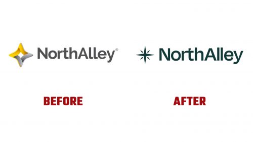
NorthAlley, a global tech leader, has rebranded to better align with its mission of providing innovative solutions in collaboration, software development, and technological advancement. This rebranding effort aims to convey values of innovation, reliability, and customer focus to a global audience.
The new logo is the centerpiece. It features a stylized star with compass elements, symbolizing direction and clarity. The star, with clean lines, represents the company’s innovative approach. Compass elements add depth and sophistication, reinforcing guidance and reliability.
The logo’s star has sharp angles and precise lines that suggest movement and progress. Its geometric form is balanced by smoother compass curves, creating a harmonious design. This blend of shapes and lines reflects dynamic work and commitment to leading clients through tech complexities.
The typography in the new brand identity complements the logo’s modern look. The primary font is a sleek, sans-serif typeface that exudes confidence and clarity. Its clean lines and balanced proportions ensure readability across various media, from digital to print. This typeface was chosen to convey innovative spirit and professional reliability.
The color palette includes shades of blue and green. Blue, associated with trust and reliability, reinforces the company’s commitment to dependable solutions. Green, symbolizing growth and innovation, highlights the focus on advancing technology. These colors are used throughout the brand’s visual elements to create harmony and balance. Blue in the logo establishes a strong foundation of trust, while green accents add vibrancy and energy.
A unique graphic element, the “Star Trail,” has been developed. This design features intersecting lines and a star, creating a visual motif across various brand assets. The Star Trail enhances brand recall and adds an aesthetic touch. It organizes information visually, guides the viewer’s eye, and reinforces the theme of guidance and direction.
The new brand identity has been implemented across all touchpoints, ensuring a cohesive presentation. This includes the company’s website, social media profiles, marketing materials, and office spaces. The redesigned website features a clean design with intuitive navigation. High-quality images, concise messaging, and strategic white space create a professional user experience. The Star Trail is integrated into the layout, adding visual interest.
Brochures, business cards, and presentation templates have been redesigned to align with the new brand identity. The consistent use of the Star Trail and the new color palette creates a strong visual connection across all materials. Each piece communicates NorthAlley’s value proposition.
The new design language extends to physical environments, including updated signage, interior design elements, and employee uniforms. This ensures the brand’s innovative spirit is reflected in the workspace, fostering employee pride and making a positive impression on clients.
Workshops and training sessions were conducted to ensure the successful adoption of the new brand identity. These sessions educated employees about the new brand values and visual identity, fostering a sense of ownership and enthusiasm for the rebrand. A communication plan informed clients and partners about the rebranding, including emails, press releases, and a launch event. Feedback has been overwhelmingly positive, with clients excited about the fresh look.
NorthAlley’s rebranding has successfully transformed its visual identity to better reflect its mission and values. The new brand, emphasizing direction and clarity, positions the company as a leading innovator in the tech industry. This thoughtful rebranding effort underscores the power of effective branding in driving business success and stands as a testament to NorthAlley’s commitment to innovation and excellence.


