Norwich University of the Arts is ushering in a new era with a groundbreaking rebrand that marries traditional artistry with contemporary digital mediums. The visual renaissance was masterminded by North Design in alliance with a university steering committee chaired by Vice Chancellor Simon Oldfield-Kerr and brand consultants Winster March.
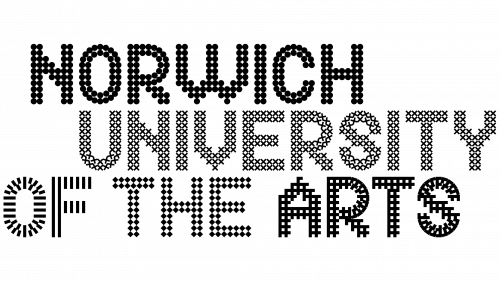
At the core of the Norwich University of the Arts logo is a bespoke typeface named “Exchange,” developed by Jonathan Leonard. Conceived as reflecting the university’s focus on “research and experimentation,” the typeface features 12 unique textural expressions encapsulating the diverse disciplines nurtured within the university walls. “The logo is a collage of these textural fonts, embodying the spirit and identity of the university,” Leonard elaborated. Using creative coding methods gives additional depth, animating patterns that make the branding come alive.
Engaging the academic community throughout the rebranding was a top priority for the university and North Design. Founding partner of North Design, Sean Perkins, has lectured at Norwich for a decade, and the project’s main design leads, Jonathan Leonard and Sophia Brandt, are both Norwich alums. To involve the larger community, the design team initiated anonymous surveys and held town halls at different project phases, ensuring a thorough community-led process.
The new identity pays homage to the university’s longstanding 178-year history and Norwich’s rich creative legacy. The color palette employs a striking yellow, rooted in the story of 16th-century Protestant master weavers who migrated to Norwich and brought yellow canaries. The vivid yellow is framed by shades of black, white, and grey and supplemented with a medley of secondary colors.
Vice Chancellor Oldfield-Kerr emphasized that the revitalized brand aims to ask “big questions” and aligns with the university’s goal of cultivating talents that “reshape the world while promoting justice, equality, and sustainability.”
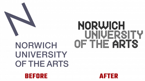
Acknowledging the merits of the previous identity by Studio Sutherl&, which had been in place since 2009, Perkins pointed out that the new look is designed to propel the university “into the 21st century.” He said it would offer a “framework that balances structure with room for free expression and collective ideation.”
The rollout of this novel branding will be phased, making its debut on recruitment collateral, social media, and a newly redesigned website. Subsequent phases will witness the rebrand taking center stage across campus signs, consummating the transformation of Norwich University of the Arts.


