The Nouvelair logo is elegant in form and vibrant in color. Although it lacks national Tunisian motifs, it still captures attention with neatness, precision, and positivity. The emblem reflects the essence of the airline’s work and conveys its authentic character.
Nouvelair: Brand overview
Nouvelair Tunisie, a dynamic Tunisian airline, has played a key role in connecting travelers with Tunisia’s charming North African country. Founded in France as Nouvelair Limited Company or Nouvelair Société Anonyme, the airline provided charter services for tourists from various European cities to Tunisia’s idyllic resorts.
Since its creation in 1989, Nouvelair Tunisie has spearheaded a new era in Tunisian aviation, meeting the growing demand for travel between Europe and Tunisia. Nouvelair has been the driving force behind the country’s tourism industry for more than three decades.
With main bases at Habib Bourguiba International Airport Monastir, Tunis-Carthage International Airport, and Djerba-Zarzis International Airport, Nouvelair is strategically positioned to serve travelers visiting Tunisia’s most popular tourist destinations.
The airline operates an impressive fleet of Airbus A320 aircraft, providing travelers with a reliable and enjoyable journey.
Meaning and History
What is Nouvelair?
Nouvelair Airlines, known as Nouvelair Tunisie, was founded in the heart of Tunisia and offers charter flights to the country’s most attractive tourist destinations. Headquartered in the picturesque tourist area of Dhkila in Monastir, the company has been firmly embedded in the local culture and society since its inception. Since its inception, the airline has grown in size and gained a reputation as one of the leading airlines in the country.
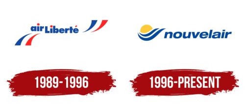
1989 – 1996
The logo is elegant, light, and simultaneously strict. It concentrates the positive energy that the airline gives to its customers. A distinctive feature of the emblem is its original shape, which is unique among other carriers. It is characterized by:
- Multilayering: Graphic and textual elements are on different planes, turning a simple two-dimensional mark into a complex three-dimensional one, indicating the diverse range of services provided.
- Symmetry: Identical details placed on both sides add harmony and balance to the logo, portraying the company as progressive, impeccable, and capable of approaching its duties thoughtfully.
- Geometry: The airline’s perfectly precise elements speak to its seriousness, high responsibility, and increased attention to detail to ensure maximum passenger comfort.
In other words, the shape of the Nouvelair emblem reflects the concept of flight safety, precise adherence to departure and arrival schedules, and the maintenance of a business atmosphere. This demonstrates the high professionalism of the staff, who are genuinely dedicated to their work.
The logo is highly symbolic, containing many direct and allegorical meanings. Since Tunisia is a colorful country, its identity is associated with brightness. This has merged with the local culture, finding reflection in each company’s main marketing tool—the personal emblem. The logo features three basic colors: blue, red, and white, which are combined in contrast.
These colors adorn the logo, infusing it with positivity and maintaining a connection with symbolism. Through them, the airline conveys its main message—its origin. All three colors represent the flags of Tunisia from different periods: red and white for the current flag and blue for the ancient flag from the Ottoman Empire period. This is another sign of the company’s uniqueness and authenticity, showing travelers worldwide the brand’s country of origin.
The colorful stripes point sharply toward the inscription, conveying that all roads lead to this airline. They are arranged as quotation marks around the phrase “air Liberte” (the carrier’s old name). The text is set in an extra-bold sans-serif font, but thanks to the wide spacing between the letters, it reads very easily: each glyph is visible. The red dots above the blue enhance the good readability of the “i” letters: they highlight the inscription, draw attention to it, and signal the availability of services.
1996 – today
The Nouvelair logo features the company name in a lowercase font. The letters are smooth, flowing, and slightly italicized, adding a dynamic feel that matches the wavy lines in front of it. Two curved blue stripes frame a yellow sun, shaped like a half-disk with a raised right edge. The ends of the stripes come to a point. This design emphasizes the airline’s focus on flying to ideal vacation spots. The colors look sun-faded like they’ve been bleached by the tropical sun.
The sun-faded colors and blue stripes evoke relaxation and travel, fitting the theme of vacations. The pointed ends of the stripes add sophistication, highlighting quality service. These elements create a memorable logo representing the airline’s goal of connecting with travelers.
The lowercase, slightly italicized font adds approachability and friendliness, inviting travelers to choose Nouvelair. The smooth letters suggest ease and comfort, mirroring the airline’s service.
The curved blue stripes and yellow sun create a balanced design. The sun’s raised edge symbolizes warmth and sunny destinations, reinforcing the holiday travel theme.
The logo’s sun-faded colors and dynamic elements capture the essence of relaxation and adventure. The pointed ends of the stripes add sophistication and a sense of forward motion, showing the airline’s commitment to getting passengers to their dream destinations.


