


![]() NPR Logo PNG
NPR Logo PNG
The NPR logo demonstrates working in tandem, bringing together many stations broadcasting on the air. The emblem symbolizes work for people and the maintenance of uniform standards throughout the coverage area.
NPR’s history began after President Lyndon Johnson signed the Public Broadcasting Act on November 7, 1967. The law created the Corporation for Public Broadcasting, a nonprofit body meant to support noncommercial radio and television. CPB later formed the Public Broadcasting Service for television and the National Public Radio for public radio.
NPR was incorporated on February 26, 1970, with 88 founding stations across the United States. Donald Quayle became its first president, the staff had 30 employees, and the studios were based in Washington, D.C. NPR first went on air in April 1971, broadcasting Senate hearings on the Vietnam War.
On May 3, 1971, All Things Considered debuted as NPR’s daily evening news program. Its format differed from that of commercial radio, featuring longer reports, commentary, and human-focused stories instead of brief headlines. In 1976, NPR created a department for specialized audience programming and launched the Spanish-language Enfoque Nacional.
In 1977, NPR merged with the Association of Public Radio Stations and became a full member organization. In 1979, Morning Edition debuted, and NPR launched a satellite delivery system. By 1980, its national satellite network connected 15 signal points. A financial crisis followed in 1983, when NPR had about $9 million in debt and only $20,000 in cash. After CPB loans, layoffs, and restructuring, NPR repaid the debt in about three years. Fresh Air and Car Talk reached national audiences in 1987. By 2008, NPR supplied programs to more than 860 public radio stations, competing with networks such as Clear Channel Communications.
Meaning and History
![]()
Since 1971, this American media organization has been officially called National Public Radio. However, it is better known by its trademark NPR, which has been used in slogans and logos for many years. In the old radio network emblem, all three letters were lowercase, and their geometric shapes matched the curves of the nearby microphone, a key attribute of radio broadcasting.
In the mid-1990s, Steff Geissbuhler from C&G Partners developed a flexible corporate style for the group of radio stations. This resulted in an icon with the uppercase inscription “NPR,” where each glyph was in its “sound” square. They varied in color and in the arrangement of decorative lines. By the end of the millennium, it became clear that this logo was too detailed and blurry for use on the internet. New designers changed the letters to lowercase and removed the patterns, filling the squares with solid colors.
What is NPR?
National Public Radio broadcasts via satellite and distributes news and cultural programs in the United States and Puerto Rico. Headquarters in Washington, D.C. The network’s profit is around $ 6 million.
1971 – 1994
![]()
The first logo is shaped like a professional microphone, used by presenters in the studio and singers while recording songs. The image immediately showed which area the organization belongs to.
Next to the microphone is the abbreviation NPR (National Public Radio) in lowercase. The symbols are as streamlined as the microphone and repeat their individual parts. The company has two names at the same time. Legally, it is National Public Radio, and its registered trademark is “NPR.” All logos use the last abbreviation.
1994 – 1998
![]()
In 1994, NPR appointed a new president, who served until 1998. In connection with his policy, the company’s visual representation has changed dramatically.
The new logo emphasizes radio waves. The three letters of the name stand apart, and each emits a signal in the form of spreading circles and stripes. Each symbol has its own color, and under it is a signature that deciphers the abbreviation.
The distance between the letters and the existence of each as a separate complex reveal the solution to the financial problem the company faced in 1983. To avoid bankruptcy, the state scholarship allocated to the organization was divided directly among individual stations, which supported the central apparatus as subscribers. Essentially, NPR itself consisted of a network of individual stations operating via satellite feeds.
Three letters can talk about broadcasting using radio waves of different ranges: short, medium, and long.
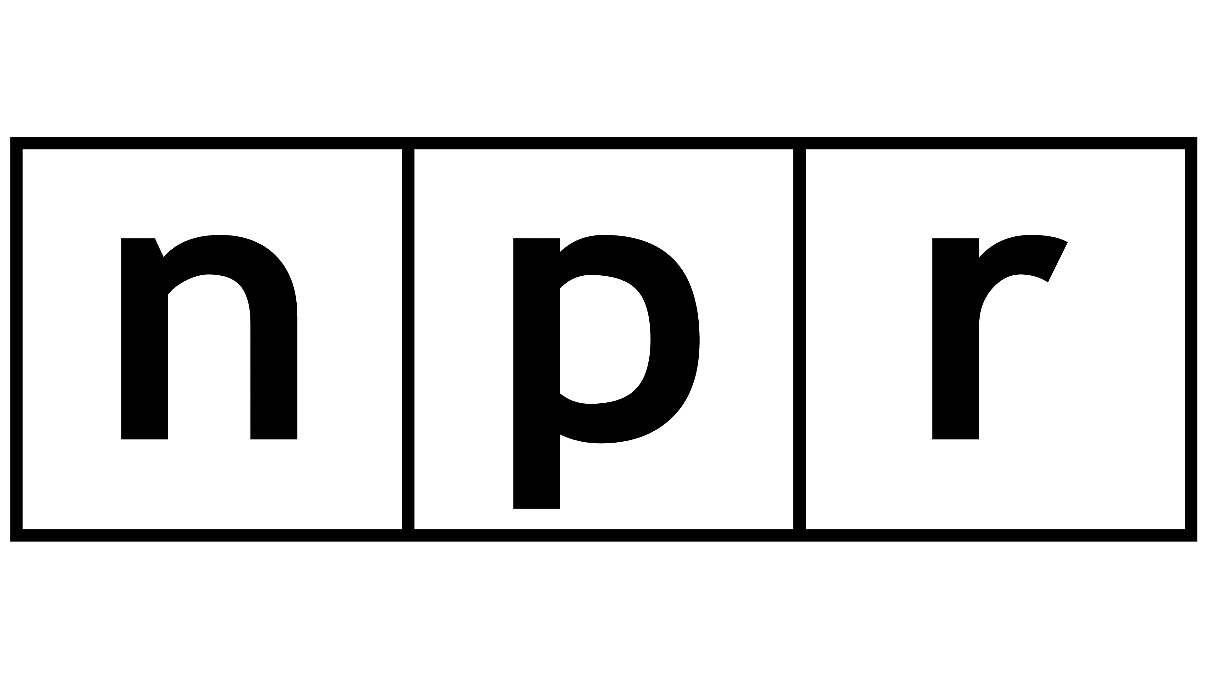
1998 – today
![]()
In 1998, management changed again. Kevin Klose, who comes from the International Broadcasting Bureau and has significant management experience, has worked to replace the previous logo, which was difficult to place on small surfaces.
The latest modification of the emblem, created under his direction and still in use today, also depicts the company’s work as individual stations. But to implement the idea, three connected multi-colored squares were used: red, black, and blue, each containing one lowercase letter of the name. This eliminated the gaps between the elements and made the lettering clearer. The need to decipher each character has disappeared.
Drawing the name as cubes showed the mobility of ether’s structure. Various blocks from different departments and organizations can replace each other, creating a continuous broadcast. Using colored cubes demonstrates that NPR broadcasts on a wide range of wavelengths. Also, three colors can indicate three options for disseminating information: via radio, the Internet, and mobile networks.
NPR Music
![]()
In 2007, NPR launched a project for the Music Discovery service, which broadcasts podcasts, concerts, news, and radio music programs.
The project’s emblem combines the Public Radio’s main logo with the word “music.” The main sign indicates that the service belongs to a larger, more well-known enterprise. The second half of the emblem is in a completely different style from the NPR bricks. This copies the idea behind the Amazon project logos. Stripes up and down from the letter M represent sound waves, which enliven the sign.
Font and Colors
The main colors of the emblem are red, black, blue, and white.
- Red: hot, latest news. Passion for your work. Movement in step with the times. The ability to change. With the advent of Internet technologies, NPR has moved into digital broadcasting, creating podcasts and organizing broadcasts on social networks. Developed an application for mobile phones. All of this is on par with the main work at radio frequencies.
- Black has a fundamental approach, extensive broadcasting experience, and confidence in the future. The company does not plan to leave the air. For stability, two centers have been established in different parts of the country, and sponsors and government funding are being secured. Therefore, the company is ready to survive in any situation.
- Blue business skills, thoughtful planning, and the creation of professional programs that users demand.
- White renewal: the ability to start anew.
The use of different colors and white letters shows broadcasting at different wavelengths, which together form a single ethereal field.