The NumLookup logo, featuring a bold hashtag symbol on a blue background, reflects the idea of quickly and efficiently searching and identifying phone numbers. Its clean and modern design emphasizes clarity and functionality, which aligns well with the service’s purpose. This is an appropriate emblem for a site that collects information about the mobile phone numbers of different people.
NumLookup: Brand overview
| Headquarters: | United States |
| Website: | numlookup.com |
Meaning and History
The main functionality of Numlookup is to obtain information about the numbers from which the user received missed calls. The website database contains millions of American numbers, so the likelihood of interacting with scammers is minimal. After checking the entered number, the system will provide information about its status, including complaints from other users.
Using Numlookup, the user does not have to worry about the legality of their actions. The company uses only legal algorithms for updating databases, working with the current regulatory legal acts. At the output, the client receives completely reliable information. Moreover, one of the obvious advantages of Numlookup is that it’s free. The user must not enter personal data to verify a full phone number.
What is NumLookup?
This website is ideal for those users who need to get reliable information about the mobile number from which they made the call.
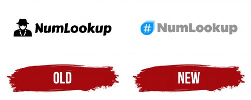
Old
The Numlookup logo conveys the website’s functionality. After reading the logo, the user immediately understands that this is a professional resource with rich experience in the information processing market. A black-and-white color scheme was decided on to help people associate the project with a serious resource.
The Numlookup logo has an emblem and a wordmark on the right. The emblem is a stylized image of a man wearing a coat, glasses, and a hat. This refers to the “spy” theme, as this man is similar to an undercover man. Moreover, the website’s functionality is aimed at maximum anonymity for the client. Also, the company thus clearly conveys the message that its main task is to analyze the identities of unknown numbers. The mystery of this character makes the logo modern and progressive at first sight.
The “Numlookup” wordmark uses a bold sans-serif font with rounded corners. At the same time, all characters are slightly tilted to the right, which indicates the use of italics.
New
Font and Colors
The wordmark uses a classic italic, bold sans-serif with rounded corners. Visually, it resembles Linotype Rana Std Bold. However, the writing style was slightly modernized to make the outlines in the letters more modern.
The logo is designed in black and white. This palette was not chosen by chance; it allows the company to emphasize the project’s anonymity and seriousness while focusing on the final result.
numlookup.com logo
