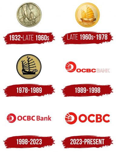
The OCBC Bank logo transports clients into the future, passing through the past. It has deep historical roots that trace back to the very inception of the financial institution. This connection empowers it to strive forward, grow daily, and evolve by modern demands. The image used in the bank’s emblem is iconic, thus firmly rooted in its identity.
OCBC Bank: Brand overview
| Founded: | 31 October 1932 |
| Founder: | Tan Ean Kiam and Lee Kong Chian |
| Headquarters: | Singapore |
| Website: | ocbc.com |
Meaning and History
The history of this bank is a history of consolidations. It started with combining three structures into one, so it almost always adhered to this strategy, evolving through mergers. And this approach is significantly reflected in the logo: it often changed, which almost always coincided with internal transformations in the financial institution.
What is OCBC Bank?
OCBC Bank is a major financial institution from Singapore, the second-largest bank in the Southeast Asia region. Its full name is Oversea-Chinese Banking Corporation. It was formed due to the merger of three banks, which emerged in the early 20th century. These are the Oversea-Chinese Bank Limited of 1919, Ho Hong Bank Limited of 1917, and China Commercial Bank Limited of 1912. The new structure was launched in 1932 and founded by Tan Ean Kiam and Lee Kong Chian.
1932 – late 1960s
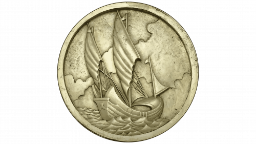
The logo looks like a zinc stamp or an engraving made on an iron plate. It has a round shape and represents a marine landscape, where the main place is given to a large sailing boat rushing forward on the waves against the background of a cloudy sky. Each stroke, each shadow, and each reflection is a significant part of the picture because the sign is colorless, and images arise from subtle lines.
Late 1960s – 1978
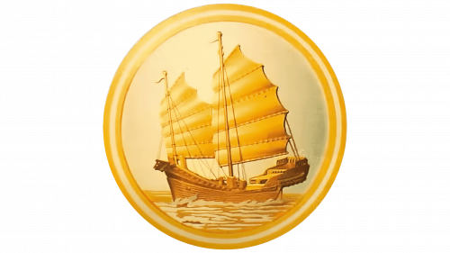
The engraving turned into a work of art. The emblem became juicy, colorful, and convex and came alive under the artist’s brush. The designer added colors to it, making the image more natural. Now the wooden junk is located sideways, not straight, and placed in the very center of the logo. It has two tall masts with wide sails inflated by the tailwind. The waves are white as if covered with light foam. The surrounding space inspires hope and gives confidence in a bright future because there is no single cloud in the sky – only shining sunlight. A light shadow is visible only on the right as a reminder of the company’s harsh past. All elements are within a circle, taken in a triple volumetric frame.
1978 – 1989
The OCBC Bank logo became schematic as if it depicted the shadow of a sailing ship. This impression is created by using only two colors – black and beige. The former draws all the elements in the emblem, and the latter serves as their background. Hence, the negative space is now actively used. However, the waves are not volumetric but linear. They form four stripes of different lengths, as the sign has retained its circular shape.
1989 – 1998
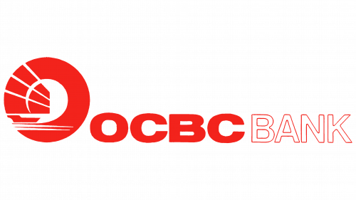
The era of the red logo began. Now it predominates with two key details: a unique symbol and an inscription. The circle has a wide ring, harmoniously combined with the image of junk. It, like part of the sail, is included in the frame. Moreover, a piece of the sail is placed on a white background in the center of the “O.” On the right is the name, written in one word but separated by color: the abbreviation “OCBC” is painted red, and the word “Bank” – is white with a red outline. In the first case, the font is bold and earthy; in the second – narrow and high. The only thing that unites them is the absence of serifs.
1998 – 2023
The inscription is standardized with the same font. Although the first part is slightly bolder than the second, they have identical typefaces. The letters are smooth, straight, chiseled, and high. This option looks modern and elegant.
2023 – today
In light of the bank’s rapid enlargement through the merger of branches, a new logo and slogan were adopted as a symbol of rebranding. According to the motto “For now, and beyond,” the developers cautiously updated the design, leaving the main elements untouched and carefully adding some novelties.
The central link of the logo remains the classic Chinese sailing boat, the bank’s heraldic sign, and its long-term ambitions. This symbol, being an integral part of the bank’s DNA, testifies to its aspiration for prospective deals and investments, paving the way to the future.
The OCBC emblem expresses the entrepreneurial spirit of the founders who ventured into ASEAN to create businesses and homes that will benefit future generations. In this context, the iconic sailing ship remains a faithful component of every version of the logo since its creation in 1932.
The current version represents an enlarged image of the stylized ship, topped with a new visual language. A significant change was the exclusion of the word “Bank” from the textual part, which emphasizes the image of the sailing ship, reflecting the resilience and innovativeness of the banking brand.
Font and Colors
During the evolution of the OCBC Bank emblem, there was a transition from an engraving style to a flat one, which influenced the appearance of text outside the logo’s early versions. Designers used several typefaces, similar to Foundation Sans Black Extended and Asimov WidOu. But mostly Geomanist is used, a clear and modern font of varying degrees of boldness.
Different shades of red have almost always distinguished the corporate palette. Before it was cadmium (code #e11a27), it became a little brighter and lighter, closer to Pantone 485C. Passionate, energetic, and strong – these are the main qualities for which it was chosen, as they are inherent in resourceful, goal-oriented, and enterprising people, such as the employees of this bank.
OCBC Bank color codes
| Cadmium Red | Hex color: | #e11a27 |
|---|---|---|
| RGB: | 225 26 39 | |
| CMYK: | 0 88 83 12 | |
| Pantone: | PMS Bright Red C |

