The Office Depot business logo speaks to the company’s professional nature. Although it takes on a familiar shape, common to many emblems of similar brands, it possesses a unique feature that sets it apart from its competitors. This is its visual simplicity. It ensures the symbol’s comfortable readability on any display and conveys that its owner is a strict, practical, and reliable business partner.
Office Depot: Brand overview
| Founded: | October 1986 |
| Founder: | F. Patrick Sher |
| Headquarters: | Boca Raton, Florida, U.S. |
| Website: | officedepot.com |
Meaning and History
The story of Office Depot began on the sunny coasts of Florida in the resort town of Fort Lauderdale. It was there that the company opened its first store. Gradually, the firm expanded its number of outlets and added various types of services, which led to the merger of the brands into a holding company managed from the main office in Boca Raton. Its founders immediately took up key positions and paid attention to visual identity. Given that it was a store, having a noticeable sign at its entrance became a priority. The emblem is text-based, not graphic, as it emphasizes the name.
What is Office Depot?
Office Depot is an American multinational corporation with business centers and retail stores in many countries worldwide. It specializes in office supplies and technical products, leveraging its brands DiVOGA, Realspace, Foray, TUL, Ativa, ODP Business Solutions, Grand & Toy, and OfficeMax. The company also operates e-commerce websites and business support centers. Founded in 1986, Office Depot has become a top industry leader, boasting a network of around 1,400 retail locations managed from its headquarters in Boca Raton, Florida. The company’s founders are Jack Kopkin, Stephen Doughtery, and F. Patrick Sher.
1986 – 2002
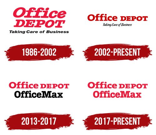
The logo features the corporation’s name. It’s set in a rounded font with no sharp angles: both outer and inner edges are smooth and rounded. Such a design leaves a positive impression on customers, as the soft design promotes a friendly mood and generates goodwill. The text occupies three lines. The first line is bold, primarily in lowercase, while the second is in uppercase. Both words are slanted to the right and colored in red. The only difference between them lies in the serifs: “Depot” has them, but “Office” does not. The third line says “Taking Care of Business,” set in black, blocky characters.
2002 – today
The corporation transitioned from a rounded font to a straight and geometric one. This font features even angles, smoothness, and boldness. The top line combines both parts of the name instead of splitting them. The letters are colored in a dark red hue, reminiscent of wine. The italicized style in the first line has disappeared, remaining only in the second. The bottom line has significantly transformed: now, the inscription is in a proprietary font specifically designed for this project. All glyphs are black, linear, sans-serif, rounded, and slanted, simulating a casual handwriting style.
2013 – 2017
When Office Depot merged with OfficeMax, they adopted a new logo. This two-tiered emblem showcases various font styles: the top glyphs are geometric, angular, flat, and red, while the bottom ones are soft, rounded, tall, and black. What makes them similar is the width of the lines forming the letters; they are all bold. This design exhibits the unique characteristics of both companies, highlighting their individuality.
2017 – today
The designers have unified the inscriptions by color; now, both are light red. At the top is the name “Office Depot,” and at the bottom is “OfficeMax.” The lines are centered. Despite the shared color palette, the first phrase is set in short glyphs, somewhat flattened, with many angles and straight lines. The second line consists of letters with rounded endings, resulting in very smooth strokes. Moreover, the dual-brand name is written as one word.
Font and Colors
Throughout the years, various typefaces, entirely distinct from one another, have been employed in the logos of Office Depot. Specifically, among them are unique fonts resembling ITC American Typewriter Bold, TheSerif Black (or possibly Extra Bold), and P22 Pooper Black Regular for the bottom line. On the contrary, the company’s color palette has always been rather limited, consistently featuring shades of black and red – ranging from muted red to wine-colored hues.
