


 Ohio State Buckeyes Logo PNG
The Ohio State Buckeyes logo is the primary symbol of the Ohio State University. It serves as a unique and accurate identifier of the university, reflecting its identity. Designers created this logo with significant attention and effort. Their task was to ensure the emblem conveyed the core meaning and had rich informational content. As a result, the modern logo stands out with its color scheme, individual theme, and bold appearance.
In addition to the main logo, the university has also developed a seal and a sports emblem. All additional elements and information can be combined with the logo, but at a strictly defined distance.
The modern logo is a bold and expressive sign. The main colors are red and blue, chosen for their expressiveness. White, red, and black are auxiliary colors to enhance visualization and emphasize the right accents.
A feature of the logo is its lettering, with the letter “O” taking center stage. It is large, noticeable, and outlined with several color contours. The phrase “Ohio State” is placed in a semicircle, with each word written in capital letters. Sometimes, it can be seen below the letter “O.” The logo embodies strength, resilience, and confidence on the path to victory.
The history of the Buckeyes began with Ohio State University, founded in 1870. Its football program started in 1890, and the first game was played on May 1 against Ohio Wesleyan, ending in a 20-14 loss. The Buckeyes’ name, linked to the Ohio buckeye tree, was used informally before becoming official in 1950. The first major football success came in 1916, when the team won its first Big Ten Conference title.
Ohio Stadium opened in 1922 and became known as the Horseshoe because of its shape. In 1944, coach Carroll Widdoes led the team to its first national championship. The Woody Hayes era, from 1951 into the early 1960s and beyond, brought repeated conference titles and national championships in 1954, 1957, 1961, 1968, and 1970. During the 1970s, the team remained a regular presence in the Rose Bowl and other major postseason games.
Jim Tressel’s arrival in 2001 marked a return to national contention. In 2002, Ohio State defeated Miami for the national title. Urban Meyer took over in 2012, and in 2014 the team beat Oregon in the first College Football Playoff final. The program later added major bowl wins, including the Fiesta Bowl in 2016 and the Cotton Bowl in 2017, before Meyer stepped down after the 2018 season.
Ryan Day became head coach in 2019 and kept the program near the top of college football. The 2020 team reached the national championship game, while the 2022 season ended with an 11-1 regular-season record and a semifinal against Georgia in the Peach Bowl. Beyond football, men’s basketball, women’s basketball, and wrestling remained active in NCAA competition.
Meaning and History
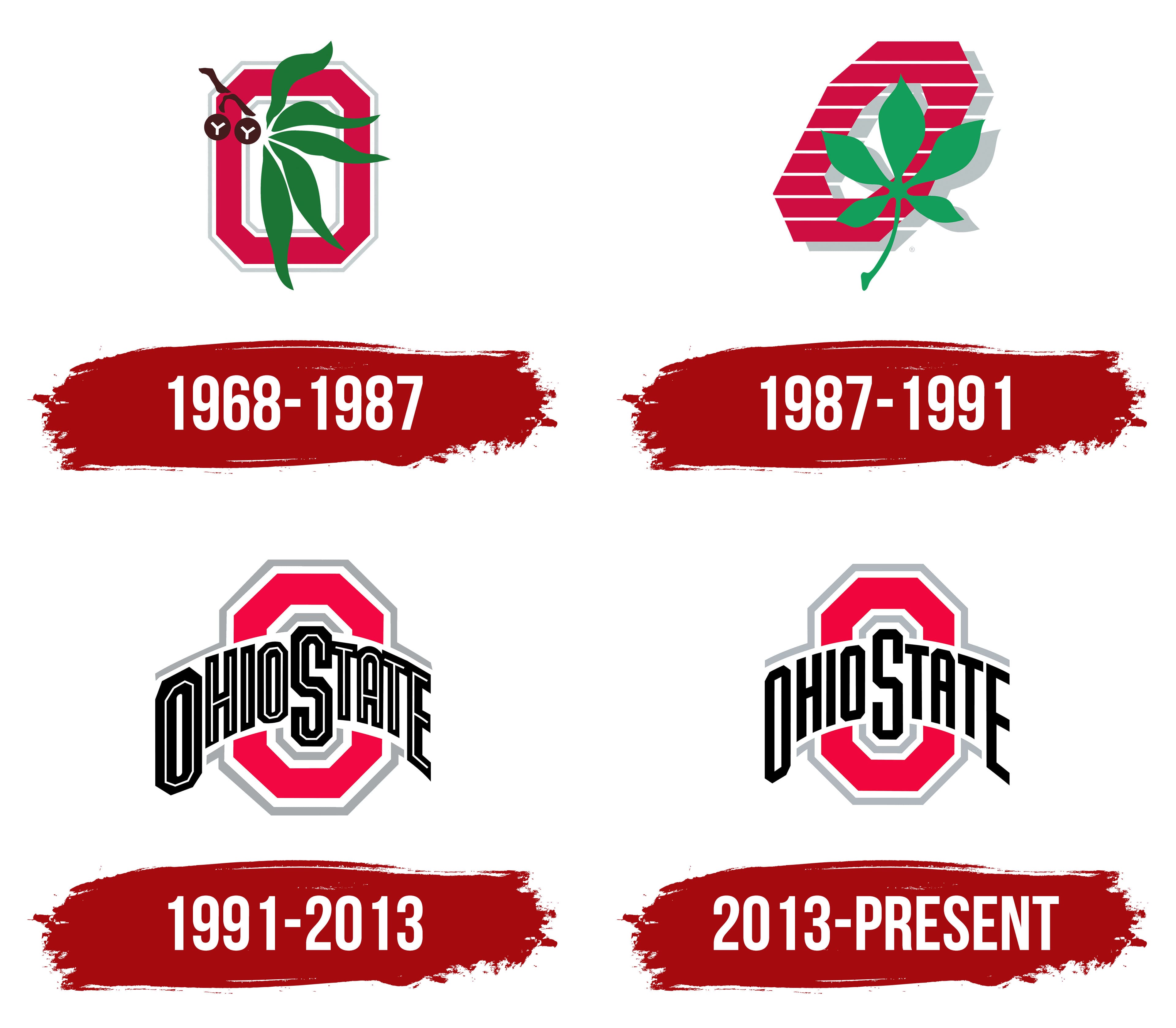
What is Ohio State Buckeyes?
They are an Ohio State University athletic team based in Columbus, Ohio. It competes in the Big Ten Conference, recognizable by its beech leaf helmet stickers and scarlet and gray colors. One of the country’s most extensive and productive athletic departments is the commander’s soccer program, which has produced numerous NFL players and won several national titles. The soccer team’s rivalry with Michigan is among the most storied in college sports. Apart from soccer, they have excelled in many other sports, including basketball, volleyball, and wrestling.
1968 – 1987

The first Ohio State University logo was introduced in 1968. Its bright colors, symbols, images, and letters made an impression. The combination of diverse elements in theme, shape, and size made the logo presentable and recognizable, giving it a lifespan of nearly 20 years.
The central element of the logo was the letter “O.” Its brightness drew attention, and the shining leaf of the state’s official tree in the foreground enhanced the effect. The leaf stood out well against the white background. The main colors of the logo were white, red, and green, which harmonized well. All lines and contours were very clear.
One technique that enhanced the logo’s visual appeal was the shape of the letter “O.” Its edges were straight rather than rounded. Many believed this letter version symbolized the pursuit of victory and a no-compromise approach to achieving success.
1987 – 1991

In 1987, despite retaining the overall content, the logo underwent significant external changes, gaining dynamism and movement. Each logo element was placed in a specific zone and appeared as a separate informational fragment.
The letter “O” was now positioned diagonally. It lost its rich red color, becoming less contrasting, but the white lines made it stand out very clearly. The letter took on a distinctive look and style. The plant leaf also changed its position: five leaves attached to one branch were now pointed upward rather than downward, as in the previous version of the logo. A noticeable and clearly defined gray shadow appeared on the white background, adding volume and depth. Black was no longer used in creating the logo.
1991 – 2013

In 1991, the university’s identity underwent a radical transformation. The logo underwent a significant transformation, gaining a textured, presentable appearance. For the first time, the image of the well-known plant was absent. The main goal was to minimize informational content and emphasize the university’s status and foundation.
The letter “O” remained at the center of the logo, retaining its scale and geometric shape. Its tone changed from bright red to a more restrained shade with a pink tint. The inner part of the letter maintained a uniform tone and featured two outlines, white and gray.
At the center of the logo was the phrase “Ohio State,” written in black with a white outline. This visualization was used for the first time. The text element had a gray outer frame, which continued the “O” letter’s outline.
2013 – today

The modern Ohio State University logo can be considered a successful evolution of all its predecessors. It has been maximized in every aspect. Contemporary identity trends have brought in rich shades and enhanced graphics. White, pink, and black are used in the most harmonious tones.
When comparing the previous logo to the current one, it’s clear that the letter “O” has become more elegant. Its size has been adjusted, and the vertical elements have been narrowed. The black color of the “Ohio State” inscription makes it stand out vividly, further increasing its recognizability.
The university allows the use of the logo but prohibits any alterations.