Omation Logo, a distinct and playful visual symbol, perfectly captures the whimsical and creative spirit of the brand. At its center, the emblem showcases a striking, oversized “O,” colored in vivid yellow. This design choice is far from arbitrary. The “O,” featuring an unconventional shape, is stylized to resemble an open mouth, complete with limbs, as if it were animatedly expressing a resonating “O-o-h-h,” bringing life and energy to the brand’s identity.
The remainder of the logo, the text “mation,” introduces an artistic typeface teeming with details, patterns, and irregularities like spots and spikes. This design element infuses the emblem with a sense of dynamism and spontaneity, reinforcing the brand’s commitment to innovation and creative storytelling.
The emblem of this company evolved further in its 3D rendition, as seen in the closing episodes of Back at the Barnyard and Planet Sheen. This advanced version brings an enhanced depth to the “O,” with the application of gradients, shadows, and highlights, resulting in an image reminiscent of a piece of baked confectionery. Additionally, all components of the logo underwent subtle modifications, refining the overall aesthetics.
As a comprehensive representation of the brand’s persona, the Omation logo symbolizes fun, innovation, and creativity, mirroring its dedication to crafting engaging and imaginative narratives.
Omation: Brand overview
| Founded: | 2002 – 2013 |
| Founder: | Steve Oedekerk |
| Headquarters: | Burbank, California, U.S. |
Omation Animation Studio, more commonly known as Omation, is an established name in the animation world. Founded by Steve Oedekerk, the same creative mind behind O Entertainment, the studio quickly made a name for itself in the dynamic arena of animated entertainment.
Having been brought to life by a founder with a rich background in animation and entertainment, the studio quickly rose to prominence. With an impressive portfolio of work, it has showcased a penchant for creating engaging and innovative content that has captured the hearts of audiences globally.
Meaning and History
When it comes to brand identity, the studio truly shines. Its trademark is a unique blend of creative storytelling, character development, and captivating animation. This triad forms the foundation of its visual identity, recognizable and beloved by its audiences. This visual identity is crafted with keen attention to detail, resulting in a consistent and easily identifiable brand image.
From a mission perspective, it’s clear that the studio strived to spark imagination and inspiration through its creations. Each piece of content is built around a story that is meant to connect with the viewer on a deeper level. The studio aimed to create an animation that’s not just visually appealing but also rich in narrative and emotion.
Embodying a perfect blend of creativity, innovation, and storytelling, the studio has indeed carved a niche for itself in the animation industry. Its brand identity is deeply rooted in the core values of imagination, emotion, and connection.
What is Omation?
Omation Animation Studio, often simply known as Omation, is an animation studio founded by Steve Oedekerk in 2002. Based in Burbank, California, Omation is known for its role in producing various popular animated films and television shows. Perhaps most notably, the studio is recognized for producing the animated series “Back at the Barnyard” for Nickelodeon, as well as the original film, “Barnyard”. Despite its dissolution in 2013, Omation’s contributions to animation continue to be appreciated by audiences worldwide.
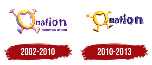
2002 – 2010
2010 – 2013
Omation color codes
| Icterine | Hex color: | #f5ee52 |
|---|---|---|
| RGB: | 245 238 82 | |
| CMYK: | 0 3 67 4 | |
| Pantone: | PMS 394 C |
| Blood Red | Hex color: | #6d0400 |
|---|---|---|
| RGB: | 109 4 0 | |
| CMYK: | 0 96 100 57 | |
| Pantone: | PMS 484 C |
| Black | Hex color: | #000000 |
|---|---|---|
| RGB: | 0 0 0 | |
| CMYK: | 0 0 0 100 | |
| Pantone: | PMS Process Black C |
| Iris | Hex color: | #593fce |
|---|---|---|
| RGB: | 89 63 206 | |
| CMYK: | 57 69 0 19 | |
| Pantone: | PMS 266 C |


