The innovative approach to online communication fully conveys the Omegle logo. A special emphasis on this is made by an unusual graphic sign, presented in the form of the Greek letter Omega. Ancient scientists interpreted it as a symbol of sincerity, which in this context means users’ openness. In addition, the name of the Greek letter is very similar to the name of the service itself, which is located right next to the picture. Such a composition generally looks very harmonious and demonstrates the site’s friendliness.
Omegle: Brand overview
| Founded: | March 25, 2009 |
| Founder: | Omegle.com, LLC |
| Headquarters: | United States |
| Website: | omegle.com |
Meaning and History
Omegle is a fun web service that works by creating chats between random users. Moreover, each of them does not represent personal data about itself. The only information that the Internet resource processes concern interests. This data allows the system to select an interlocutor with whom there would be more topics for communication. In terms of geography, the Omegle service has no restrictions. It is available to users worldwide.
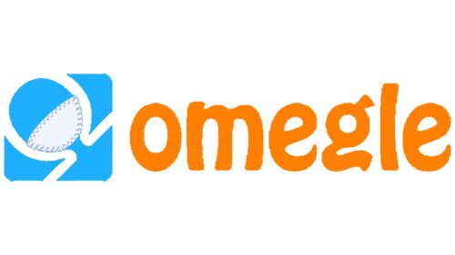
The visual identity of an exciting platform reflects all of its benefits. The current logo symbolizes goodwill, bright emotions, energy, and trust. In addition, it has an element that emphasizes the Covid-19 pandemic. This is a miniature gray mask, which is located on the sign of Omega. It reminds users of the social distancing policy.
What is Omegle?
Omegle is the name of an exciting web service that was created by an 18-year-old programmer from Brattleboro (USA). It allows you to chat online via text messages or video conference. The conversation usually involves two visitors who do not know each other. Registration and payment of any funds are not required to use the portal. The main language is English.
2009 – 2020
A unique site that allows chatting with users from all over the world was created by a young programmer, Leif K-Brooks, in 2009. Initially, the platform worked only in text format, but over time, its capabilities have expanded. Users have the opportunity to communicate in a video chat, having an additional window for text. You could find the service through its bright, expressive logo, which was a funny inscription supplemented with a Greek symbol.
The main element in the form of the platform’s name was designed in an unusual format, vaguely reminiscent of a cartoon style. It favorably emphasizes the service’s entertainment direction and demonstrates a friendly atmosphere, joy, and positivity. This is also emphasized in beautiful bright colors that symbolize warmth, energy, and comfort. The stylish inscription is underlined by another important symbol that reveals the essence of the Internet resource.
It is represented as a letter of the ancient Greek alphabet – Omega. Outwardly, it resembles a horseshoe but with elongated ends on the sides. In this logo, it is presented as a graphic element symbolizing the name of the service. It seems that Omegle was invented based on this letter at all. In addition, the graphic sign has an additional semantic load.
Ancient historians argued that the letter symbolizes sincere feelings, goodwill, and a craving for beauty (in this case, positive). These characteristics ideally describe the presented Internet resource. Users switch to the service to get vivid emotions, entertainment, and interesting communication with people from different countries. This concept line is also supported by a cheerful colorway consisting of basic and bright shades.
2020 – today
In 2020, the management decided to rebrand. The main reason was the Covid-19 pandemic, which significantly affected the usual way of life. Omegle is a socially conscious brand, so they immediately reacted to such changes and added a miniature gray mask to the previous logo. This once again confirmed that the human factor is the main value of a well-known service.
The icon itself did not overshadow the main composition since it was located on the symbol of the Greek letter and covered only a small part of it. In general, the design has not changed. The logo retains the font style, layout, dimensions, and color palette. This is also evidence of the stable operation of the Internet resource, regardless of the circumstances.
Font and Colors
The visual identity of Omegle is the perfect combination of a fun typeface, a mysterious decorative symbol, and a vibrant color scheme. In the center of the logo is the name of the web service. For the design, a smooth, fancy font was used, which was distinguished by rounded shapes and an uneven upper border of the letters. The chosen format is very similar to Hobo.
It is somewhere between Hobo EF and Hobo Std Regular. This category of fonts showcases innovation, progressive solutions, and a commitment to development. The brand’s added value is reflected in the cheerful, bright colors. It has several colors at once – white, orange, and blue.
The first symbolizes honesty and integrity, the blue represents trust, and the orange shows energy, joy, and positivity. These features have been the basis of the famous brand’s philosophy for more than ten years. Moreover, with each new stage, the web service is trying to improve more and more in order to make its platform one of the best at the world level.
Omegle color codes
| Safety Orange | Hex color: | #ff7f00 |
|---|---|---|
| RGB: | 255 127 0 | |
| CMYK: | 0 50 100 0 | |
| Pantone: | PMS 1505 C |
| Picton Blue | Hex color: | #1eaffe |
|---|---|---|
| RGB: | 30 175 254 | |
| CMYK: | 88 31 0 0 | |
| Pantone: | PMS 2995 C |
