OneDrive logo speaks of the impressive size of the cloud for storing information. The logo symbols indicate different file formats that can be placed in the vault. And a hint at the multilingual service.
OneDrive: Brand overview
| Founded: | August 1, 2007 |
| Founder: | Microsoft |
| Headquarters: | United States |
| Website: | onedrive.com |
Meaning and History
The first launch of a functional product took place in the summer of 2007. In August, users worldwide received access to extensive electronic storage, characterized by a high level of convenience and reliability. But, the creators were not going to stop there, so in the future, users were presented with new modifications that changed one after another.
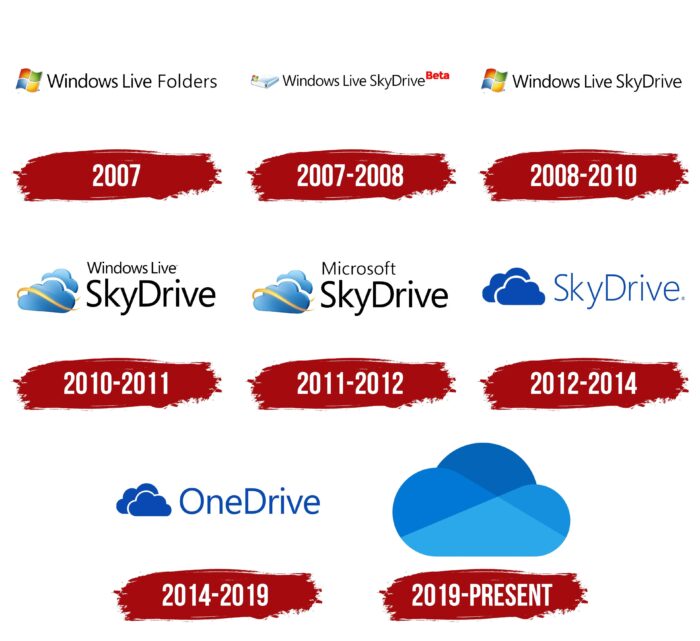
2007
The OneDrive story began on August 1, 2007. On this day, Microsoft introduced the world to the official version of the repository with a custom logo and the original name of Windows Live Folders. It was translated as “Windows Live Folders.” The version was first available to testers from America, and later the audience was significantly expanded.
The first platform logo was a simple inscription complemented by the famous Windows icon. The flag was made in 4 traditional colors and placed in front of the name of the service. The font had a standard format and thin, rounded letters. Such an emblem had nothing remarkable but, at the same time, clearly conveyed the essence of the vault.
2007 – 2008
At the end of 2007, a significant event for the company took place – the name of the platform was changed to SkyDrive. The decision to change the name can be interpreted as a desire to improve the service and modernize its corporate identity. During this period, the repository became available to many users (the coverage area included more than 60 countries).
Windows Live SkyDrive has received a new icon that has become a symbol of change in the company. The program’s logo now consisted of 3 elements:
- The image of the hard disk
- The flag of the Windows corporation
- The name of the service
The font and colors have not changed. The letters are neat and thin, and the flag still consists of 4 colors. The color of the lettering was black. Such changes symbolized some renewal and, at the same time, emphasized stability.
2008 – 2010
In 2008, SkyDrive developers pleasantly surprised their users. They have expanded the storage capacity to 25 GB and added a new feature (photo and video storage). The changes were also reflected in the corporate logo. The hard drive icon with a small flag has been replaced with a flag from the original version of Windows. According to the developers, this design better emphasized the essence of the program. As presented, it existed for two years.
2010 – 2011
The next change took place in 2010. On June 7, SkyDrive received a new update – support for office applications (Office Web Apps). The new feature opened up new possibilities for users and made the program more popular.
Updates also touched the logo. The font of the inscription and the icon located in front of it has changed. Windows Live SkyDrive is divided into two parts. The first two words are located on top of the words SkyDrive. The bottom part was more expressive as the font size increased.
The Windows flag has been replaced with a stylish icon that looks like two clouds. Between them is a thin golden ribbon with free edges. Updates made the logo more understandable and friendly. Two clouds connected by a ribbon symbolized synchronization and data exchange.
2011 – 2012
2011 was the beginning of a new era of visual identity, OneDrive, which began with a change in data transfer technology. For the new version, the HTML5 format was used. In addition, the repository has received an updated interface and several useful options. Many changes have also affected graphic design. During this period, Windows Live’s words were removed from the name and replaced with Microsoft. The SkyDrive add-on and the cloud icon remain unchanged.
2012 – 2014
In August 2012, there were more significant changes in the design of the logo. As in previous periods, this event was accompanied by several functional updates. Particular attention was also paid to the graphical interface. The company has moved to a new level using the Metro UI style.
Its essence lies in the emphasis on convenience, minimalism, and smooth lines manifested in the new logo. It included two clouds, made in blue and without a yellow line. One of them was superimposed on the other, symbolizing the storage and synchronization of data. The picture was supplemented with the inscription Sky Drive-in blue. The light blue color was chosen for the background, associated with reliability.
2014 – 2019
February 2014 began with the loss of a lawsuit in court. British Sky Broadcasting said the service’s existing logo infringes trademark rights. Microsoft lost in this dispute, which was the reason for the change in logo and name. Cloud storage received from that moment became known as OneDrive.
The logo has been greatly simplified. It consisted of two clouds painted blue. Many users very liked the laconic icon. And, it’s not surprising. After all, the blue color evokes trust, a feeling of goodwill, and also denotes development and professionalism.
2019 – today
The final version of the emblem was adopted only in 2019. The goal of the redesign was to make the logo more stylish and in line with the new generation of digital technologies. The update process used the new Fluent Design design language. This is a more modern solution than the old deprecated Metro UI style.
Font and Colors
A complete update of the graphic design gave an amazing result. The program received a laconic logo in the form of a single cloud with the original coloring. The picture is divided by an almost invisible line into several areas with different shades of blue.
This symbolizes the wide range of functions of the vault and its capacity. An important distinction is also that the lightweight cloud is not weighed down by the lettering and can be interpreted as simple and easy to use and has a clear interface.
OneDrive color codes
| Spanish Sky Blue | Hex color: | #28a8ea |
|---|---|---|
| RGB: | 40 168 234 | |
| CMYK: | 83 28 0 8 | |
| Pantone: | PMS 2995 C |
| Celestial Blue | Hex color: | #1490df |
|---|---|---|
| RGB: | 20 144 223 | |
| CMYK: | 91 35 0 13 | |
| Pantone: | PMS 3005 C |
| French Blue | Hex color: | #0078d4 |
|---|---|---|
| RGB: | 0 120 212 | |
| CMYK: | 100 43 0 17 | |
| Pantone: | PMS 285 C |
| Denim | Hex color: | #0364b8 |
|---|---|---|
| RGB: | 3 100 184 | |
| CMYK: | 98 46 0 28 | |
| Pantone: | PMS 285 C |
