Onnit: Brand overview
In 2010, Onnit, the brainchild of Aubrey Marcus, was born in Austin, Texas. Onnit initially positioned itself as a niche marketer offering nutritional supplements and fitness tools. With a background in acting and a passion for mixed martial arts, Marcus brought his philosophy to the brand, offering a holistic approach to wellness that included physical fitness and mental health.
Over time, Onnit expanded its horizons, venturing into new areas such as nootropics, a variety of nutritional products, clothing lines, and more. The company carved out a niche for itself by offering innovative supplements, particularly specialty products like alpha brain and shroom tech. However, what really set Onnit apart was its philosophy of life and performance enhancement.
Onnit utilizes various digital platforms to spread its philosophy and communicate with its audience. A vibrant YouTube channel and an insightful blog and podcast have become the company’s mouthpiece to promote its core beliefs. Collaborations with renowned athletes and fitness activists have further strengthened the brand’s presence.
Today, Onnit has a prominent place in the ever-evolving world of health products and supplements. Its distinctive view of holistic human betterment has built a loyal clientele who share the brand’s commitment to unlocking all facets of human potential.
Meaning and History
What is Onnit?
Founded in 2010 by former actor and mixed martial arts competitor Aubrey Marcus, Onnit is dedicated to helping people reach their maximum potential through a holistic approach to physical, mental and spiritual well-being. Originating as a humble business selling supplements, Onnit has since expanded its product offerings to include nutritional products, fitness equipment and apparel.
2010 – 2012
2012 – 2016
2016 – 2019
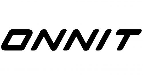
2019 – today
Movement is the main theme of the logo of Onnit, an American online store selling a variety of products to keep you healthy and fit. To show this, the text is slanted to the right, as if it has some kind of internal energy. The wordmark is simple: it’s just a two-dimensional name. The letters have sharp edges and are square in shape, making them appear wide. The ends of the letters are rounded, so the logo evokes good feelings rather than wariness.
The slanted text is reminiscent of running or moving forward. The square and wide letters are reminiscent of strength, suggesting product reliability. The rounded ends of the letters are reminiscent of a friendly smile, evoking a pleasant feeling when looking at them. The logo suggests that this is a place for people who want to move and stay healthy without making it a big deal.
Onnit color codes
| Black | Hex color: | #000000 |
|---|---|---|
| RGB: | 0 0 0 | |
| CMYK: | 0 0 0 100 | |
| Pantone: | PMS Process Black C |

