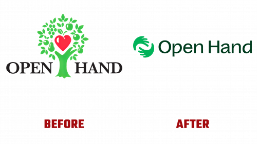
Atlanta’s Open Hand has reinvigorated its brand image, sharpening its focus on its mission: to provide nutrition, dignity, and love to vulnerable populations. With a 35-year history, this community organization has become indispensable in home-delivered meals and nutritional education services. It boasts a staff fully committed to community well-being, an impressive roster of volunteers, and the endorsement of multiple community partners. The organization is a powerhouse of benevolence, prepping and delivering 5,000 meals a day and serving more than 4,500 medically fragile individuals. On the education front, Open Hand enlightens 3,000 clients each year about healthful eating.
The new Open Hand logo is an elegant and simplified symbol central to this rebranding effort. The design showcases two hands melding together to loosely form an “O.” Given that hands are often tricky to represent effectively in logos, this design achieves readability while maintaining an abstracted elegance. The chosen wordmark employs Displaay’s Baggos typeface, injecting a touch of subtle whimsy into the overall aesthetic.
Alongside the new logo, the organization’s fresh branding incorporates the Baggos typeface as its primary font and introduces a lively color scheme. Other captivating design elements include rounded shapes and vivid, kaleidoscopic images of fresh produce. These elements come to life in a series of eye-catching bus shelter advertisements featuring the revamped design’s colors and forms. These ads are geared toward capturing public attention, leveraging both their visual simplicity and coordinated color schemes.
One point of critique is that while the icon functions well in different applications, like Good Measure Meals, it somewhat lacks a direct textual connection with the word “Hand.” Yet, the dominant themes of community support and helping hands remain evident and robust.
This brand makeover is more than just a visual refresh; it amplifies Open Hand’s foundational mission and existing community influence. The organization has adeptly crafted a branding system that’s as flexible as it is focused, zeroing in on the importance of nutritious food and positive community engagement. The rebrand is expected to fortify Open Hand’s already considerable role in fostering community health and well-being.


