“On trips and business trips, the site is an indispensable assistant,” says the Orbitz logo. The emblem says that the portal helps to easily and conveniently plan travel, choosing suitable flights and places to stay.
Orbitz: Brand overview
| Founded: | June 2001 |
| Founder: | Orbitz Worldwide, Inc. |
| Headquarters: | Chicago, Illinois, United States |
| Website: | orbitz.com |
Orbitz is a themed website designed specifically for travelers and tourists. It is presented in an aggregator format that allows users to view hundreds of different accommodation options and flights in almost any country. A suitable solution can be easily booked here.
A successful Internet resource owner is a large American company Orbitz Worldwide, headquartered in Chicago. It is a subsidiary of the American travel company Expedia Group. The site has been successfully operating for several years and is one of America’s most reliable, most reliable travel service providers.
Meaning and History
The company was founded over 15 years ago. Throughout the entire period of its existence, it has been steadily developing and, at the same time going through difficult stages. The turning points were reflected directly in the corporate identity and logo.
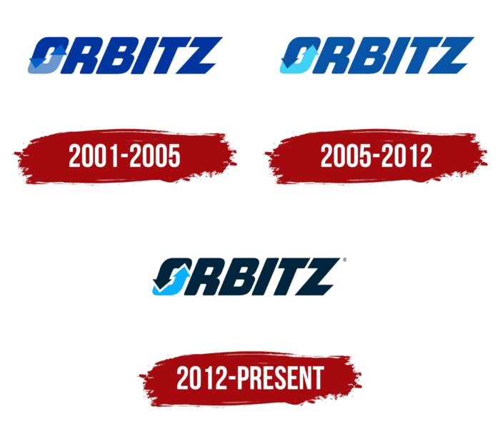
2001 – 2005
Orbitz was founded back in 2001 due to a partnership between major airline companies. Rich Barton (CEO of Expedia Group) and Mark Åckerstron (Technical Director of the hospitality sector) played a key role in the brand formation. As a result of the efforts of these people and a team of experienced developers, a convenient and functional platform for travelers was created.
The site’s visual identity was based on a cool and saturated color scheme, which was favorably combined with a massive font. A deep blue was chosen as the main color, complemented by a lighter shade. Such a coloring immediately caught the eye, which made the brand recognizable, but at the same time, it conveyed calmness.
Many designers have drawn a parallel of the chosen color with a shade of a sea wave, which evokes only positive associations. The emblem itself consisted of one word – Orbitz. Company name and nothing more. The same can be said for a website. All the attention of the developers was focused on creating a high-quality Internet resource where you can immediately find a place to stay and air tickets.
2005 – 2012
Important events took place during this period. The prerequisites for this were laid back in 2003 when the company went public and issued shares. Shortly after that, the airlines owned a 70% stake in Orbitz Worldwide, and a little later, the company was taken over by the Cendant Corporation (New York). In 2006, the Blackstone Group acquired part of the Cendant business, including the Orbitz website.
The change in ownership entailed some minor changes to the logo. The inscription and the selected font remained the same. The first letter “O” had also not changed. It was a circle of two arrows that followed one after the other. The changes affected the colors of the logo. Instead of a deep blue, a light blue hue was chosen. The color of one of the arrows also brightened a little.
The chosen color scheme and dynamic cursive font symbolized professionalism. In addition, the design evoked associations with reliability and a progressive approach to the provision of services, which were the main principles of the company’s work.
2012 – today
Another turning point came in 2015. In February of this year, Orbitz Worldwide was bought by the large travel company Expedia Group, the current owner of the site. It seriously impacted the resource and contributed to its rapid development. The corporate style also changed during this time.
The logo has changed colors again. This time, I chose a darker shade of blue for the letters and a bright blue color for one of the arrows of the “O.” This decision testified to a more modern approach to design and the desire for improvements. The updated corporate badge demonstrated the development of the brand.
Font and Colors
The modern Orbitz logo is a stylish version that has been kept since the last update. This is a memorable and strong sign, which at the same time is distinguished by its simplicity of execution. It symbolizes the brand’s essence – a decent quality of services for tourists combined with an intuitive interface.
A special semantic load is also assigned to the first letter “O.” It is made in the form of arrows closing each other. Such an icon is the embodiment of movement and development. Orbitz is always trying to improve its service and make it as comfortable as possible for users.
The font is in bold italic sans-serif format. The emblem shows clear lines and rounded corners of some of the letters. Diagonal cuts in the letter “Z” also give some dynamism. In general, the emblem stands out well against the background of the design of other similar services and demonstrates the company’s professionalism.
Orbitz color codes
| Prussian Blue | Hex color: | #01253d |
|---|---|---|
| RGB: | 1 37 61 | |
| CMYK: | 98 39 0 76 | |
| Pantone: | PMS 2965 C |
| Picton Blue | Hex color: | #08b0ff |
|---|---|---|
| RGB: | 8 176 255 | |
| CMYK: | 97 31 0 0 | |
| Pantone: | PMS 2995 C |
