This cookie speaks for itself. Just try it! This is the central motif promoted by the well-known brand. The Oreo logo contains nothing but the original name, although the side “O” s were once two round-shaped shortbread sweets. Minimalism suits the brand.
Oreo: Brand overview
The first cookie appeared in 1912 in New York. The quarter where it was made was subsequently named Oreo Way, which indicates the brand’s significant contribution to confectionery production development. Statistics confirm the popularity of sandwich biscuits: according to the world market analysis, about 3 billion people buy them yearly.
Cookies debuted in 1912 when the National Biscuit Company, Nabisco, introduced them in the United States. This new snack featured two chocolate wafers with a creamy filling in between, sold in tin cans for 30 cents a pound.
In the 1920s and 1930s, cookies grew in popularity. In 1921, Nabisco renamed it the Oreo Sandwich, and in 1937, it became the Oreo Creme Sandwich, emphasizing the creamy center. Despite the sugar rationing during the 1940s and 1950s, cookies’ popularity did not falter. Nabisco’s advertising campaigns, including the slogan “Oh! Oh! Oreo,” played a significant role in their success.
The 1960s and 1970s saw further innovation with the introduction of the Double Stuf Oreo in 1974, offering twice the filling. The 1980s and 1990s marked a period of cookie diversification, with Nabisco removing artificial colorings and introducing new flavors like mint and peanut butter, broadening its appeal.
The turn of the millennium was a significant cookie era, with Kraft Foods acquiring Nabisco in 2000. This period under Mondelez International, Kraft’s snack division, saw Oreo expanding its product line with dozens of new flavors, formats, and limited editions. The brand’s marketing became more interactive, with social media, viral videos, and brand partnerships. The “Twist, Lick, Dunk” campaign highlighted the cookie’s fun aspect.
Meaning and History
Mondelez International Holding owns the Oreo trademark. The company specializes in snacks, drinks, and baby food. She joined the venture in 2012, 100 years after the National Biscuit Company launched the round black biscuit with white filling. However, the idea was not original: a similar product was sold under the Hydrox brand then.
No one knows why the new confection was decided to be called Oreo. Rumor has it that the word comes from the French “doré” (“gold”) because the original packaging was golden in color. According to another version, this results from mixing letters from the words “chocolate” and “cream.”
The design of the cookie itself raises no less questions. Enthusiasts decided to look into the patterns depicted on the circles of chocolate dough and found many unexpected symbols there. These include, for example, the Cross of Lorraine and the Cross Pattée, two vintage emblems associated with the First Crusade. As for the Oreo logo, it looks much simpler. It only has the brand name and is decorated in white and blue colors. However, until the 1950s, most of the word marks contained some shade of red.
What is Oreo?
It is a brand of confectionery that consists of two chocolate chip cookies connected by a layer of cream. These sweets can be recognized by their classic round shape and black color. But the fillings are very different: with lime, banana, strawberry, mint, green tea, blueberries, and other flavors.
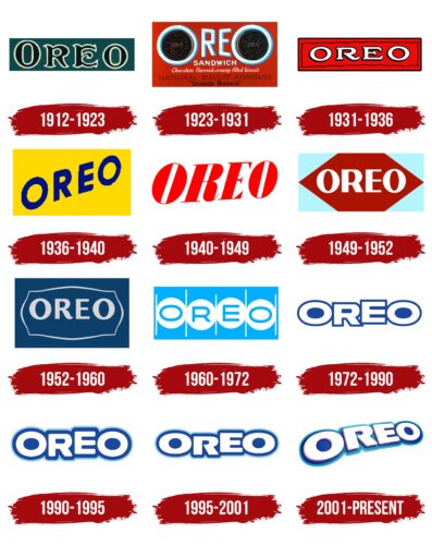
1912 – 1923
At the dawn of its existence, the brand used a turquoise logo. It showed the brand name of the sandwich biscuit, which was made up of dark letters with white outlines. The first “O” was larger than the last, but all the glyphs were in uppercase. The letters “R” and “E” looked non-standard due to curved strokes, uneven thickening, and curved spike-shaped serifs.
1923 – 1931
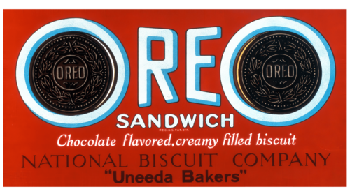
In the 1920s, Oreo packaging featured a complex logo with lots of text. It was depicted against the background of a red rectangle. The bluish word “OREO” occupied the top half with light blue shadows along the right edge of the letters. Both “O’s” were large and round because inside, they were the same round cookies. Designers have tried to convey the shape, color, and patterns of branded products with photographic accuracy.
Below that was the word “SANDWICH” and below that, small letters “REG. U.S. PAT. OFF.”. Two different sans-serif fonts were used for them: in the first case – bubble, and in the second – thin. The phrase “Chocolate flavored, creamy filled biscuit” in elegant serif cursive was on the next line. Even lower was the black phrase “NATIONAL BISCUIT COMPANY.” The authors of the logo chose an antiqua with thin serifs and a funny asymmetry. The closing text, “Uneeda Bakers,” was enclosed in quotation marks and written in bold, grotesque.
1931 – 1936
Only the brand name was preserved after the redesign of all the inscriptions. The developers created for him a custom set of glyphs with unusual “R” and “E.” All letters were white but stood out due to the black shadows. A narrow red rectangle was used as a base, decorated with a wavy line along the edges.
1936 – 1940
The designers diagonally placed the word “OREO” and chose a new font: a bold grotesque slanted to the right. They repainted the inscription in dark blue, enlarged the background rectangle, and made it yellow.
1940 – 1949
In 1940, the cookie’s name changed to red. The angle of elevation of the line decreased so that the inscription was located not diagonally but almost horizontally. The color base disappeared, giving way to an empty white space. The typeface was reminiscent of Casady & Greene’s BodoniFLF Bold Italic but with wider vertical lines, like Jeff Levine Fonts’ Composer JNL Oblique.
1949 – 1952
In the 1949 version of the logo, the inscription was in bold sans-serif, similar to Mint Type’s Alethia Pro Book. The white word was in the center of a two-color rectangle resembling a burgundy hexagon with four blue triangles around the edges.
1952 – 1960
After the redesign, both “O”s became round, but the space inside them remained oval. The diagonal stroke “R” smoothly curved upwards. Also changed the length and thickness of the vertical lines in the composition of the letter “E.” The inscription was repainted in light gray with a blue tint, while it received a thin figured frame of the same color. The rectangular base was completely dark blue.
1960 – 1972
In 1960, Oreo had a logo, and each letter from the brand name was placed in its white circle. Moreover, the circles, lined up in one row, were in contact with each other and separated only by thin vertical stripes. The background and the inscription were light blue. As for the font, the designers opted for a subtle grotesque with flattened “Os.”
1972 – 1990
After the redesign, the letters became white and bold. The typeface was roughly similar to Chank Fonts’ Adrianna Extended Extrabold, but only the “E” looked like a glyph similar to Runes & Fonts’ Mesa Grande Regular. The blue rectangle has taken on a darker hue, and the circles and dividing lines have disappeared.
1990 – 1995
In the first half of the 1990s, a word mark was used with white lettering encircled by a blue line. The edging exactly followed the contours of the letters. At the same time, the blue base became even darker than before. The letters “R” and “E” had rounded corners for the first time in a long time.
1995 – 2001
The rectangular base is gone. The white word “OREO” remained with a double outline that was light blue on the outside and dark blue on the inside. The designers slightly shortened the middle horizontal stroke of the “E” and changed the look of the “R.”
2001 – today
In 2001, Kraft Foods bought Oreo. Transferring the trademark to a new owner was another reason to update the logo. The specialists who worked on it arranged the inscription diagonally. They also made the letters three-dimensional due to the gradient and rescaling. Now, the word has metallic shadows and unevenly colored blue outlines.
Font and Colors
An emblem with the brand name is used on cookie packaging. It looks modern thanks to the transition of colors, asymmetry, and different letter sizes. Designers deliberately rounded the corners because the streamlined shape is associated with softness and lightness.
A free font called Oreos was created based on the Oreo logo. Its author is Dennis Ludlow. This is grotesque, with bold, slightly flattened glyphs. The wordmark has three base colors: white, Wonderfilled Blue (#47c9f3), and Oreo Blue (#124f98). However, they are not presented in their pure form but with a transition of different shades.
FAQ
What do the symbols on Oreos mean?
The Oreo cookie design, including a circle with a cross of two stripes, is not for decoration. It represents Nabisco’s logo and shows the cookie’s history. This logo signifies European quality and reflects Nabisco’s dedication to great baking.
The Nabisco symbol comes from the Cross of Lorraine, an important symbol with a long history. The Knights Templar used the cross in the 11th century during the First Crusade. The cross showed their faith and mission. Nabisco uses this symbol on Oreos to show respect for tradition and quality. This design and the cookie’s taste bring a piece of history to snack time. The mix of good baking and history makes Oreo a classic snack.
What is the meaning behind Oreo?
The name “Oreo” is a puzzle because no one knows where it originated. There are a few guesses about its origins. Some think it might come from the French word “gold,” since the first Oreo package was gold, hinting at something special or high-quality. Another guess links the name to a Greek word that means “beautiful” or “nice,” pointing to the cookie’s great taste and look. Some people argue that the name was chosen for its simplicity. “Oreo” is easy to say and remember, which could make it a smart pick for a brand name.
No one knows how the cookie got its name, even though there are different ideas. Each idea gives a peek into what might have influenced the choice, from wanting to show off the cookie’s quality to picking an easy-to-remember name. This mystery makes the cookie even more interesting and is a key part of its charm and popularity.
Which country owns Oreo?
Mondelez International, Inc., a big company based in Chicago, USA, owns Oreo cookies. It’s well-known in the world of sweets, snacks, and food and handles many other famous brands like Cadbury, Toblerone, and Ritz.
Mondelez International is huge in the snack food market and works in many countries, sharing its products with many people. One of its top products, Oreo, enjoys a broad reach thanks to Mondelez’s global network. This has made Oreo one of the world’s most well-known and loved cookies. With Mondelez International’s support, Oreo remains an important product for the company, helping it stay at the top of the snack food industry.
What was Oreo’s first slogan?
The brand’s first slogan, “Oh! Oh! Oreo,” came out in 1950 and started the brand’s journey in the sweet snack market. This slogan was memorable and became the jingle that people remembered and helped make Oreo a household name. Before the brand became famous for “Milk’s Favorite Cookie” in 2004, it tried many slogans to find what worked best with customers. But “Oh! Oh! Oreo” was the first and laid the groundwork for marketing and growth into a familiar brand at home.
When the brand first used “Oh! Oh! Oreo,” it was looking to grab people’s attention. At that time, advertising started valuing catchy jingles and slogans to make brands stand out.
Because the cookies have changed over the years, the slogans show that the company knows its market well and can keep up with changing tastes. Moving from “Oh! Oh! Oreo” to “Milk’s Favorite Cookie,” Oreo’s marketing helped it stay popular. This change in slogans shows how Oreo went from being just another cookie to a favorite treat for people everywhere. The “Oh! Oh! Oreo” slogan started building a brand many people love, showing how important a good slogan is to a product’s success.
What is Oreo’s original name?
The brand story starts in 1912, four years after Hydrox cookies were first made. Even though Hydrox was the first cream-filled chocolate sandwich cookie, Oreo was introduced to compete with it. In the beginning, people saw Oreo as just another version of Hydrox. However, as time passed, Oreo became more popular thanks to its marketing and how it was sold in stores. This change in popularity made Hydrox seem like the copycat, even though it came first.
The switch in how people saw these two cookies shows how marketing can change a brand’s image.
