


![]()
The analog photography and darkroom art festival, Oslo Negativ, has introduced a new visual identity for the upcoming season. The updated design was created by Norwegian designer Are Kleivan. The festival has been held in Oslo since 2019, each time at new venues across the city. This year, the exhibitions are located in a former veterinary college building, which has been converted into gallery spaces.
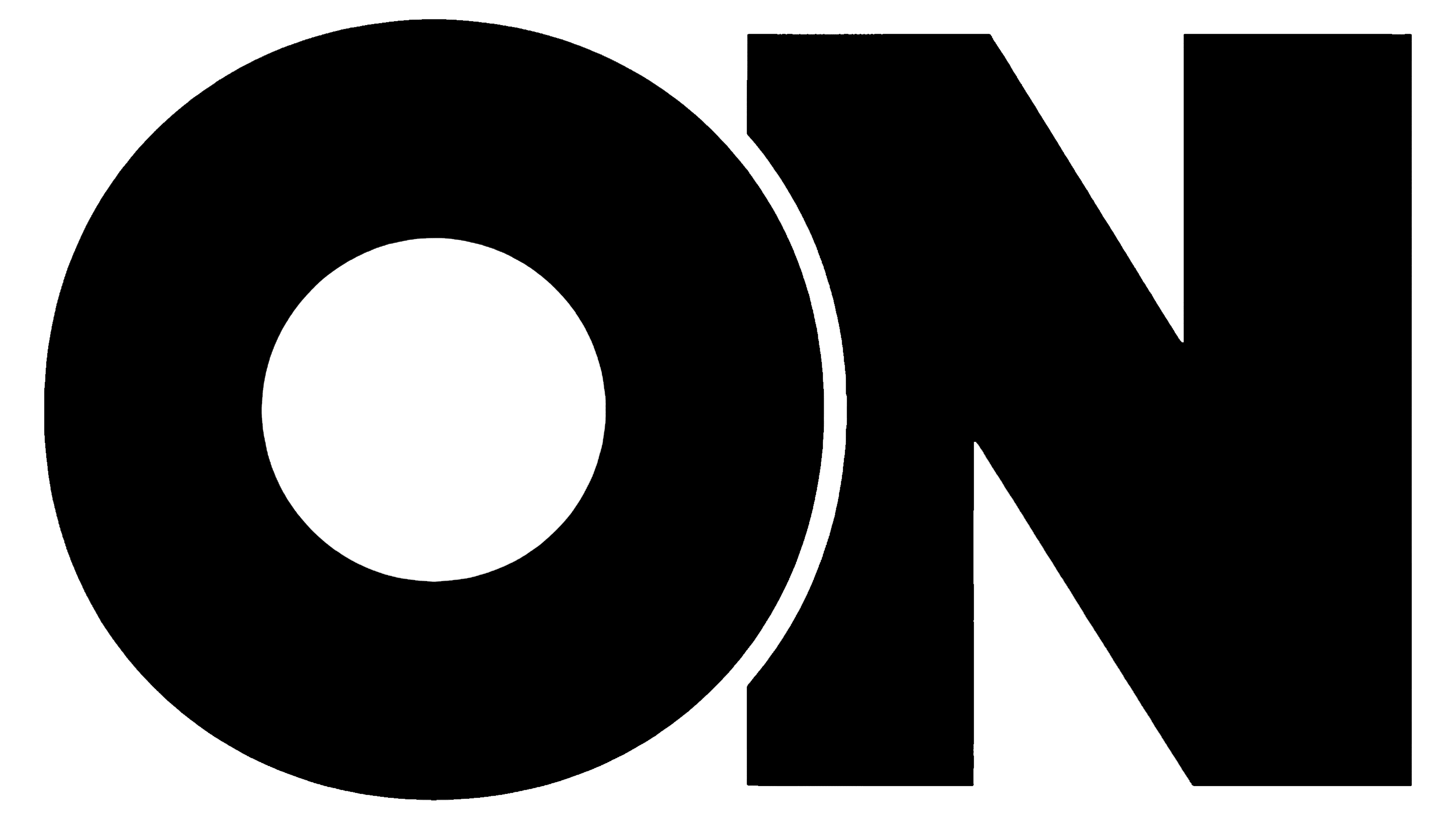
The new logo retains the letters “ON,” referring to the “on” state of a film negative. Previously, the word “Oslo” was written in a bold typeface, while “Negativ” appeared in a thin and narrow font, making the text look uneven. Now, the font is uniform and balanced, making the logo easier to read and use across different formats.
![]()
The festival’s primary colors are black and white, which are associated with analog photography. Other colors are not fixed and change each year, but they are selected to match the work of the photographers featured in the exhibitions.
Another change is a new layout system for texts and posters, making it easier to showcase the work of different artists. The fonts are clean, without unnecessary details, and are designed to be easily readable so that visitors can focus on the photographs themselves.
The festival presented around 40 exhibitions by well-known photographers and emerging artists. Partners of the event include the Preus Museum of Photography, the Møller Collection, and several galleries.
The updated design helps Oslo Negativ maintain its status as a platform for creativity and dialogue among artists working with analog photography.
![]()