


![]() Pacman Logo PNG
Pacman Logo PNG
The Pac-Man logo creates a friendly, welcoming atmosphere, motivating users to visit the arcade and try their hand at its levels. The emblem focuses on the absence of aggression to attract as many users as possible.
Pac-Man began at Namco in Japan in 1979, when 25-year-old designer Toru Iwatani started work on a new arcade game. Arcades were then dominated by space shooters such as Taito’s Space Invaders and military-themed games, with young men forming most of the audience. Iwatani wanted a game built around eating, a theme he considered accessible to women, couples, and casual players.
The character came from the shape of a pizza with one slice removed. A nine-person team worked on the project for about 18 months, with Shigeo Funaki and Shigeichi Ishimura handling programming. Iwatani gave each ghost a different behavior: Blinky chased directly, Pinky aimed ahead, Inky moved less predictably, and Clyde wandered through the maze. This made the game depend on patterns rather than random threats.
The game first appeared in Japan as Puck Man, from the phrase “paku-paku taberu.” In the US market, the name was changed to Pac-Man to avoid vandalism on arcade cabinets. The first machine was installed in Tokyo’s Shibuya district on May 22, 1980. In the United States, Midway Manufacturing began distribution in October 1980, and by 1982, about 400,000 machines had been sold.
Pac-Man soon passed Space Invaders as the world’s best-selling video game and competed with Nintendo’s Donkey Kong in arcades. In 1982, “Pac-Man Fever” reached number nine on the Billboard charts, and ABC aired an animated series. Atari’s 2600 version sold 7 million cartridges, though 5 million copies remained unsold. Midway released Ms. Pac-Man the same year. In 2006, Namco merged with Bandai, forming Bandai Namco, which has held the franchise rights since then.
Meaning and History
![]()
The plot of the game is simple but engaging enough to have maintained its popularity for over 40 years. During this time, the arcade’s logo changed only once when the beta version gave way to the final version. It is worth noting that the game’s title varies by country of release.
What is Pac-Man?
Pac-Man is a Japanese maze-based arcade game developed in 1979. The essence of the game is for the main character to consume 244 elements along his path and score up to 14,600 points.
1979 – 1980
![]()
In 1979, Pac-Man was being tested, and a beta version was released. The logo for the testing period featured the maze’s name on a blue background.
The word “Pac-Man” can be translated as “pack-man.” In fact, it is a smiley face capable of consuming (or “packing”) yellow dot-like cubes arranged in its path. The character collects elements until it swallows them all or encounters a ghost. Interestingly, the original name sounded like “pakuman” (Pack-Man) and imitated chewing sounds in Japanese. Changes were made for English-speaking audiences to prevent children from transforming the first part into a curse word.
The letters of the inscription are yellow, like the game’s elements, and stylized as the arcade’s characters. The “C” depicts Pac-Man himself. The other symbols represent the maze’s dots and the ghosts that must be avoided.
The background is the color of the maze field. Its placement as a stripe shows the path Pac-Man follows. The rainbow-shaped bend indicates the protected, fairytale world that exists within the game.
In the upper-right corner of the logo, two cherries serve as decorative elements and are also game elements. The berries are bonuses that appear on each level twice for about 9 seconds each, and players must try to eat them within that time.
The emblem resembles a candy logo, hinting at Pac-Man’s consumption of the elements.
1980 (Japan)
![]()
The Pac-Man game began to spread simultaneously in Japan by Namco and in America by Midway. The logos of different countries differed slightly. The Japanese Pac-Man retained its original name, Packman, creating an association with food consumption. The hyphen between the parts of the word was removed.
The blue background was replaced with an orange one, and the bend was removed. The game was initially conceived as a pacifist game without violence or wars. The goal was to attract not only male but also female and child audiences and to gain parents’ trust. Blue is considered more masculine and militant, while the orange-yellow palette successfully attracted attention. Smoothing the background corners also emphasized the game’s peaceful atmosphere. The red outline indicated the fruits and berries featured in the arcade.
White backgrounds and shadows under the letters gave the elements volume, making the symbols more similar to the game’s characters.
1980 – today
![]()
Midway preserved the logo’s overall appearance but changed the game’s title to avoid unpleasant incidents.
Font and Colors

The Pac-Man logo is done in shades of orange, a warm color that evokes pleasant sensations, encourages communication and friendship, and lifts the mood. The orange color is associated with the theme of food and suggests sweet fruit.
In addition to the main orange, the logo features blue, red, and white, all of which, except white, correspond to the colors of the ghosts in the game.
The red color emphasizes the game’s pace and the need for quick reactions to plot twists. The white elements emphasize Pac-Man’s good, non-aggressive nature.
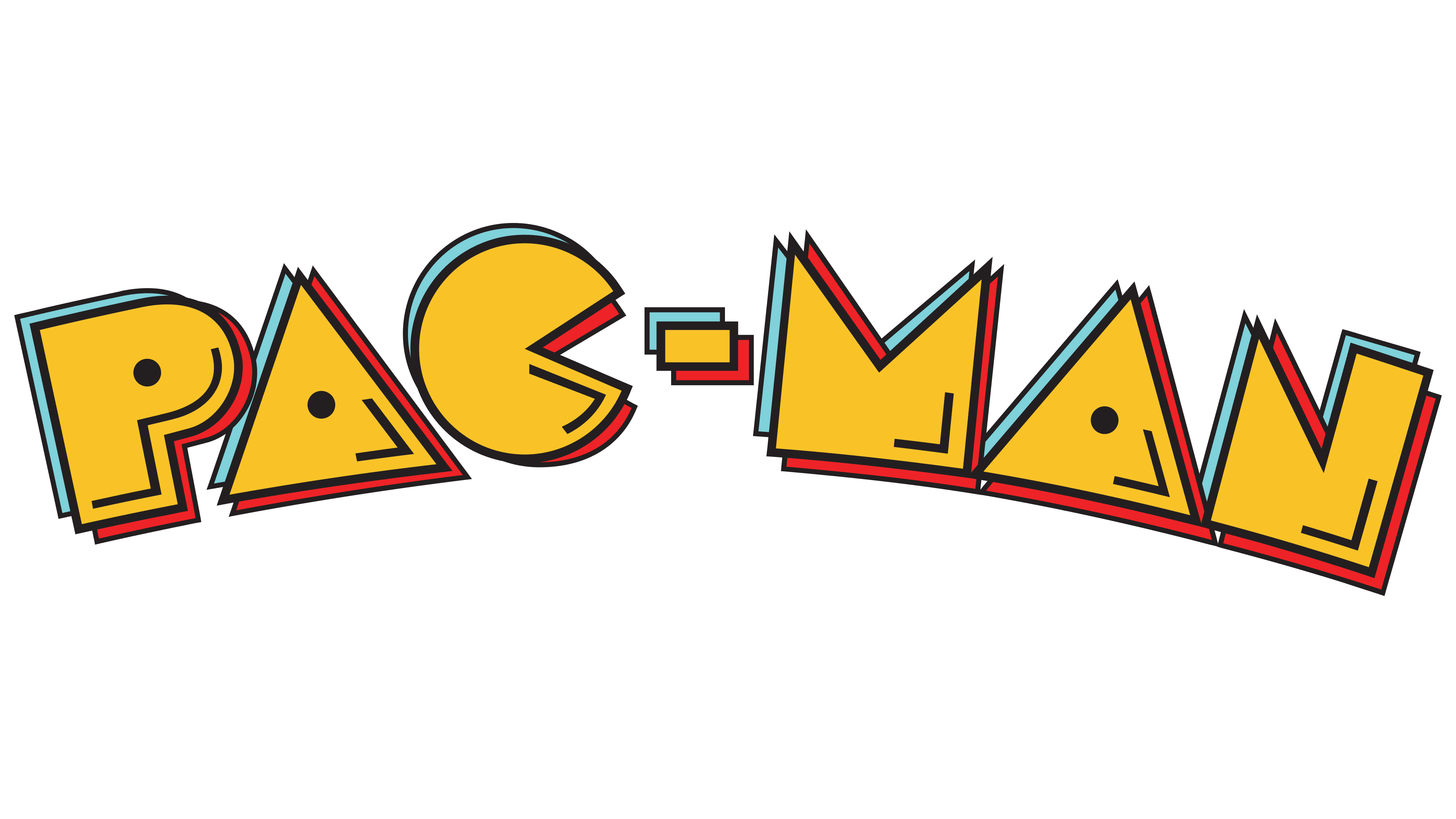
The game’s font is unique; all letters are stylized as elements of the game board.