The Pacsun logo is free and easy. The emblem indicates a wide selection of unique items belonging to well-known brands. The sign invites one to find their style in one of the company’s stores scattered across the country.
Pacsun: Brand overview
Founded in Newport Beach, California, in 1980 by Jack Hopkins, the retail store originally known as Pacific Sunwear, or PacSun, began its journey selling surf-related brands and clothing inspired by the Californian lifestyle. During the 1980s and 1990s, the company experienced significant expansion, launching hundreds of stores nationwide. This made it a go-to destination for young shoppers seeking skate and surfwear, along with casual attire reflective of the West Coast vibe.
In the early 2000s, PacSun’s acquisition of the surf brand Quiksilver positioned it as a key national distributor of major surfing labels. The growth trajectory continued well into the 2010s, with PacSun boasting over 600 stores, including outlet locations, at its height.
The late 2010s, however, presented new challenges as shifts in consumer preferences began to veer away from action sports brands. Facing these headwinds, PacSun filed for Chapter 11 bankruptcy in 2016. The company restructured and emerged a year later, albeit with a reduced number of stores.
In its current iteration, PacSun has reinvented itself as a premier hub for emerging streetwear and contemporary youth culture brands, targeting modern teenagers and young adults. While its scale has reduced from its peak in the early 2000s, the brand continues to exude its quintessential West Coast ethos and remains synonymous with board sports fashion.
Meaning and History
The history of the Pacsun emblem is a journey from individuality and a clearly chosen niche to broad coverage and bankruptcy. In the quest for its own identity, the brand has taken an interesting path, trying to transition from retail to becoming a fashion brand with its own designs. However, it failed to stand out sufficiently, which is well reflected in the evolution of the company’s logos.
What is Pacsun?
A private American youth clothing and footwear brand. It has 325 stores in all states and over 8,000 employees. After bankruptcy, it has been owned by Golden Gate Capital since 2016.
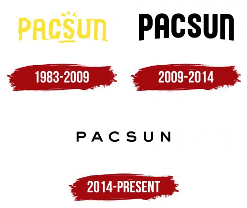
1983 – 2009
The brand’s emblem consists of its name. The name is an abbreviation of Pacific Sunwear. The choice of name is linked to the fact that the brand initially sold clothing for surfers.
The sunny theme influenced the logo’s appearance. The sign is executed in bright yellow to convey the blinding brilliance of the sun. Above the letter S, there are rays of the Sun rising above the earth, denoted by an underline.
Emphasizing the letter S divides the word into two parts and indicates the composite name. At the bottom, the emblem has a curve that seemingly lifts the inscription upwards. This technique conveys the sunrise and the rise of a wave.
The viewer feels as if they are on a hot California beach on a clear day, where the first store opened in the coastal town of Seal Beach.
2009 – 2014
In 2009, Gary Schoenfeld became the CEO of the company. Under his leadership, the brand refreshed its identity. The font of the inscription and the arcuate bend were preserved. However, additional elements and bright colors disappeared.
Stores expanded their range to include everyday clothing unrelated to the sunny coast. The brand’s geography also changed. Therefore, the sun symbol became irrelevant.
The black, smooth letters with harmonious, smooth curves spoke of style and a modern range for young, affluent people. Continuing the theme of elitism, the brand began developing a clothing line in collaboration with the Jenner family and conducted broad advertising campaigns featuring famous athletes.
2014 – today
Despite all efforts and a well-thought-out strategy, Gary Schoenfeld failed to save the brand, which gradually decreased its profits since 2008. 2014 was the last year the company showed profit before bankruptcy.
As a sign of desperation in an attempt to change the situation, the management updated the emblem to make the design more youthful and modern.
Following the fashion trend, the logo adopted a black color with a large space between the capital letters. The emblem mirrored the image of many fashion publications, brands, and retailers. The design lacked individuality or any feature that could ‘catch the eye.’
Therefore, this attempt did not bring success to the owners. Two years later, the chain went bankrupt and was acquired by a private owner. The new owner merged it with another brand in a collaboration named PSEB.
Font and Colors
Black is considered neutral in fashion. As customer tastes and preferences vary, a black logo allows for successful navigation in the constantly changing world of fashion, attracting more customers.
The font resembles Sackers Gothic Heavy. The thin symbols support the theme of slimness and a sporty lifestyle. The wide spacing between letters conveys the diversity of styles and brands sold in the stores.

