Recently, the American homewear manufacturer Pair of Thieves presented its new visual identity. Founded by three friends in 2014, the brand has focused on producing socks, underwear, T-shirts, homewear, paying close attention to the style and high quality of soy products. The style in this area is the main distinction of the brand, which expands the approach to the development and production technology of most wardrobe items, lingerie, diversifying the range of proposals. Distinguished by the latest technological advances, innovative implementations, and a creative attitude to creating model lines, the company has successfully competed with such major brands with years of experience as Fruit of the Loom, Jockey, and Hanes.
The new identity for Pair of Thieves was developed by one of the leading American branding companies – Team Studio. Her team positions themselves as dreamers who successfully combine design, imaginative thinking with systems and tools to create an impressive visual message that reveals brands’ characteristics, experiences, and goals, making them unique and attractive. In the course of its work, the agency delved deeper into the essence of the brand’s visual identity, turning the packaging redesign process into a full-fledged rebranding of Pair of Thieves.
The logo update impacted the time of its implementation due to the appearance of imitators, which saw future high efficiency in the new Pair of Thieves emblem. Team Studio developed and implemented new kits in record time to prevent imitators from taking full advantage of the championship.
The effectiveness of the new image is primarily reflected in the graphical navigation system, which was developed for application on the packaging. The proposed option turned out to be convenient and maximally informative for making the right decision to buy the right type of product, according to the required characteristics, quickly. The rejection of the use of traditional images, photographs, replacing them with original and even funny options, has significantly increased the attractiveness of the packaging.
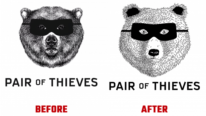
This also affected the logo, which looked like a hand-drawn drawing. While retaining the image of the face of the bear, the new version included a scalable version that gained digital clarity and high-quality visual perception. At the same time, a selection guide using an electronic QR code has been integrated into the digital navigation system. As a result, the logo acquired improved aesthetics and became the most functional and useful one.
