


 Panasonic Logo PNG
The Panasonic logo is simple and precise. Harmony and minimalism represent a solid company that works confidently and smoothly. The emblem inspires trust in the brand’s products and guarantees their perfect performance.
Panasonic’s history began on March 7, 1918, when 23-year-old Konosuke Matsushita moved to a larger home in Osaka with his wife, Mumeno, and her 15-year-old brother, Toshio Iue. There, he founded Matsushita Electric Housewares Manufacturing Works. Before that, he had worked as a wiring technician at Osaka Electric Company and had developed an improved light bulb socket. After management rejected the idea, he left and began the business with almost no capital.
The first months were difficult, as early orders barely covered living costs. A contract for fan insulation plates gave the workshop enough money to continue. By the end of 1918, it employed 20 people. In the early 1920s, the company added plug sockets, two-way adapters, and bicycle lamps. In 1927, Matsushita introduced the National brand for rechargeable bicycle lamps, and in 1935, the firm became Matsushita Electric Industrial Co., Ltd.
World War II forced the company to produce wooden ships and aircraft components. After Japan’s surrender, US occupation authorities restricted large corporations, and Matsushita was removed from management for a time. Employees and unions defended him, and he returned in 1950. Postwar expansion followed, with a 1952 venture with Philips for black-and-white televisions, refrigerators, mixers, and rice cookers, and the control of JVC in 1954.
In 1955, PanaSonic was registered for North America because National already belonged to other firms there. Technics appeared in 1965, followed by the SL-1200 turntable in 1972. In 1976, JVC launched VHS, defeating Sony’s Betamax through longer recording and open licensing. Matsushita became Panasonic Corporation in 2008, acquired Sanyo in 2009, signed a battery agreement with Tesla in 2016, and became Panasonic Holdings Corporation in 2022.
Meaning and History
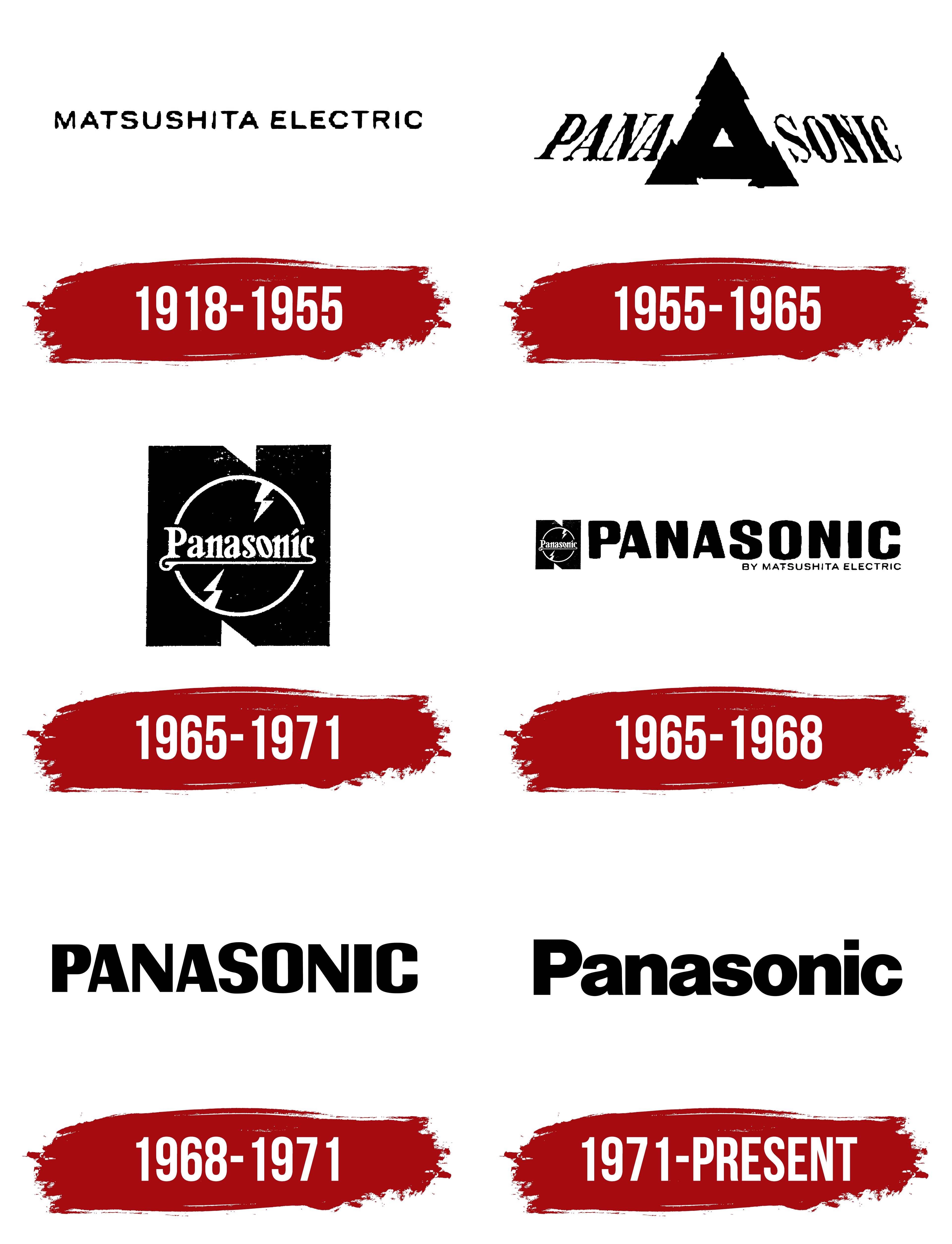
The company’s logo has changed several times, demonstrating the transition from a small company to a gigantic corporation. The main focus of the emblems is on the textual part. For each option, a unique font was chosen to reflect the company’s values and its self-perception at that time. The logo’s color scheme has remained constant for over 100 years, pointing to electrical wiring and the technical orientation of the brand’s products.
What is Panasonic?
A large company with a net profit of $2.6 billion, producing consumer electronics and appliances. The manufacturer is also involved in automation and business solutions. The headquarters is located in Japan. Products are sold worldwide, but 64% of revenue comes from Asian countries.
1918 – 1955

The first Panasonic logo stands out from the rest with its content. It features a simple, small inscription in capital letters: Matsushita Electric.
The future corporation was established as Matsushita Electric Housewares Manufacturing Works, named after its founder, Konosuke Matsushita.
The letters of the inscription are rounded, suggesting the corporation’s first product: light bulbs. They demonstrated their shape and soft, pleasant light. The symbols conveyed the company’s core values and its aspiration to make people’s lives easier and delight them with its products. They showed a commitment to harmony and perfection in their products.
Capital letters and black color were a statement of leadership and a way to signal to competitors their strengths.
1955 – 1965

1965 – 1971

1965 – 1968

1968 – 1971

1971 – today
The 1971 emblem is simple and harmonious: the word “Panasonic” in smooth black, rounded letters with saturated, bold glyphs. The company adopted the name Panasonic in 2008. Before that, from 1955, Panasonic was the manufacturer’s brand for household appliances and electronics, under which TVs were exported to the US. In 1970, sales of all products began in Europe under this brand. Therefore, a unique logo was developed for the brand. With it, the company and its products were associated abroad.
Panasonic is made up of two words: Pan and Sonic. It refers to the company’s famous receivers and tape recorders, which became popular in the 1960s and 1970s. The close placement of elements indicated a small product range and a single electronics direction.
The logo choice proved quite successful, and the company has not changed it for over 50 years. Since 2008, the emblem has been used for the company and the brand.
Font and Colors
From the first logo, Matsushita Electric chose a minimalist color palette. This approach enabled a harmonious representation of a large corporation with multiple business lines and factories worldwide. Black is the color of power, might, and victory over competitors. Many of the brand’s products have black housing.
The font is similar to Nimbus Sans D Black. The black capital letter hints at the company’s significant weight and popularity in Asia, as well as its plans to conquer the European market. Writing the word in accordance with all grammar rules represents the manufacturer as law-abiding, adhering to rules and instructions, and respecting the orders of foreign countries where their products are sold.