The Paramount Animation logo gives a sense of unquenchable magic. It’s a continuation of traditions, anticipating something interesting and new. At the same time, the emblem makes it clear that the film studio remains true to its values, cherishes its viewers, and will long dominate world cinema, rising like an eternal mountain.
Paramount Animation: Brand overview
| Founded: | 2011 |
| Founder: | Brad Grey |
| Headquarters: | Los Angeles, California, U.S. |
| Website: | paramountanimation.com |
Meaning and History
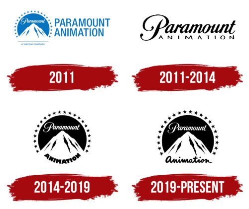
After its opening, the animation studio initially used the parent logo to underline its close connection with the parent company. With this, it expressed its gratitude and highlighted its high status as an experienced representative of the film industry, modestly adding its own name on the side.
After a series of successful projects, the label decided to get a personal mark, but it remained in tune with the emblem of the world-famous film studio. Over the many years of the symbol’s existence, only the style of the lower inscription has changed.
What is Paramount Animation?
Paramount Animation is a subsidiary label of Paramount Pictures, owned by Paramount Global. It focuses on the production of animated films, a venture it has successfully undertaken since 2011. Its debut work is “The SpongeBob Movie: Sponge Out of Water.” The founder of the animation division is Brad Grey. The headquarters is located in the city of Los Angeles, California.
2011
The logo consists of a blue circle with a frame containing twenty-two stars. At the center, a tall snow-capped peak called Majestic Mountain is depicted. Its prototype is presumably Ben Lomond Mountain in Utah, which William Wadsworth Hodkinson, the author of the original emblem developed in 1914, saw in childhood.
Below, under a straight horizontal line, is the phrase “A Viacom Company,” set in a very small, sans-serif, uppercase font. The same style is used for the second inscription, which consists of the name of the animation department. The letters are tall, even, and styled strictly in this case. They are so large that they constitute two-thirds of the neighboring sign. The basic color of the logo is blue.
2011 – 2014
The emblem is textual and built on the commonality of the parent company’s name and division. For this purpose, designers emphasized the first word: they enlarged it, colored it intensely black, and added boldness. The style was preserved as in the original – a continuous calligraphic text with rounded letters and a slight tilt to the right. The authors made the second part of the name geometric and stretched it to match the length of the top word. All the letters are squat, wide, and angular.
2014 – 2019
The logo returned the original sign with a white mountain on a dark round background. It is exactly similar to the emblem of the parent film company. The only difference between them is in the lower inscription. The word “Animation” is in bold font with a minimal character interval. It is curved into an arch, covering all the space between the stars. “Paramount,” as before, is executed in a rounded calligraphic font without serifs in uppercase.
2019 – today
Designers enlarged the logo, so the mountain seems massive. A capital transformation has overtaken the lower part: careless handwriting appeared instead of geometric print signs. The capital font was canceled, so even the first letter “a” is lowercase. It just surpasses the others in size. The text became connected (there is no gap between glyphs), horizontal (developers abandoned the form of an arch), and uneven (the inscription looks as if a child wrote it).
Font and Colors
Paramount Animation’s logo uses a rounded cursive typeface in a handwritten style. It’s somewhat similar to Edwardian Script Alt Bold. Later, the Paramountain font of the same name appeared, which was created based on the original inscription from the emblem.
The color palette is modest and consists of a classic combination of white and black. However, monochrome does not spoil the sign – on the contrary, it gives it a serious tone and business character.
Paramount Animation color codes
| Black | Hex color: | #000000 |
|---|---|---|
| RGB: | 0 0 0 | |
| CMYK: | 0 0 0 100 | |
| Pantone: | PMS Process Black C |


