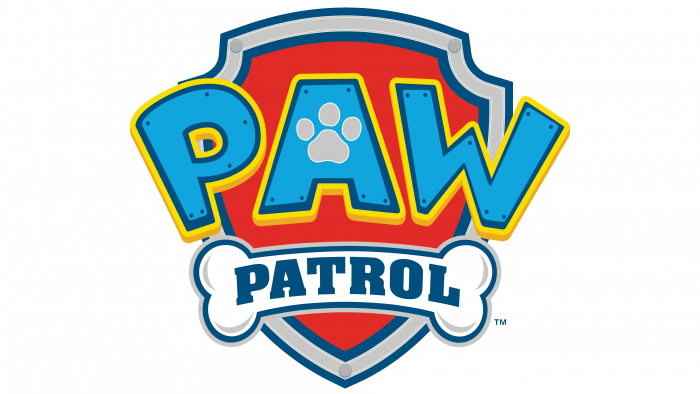
“Fear nothing, dogs are on guard of order and tranquility!” says the PAW Patrol logo. The emblem has a lot of magic, courage, and dog loyalty. Patrol is a real shield from dangers and problems. And a worthy reward for patrolmen is sugar bones.
PAW Patrol: Brand overview
| Founded: | August 12, 2013 – present |
| Founder: | Scott Kraft |
| Headquarters: | Canada |
Meaning and History
The storyline centers around a boy named Ryder. He leads the PAW Patrol search and rescue team of dogs. This group is on a mission to protect the Adventure Bay community and all surrounding areas. Each four-legged character lives in his booth, which turns into a car. They also have backpacks where the necessary tools are collected because all the puppies are busy with a certain task. So, they have the skills to work as an air pilot, police officer, firefighter, and other emergency workers. That is, each dog has its task.
At first, the main characters were realistic, and their appearance and color corresponded to the breed they represent. Then the artists made them cartoonish and simple. They adopted Ryder’s hairstyle from Ronnen Harary. But in general, the concept of the television series is unique. It does not repeat the previously existing programs: it originated from a toy transformer truck developed by the co-founder of Spin Master in 2010. Later, the channel requested a continuation of the toy programs, and Keith Chapman submitted an idea for a project with the PAW Patrol team. Then she bore the temporary name Raffi & the Rescue Dogs. After implementing the concept on the TV screen, the company immediately began to manufacture children’s goods.
In parallel, the show’s scriptwriter Scott Kraft and director Jamie Whitney finalized the plot: they expanded it, abandoning the topic of helping a dog. The creators have made puppies lifeguards for everyone. Moreover, the authors could not find a name for the main character for a long time, so it was first constantly changing: his name was either Raffi, then Roddy, or Robbie. When the Ryder variant appeared, the search stopped. A similar thing happened with the emblem. In thinking over the concept, an interim version was adopted, but later it was improved and approved.
At the beginning of 2020, the television project had eight seasons with 26 half-hour episodes. And in 2021, a message appeared that shooting season 9 began. There is also a full-length film, the release of which is scheduled for the end of the summer of 2021, a line of toys of the same name, video games, DVD releases, and various film adaptations. The original show and all related products have won multiple awards from the Academy of Television Arts & Sciences and the Academy of Canadian Cinema & Television.
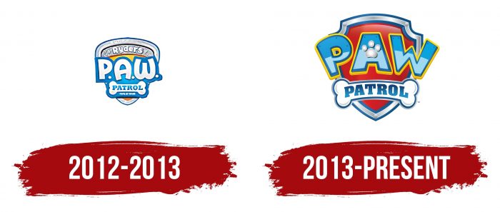
2012 – 2013
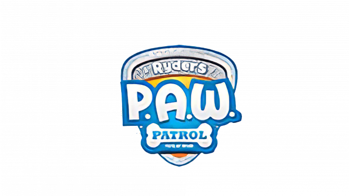
The prototype logo looked a little different than the modern emblem. It consisted of a triangle with its narrow end upside down. Its corners were rounded, and a small gray rectangle served as a background. The inscription “Ryder’s P.A.W. Patrol” occupied the central part, divided into three lines. Above, in a silvery curved band, was the word, Ryder. In the middle, it was designated “P.A.W.” in large letters, where the “W” looked like an inverted number “3”. At the bottom of the bone was the inscription “Patrol.” Each part of the name had its color: white, blue, and white with a blue border. The font was capitalized, smooth, rounded.
2013 – today
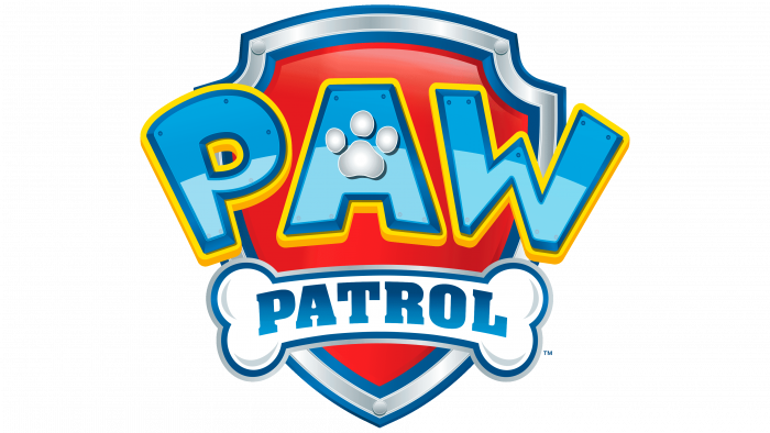
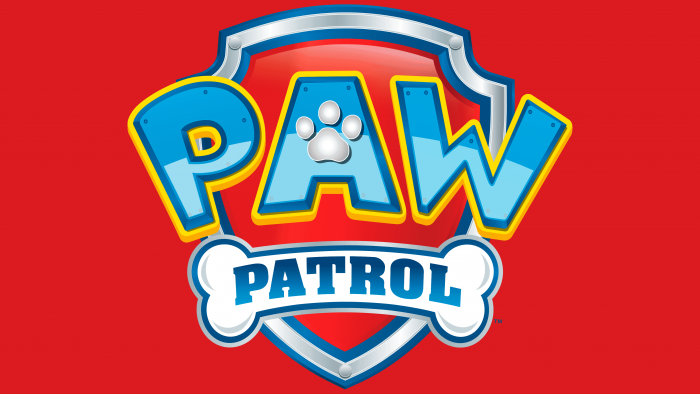
The telecast adopted the final logo after the studio decided on the concept, characters, and script. The design elements have remained in the same places, but their configuration and design have changed. So, the triangle has become a shield, military or law enforcement, such as is used in the logos of power structures. It has a silver border with a blue frame and an inner border that highlights another shield – the inner one, red.
They bear the word “PAW,” but in a different image – without dots after each letter, in blue and a yellow line along the edge. The center lumen “A” is formed by the footprint of the dog’s paw. Three pads “imprinted” on the sign form its crossbar. The developers left the bone placed below but made it curved in the form of a half-arc. It contains the words “Patrol” in a serif typeface. The word “Ryder’s” disappeared because the authors abbreviated the title of the children’s TV show.
PAW Patrol: Interesting Facts
Since its launch in 2013, “PAW Patrol,” a Canadian animated series, has won over children globally. Keith Chapman created the series, which was produced by Spin Master Entertainment with TVOKids and Nickelodeon. It centers on Ryder, a boy, and his team of rescue dogs, embarking on missions to safeguard Adventure Bay.
- Real-Life Inspiration: Keith Chapman created “PAW Patrol,” watching a child play with a toy firetruck and imagining a dog emerging. This sparked the idea for a show about brave dogs, each with unique skills and vehicles.
- Varied Dog Team: Initially, the team featured Chase, Marshall, Rocky, Zuma, Rubble, and Skye. New members like Everest, Tracker, and Rex later joined, enriching the team with their talents and vehicles.
- Educational Focus: Beyond thrilling escapades, “PAW Patrol” imparts lessons on teamwork, problem-solving, and civic responsibility. Safety, environmental care, and kindness are recurring themes.
- Worldwide Appeal: The show enjoys international acclaim and is available in many languages across over 160 countries. Its popularity has spurred various merchandise, from toys to apparel.
- Expanded Universe: The franchise has grown to include live shows and a 2021 feature film, offering new stories for fans to enjoy.
- Engaging Spin-offs: “PAW Patrol” has inspired various interactive media, like video game apps and theme park attractions, immersing young fans in its world.
- Producer’s Triumph: Spin Master Entertainment has seen remarkable growth thanks to “PAW Patrol,” highlighting its success in creating captivating children’s content.
- Cultural Resonance: The series has left a significant mark on culture, featuring in other media and discussing the impact of children’s programming.
- Educational Collaborations: Spin Master has joined forces with educational bodies to produce themed content that promotes learning and safety.
- Wide Audience: Although aimed at preschoolers, “PAW Patrol” has fans of all ages drawn by its uplifting messages, engaging plots, and memorable characters.
“PAW Patrol” is a beloved fixture in children’s media. It illustrates its heroic dogs’ timeless charm and adventures, embodying the spirit that no challenge is too great.
Font and Colors
The current logo exists in three versions, each of which is used for a specific purpose. They are identical in configuration, elements, and content. The only difference between them is style. So, there are two color emblems (three-dimensional and flat) and one monochrome (black and white).
For the word “PAW,” the designers have chosen the font of their design, so it is individual. However, some similarities can be traced to comic typefaces such as Grobold and Minnie. But the inscription “Patrol” has a different style – austere, with serifs. This font is close to the Aachen version created by Alan Meeks. When adapting the emblem for other countries where this program is shown, the inscriptions are issued in other languages, but the design is exactly preserved. Therefore, the fonts may still differ slightly.
The brand range is very bright and varied. It consists of flowers that attract the viewer’s attention, which is incredibly important for a children’s audience. The scheme includes red, blue, yellow, white, silver. In the monochrome version, the logo is colored only in white and black.
PAW Patrol color codes
| Safety Red | Hex color: | #bd221f |
|---|---|---|
| RGB: | 189 34 31 | |
| CMYK: | 0 82 84 26 | |
| Pantone: | PMS 485 C |
| Spanish Sky Blue | Hex color: | #099eda |
|---|---|---|
| RGB: | 9 158 218 | |
| CMYK: | 96 28 0 15 | |
| Pantone: | PMS 801 C |
| Golden Yellow | Hex color: | #fee301 |
|---|---|---|
| RGB: | 254 227 1 | |
| CMYK: | 0 11 100 0 | |
| Pantone: | PMS 108 C |
| Pastel Blue | Hex color: | #abb7bd |
|---|---|---|
| RGB: | 171 183 189 | |
| CMYK: | 10 3 0 26 | |
| Pantone: | PMS 7542 C |
