The full range of useful information needed to educate and improve viewers’ skills is encoded in the PBS logo. The logo shows various ways to present data and an impressive list of topics covered.
PBS: Brand overview
| Founded: | November 3, 1969 |
| Founder: | PBS’s member public television stations |
| Headquarters: | Crystal City, Arlington, Virginia, U.S. |
| Website: | pbs.org |
Meaning and History
The experience of the Public Broadcasting Service proves that the television environment can be used not only for entertainment but also for educational purposes. Her programs’ format mixes both to maintain a balance between entertainment and practical use. This way, they can interest a wide range of viewers without losing their educational value.
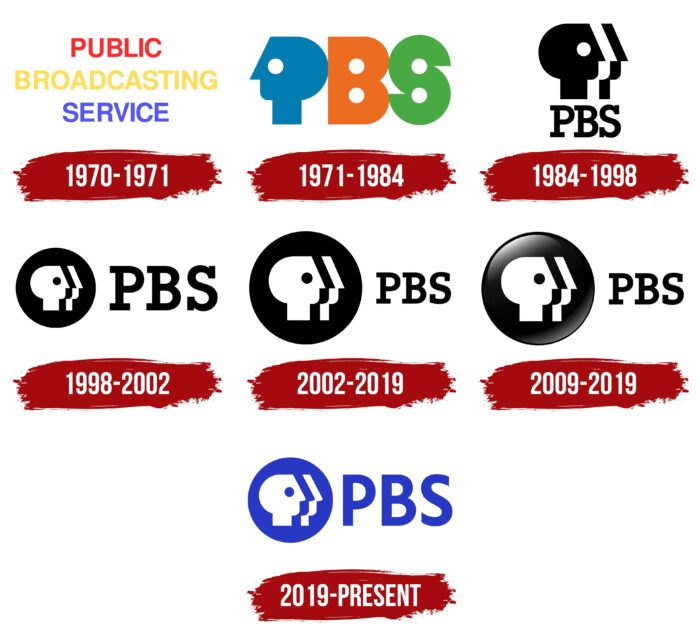
PBS was incorporated at the end of 1969 and started operating a year later, taking the place of National Educational Television. For half a century of its existence, it has changed many logos. At the same time, all of them (except the first one) contain one common element – the image of the face in profile. The iconic symbol came in 1971 when Herb Lubalin stylized the letter “P” to look like a human head.
1970 – 1971
The first PBS logo was created in 1969 at the same time as the broadcaster but did not come into use until 1970. It made its debut during the premiere of The Andersonville Trial and then appeared on the screen along with the last symbol of National Educational Television. It was a kind of placeholder – a temporary option that was needed when moving from NET to PBS.
The structure of the logo was very simple: a three-line inscription “PUBLIC BROADCASTING SERVICE” on a plain background. The designers chose the regular Helvetica font for the text. The color scheme was the same as the palette of the NET logo: one word was red, another was yellow, and the third was blue.
1971 – 1984
In 1971, a second PBS symbol appeared, which is now nostalgic for people who grew up in the 1970s. It was designed by Herb Lubalin, an American typographer and graphic artist. Lubalin considered several versions of the design. He even wanted to integrate the word “PBS” into the falcon’s neck or decorate it with stars. But in the final version, only an abbreviation remained from the first concepts.
A blue P-shaped head replaced the letter “P” turned to the left. It consisted of a set of geometric shapes: a triangular nose around the eye, a square neck, and a semi-oval base. This was followed by an orange “B” with two symmetrical hole circles. The same circles were inside the green “S,” which was shaped like a modified number “8”.
In the original version, under the acronym was the phrase “PUBLIC BROADCASTING SERVICE,” written in ITC Avant Garde Gothic. Herb Lubalin collaborated with Tom Carnase to design the PBS typeface with Ernie Smith. There was also a variant without the full name of the service.
1984 – 1998
In the mid-1980s, PBS needed a new identity because the three-letter sign was reminiscent of ABC, NBC, CBS stations. The company representatives turned to Chermayeff & Geismar for help to solve the problem.
Tom Geismar directed the creative process. He immediately singled out the main symbol of the broadcasting service – “P” in the shape of ahead. The designer turned it to the right side, increased the back of the head, lengthened the nose and neck. In addition to the “cosmetic surgery,” he carried out “cloning,” adding a fragment called The Split. This part looked like two additional profiles, with the middle silhouette formed by negative space. It seemed that the picture depicted three faces: black, white, and black again. The firm has named the new symbol Everyone. It was introduced in March 1984 and appeared on TV screens in September.
Under the triple P-profile was the abbreviation “PBS.” Her ITC Lubalin Graph Demi font, named after Herb Lubalin, was created by Chermayeff & Geismar. It contained bold letters with rectangular serifs.
1998 – 2002
In the late 1990s designers, Publicis & Hal Riney developed a new logo for the Public Broadcasting Service. They placed the heads inside the black circle and changed their color so that the front profile became white. The abbreviated name of the company was to the right of the icon. The symbol was animated by Lee Hunt Associates.
2002 – 2019
In 2002, PMcD Design staff changed the scale of the elements: they enlarged the disk with a P-shaped graphic sign and reduced the inscription. The font has also changed. The new Caecilia 75 Heavy felt smoother and more concise than the old ITC Lubalin Graph Demi.
2009 – 2019
The logo created by PMcD Design had a 3D version. She was distinguished by a black and white gradient inside a circle. And the inscription looked the same as in the previous version.
2019 – today
On the eve of the 50th anniversary of PBS, the letter “P” has undergone a “facelift.” Branding studio Lippincott was responsible for the process. The evolved heads had rounded noses and almost doubled their necks. The circle with heads has been reduced. The designers also changed the font: it has no serifs for the first time since 1971. The new style reflects the digital age, while the signature PBS Blue color makes the symbol more visible across platforms. The modern logo first appeared on the company’s official website in 2019. Over the next year, 70% of stations receiving PBS programming began using it.
PBS: Interesting Facts
PBS (Public Broadcasting Service) stands out in American TV for its focus on education, culture, and information. It’s a non-profit network aiming to serve the public’s interest.
- Starting Point: PBS started on November 3, 1969, to offer diverse, quality shows focusing on education, culture, and public affairs—things other networks often ignore.
- How It’s Funded: Unlike commercial networks, PBS gets money from the government, private donations, foundations, and viewers. This mix helps it keep producing shows that matter to the public.
- Network of Stations: Over 350 member stations across the U.S. broadcast PBS. Non-profits, governments, universities, or community groups usually run these stations.
- Famous Shows: PBS has hosted many memorable shows, like “Sesame Street” for kids, “NOVA” for science lovers, and “Masterpiece Theatre” for drama fans.
- Education Beyond TV: PBS also focuses on education off the screen. For example, PBS LearningMedia gives teachers many digital classroom resources.
- Leading in Tech: PBS was early to use digital broadcasting, high-definition TV, and streaming, making its content more accessible.
- Awards: PBS shows have won many awards, including Emmys and Peabodys, for their high-quality programming.
- PBS Kids: Since 1994, PBS Kids has been crucial for children’s educational content, creating characters and shows loved by many.
- In-depth Shows: PBS is known for detailed coverage of important issues through shows like “Frontline” and “PBS NewsHour,” and it explores historical topics in series like “American Experience.”
- Worldwide Impact: PBS’s reach goes beyond the U.S., with its shows watched worldwide, sharing its quality content internationally.
PBS is dedicated to educating and informing viewers, making it a key part of American TV for over fifty years. Its commitment to quality programming has earned it a special place in the hearts of many.
Font and Colors
The iconic three-headed symbol represents the very “public” that is mentioned in the name of the Public Broadcasting Service. At the same time, it is still the “P” from the original Herb Lubalin acronym, although it is no longer so obvious. The Lippincott designers have kept the emblem but simplified it a bit to adapt it to the multi-platform world. Three profiles pointing in the same direction reflect different points of view. These are attentive viewers focused on PBS educational content.
In 2019, the inscription on the logo remained sans-serif for the first time. The custom font used is called PBS Sans. It was created specifically to make the abbreviation easy to read on a screen of any format. All three letters are bold, capitalized, and the same size as the heads inside the circle.
Another innovation from Lippincott designers is PBS Blue. A bright electric shade has replaced black. Its task is to highlight the Public Broadcasting Service brand in an oversaturated media space. It is believed to evoke a sense of integrity and trust. And its combination with white color creates inner balance.
PBS color codes
| Persian Blue | Hex color: | #2135c5 |
|---|---|---|
| RGB: | 33 53 197 | |
| CMYK: | 83 73 0 23 | |
| Pantone: | PMS 2736 C |


