The modest and serious Peanuts logo does not convey the fun and carefree nature of the story it represents. The only thing they have in common is a passion for teaching. Yes, the main characters and their emblem contain a note of social-psychological education so that children grow up smart and adapt to various life situations—even the most unpredictable ones.
Peanuts: Brand overview
| Founded: | 1950 |
| Founder: | Charles M. Schulz |
| Headquarters: | United States |
| Website: | peanuts.com |
Meaning and History
The comic owes its strange name to bureaucracy. The fact is that initially, it was called Li’l Folks, where the first word was an abbreviation for Little. But it turned out that there is already a registered trademark Little Folks. A new title was needed to avoid legal conflicts because the comic decided to publish on a large scale since it sparked interest among readers. The UFS (United Features Syndicate) board chose the unusual name for the cartoon sketch.
The informal term guided its representatives for the cheapest and noisiest places in the theater – “Peanut Gallery.” The gallery got its nickname due to the cost of peanuts in the theater buffet: it was just that cheap snack that viewers of inexpensive seats preferred. And children (in this case, the target audience) are noisy and fidgety. But Charles M. Schulz did not like this choice, and he remained in disagreement with the name until the end of his life. However, paradoxically, it has become forever fixed, even in the logo.
What is Peanuts?
Peanuts are the longest children’s literary work told by one person and printed in a newspaper. It was published as a short publication from 1950 to 2000 inclusive. Its author is Charles M. Schulz, who wrote and illustrated the story himself. The comic gained such popularity that it subsequently became a franchise, which included books, movies, cartoons, plays, amusement parks, apps, etc. It appeared in more than 2,600 newspapers.
1950 – 1952
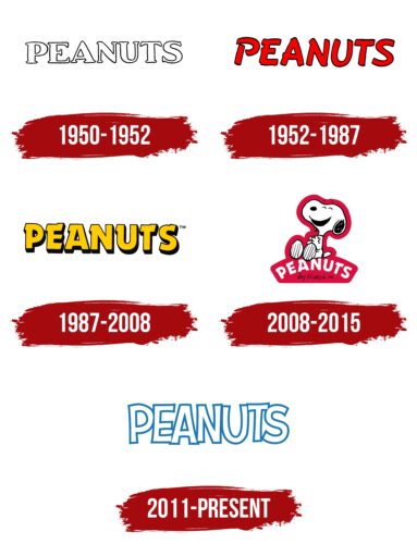
The Peanuts emblem is textual. It represents a single inscription made in a “naked” font; the inside of the letters are white, empty, and externally outlined by a thin contrasting stripe. It is the black contour that forms the glyphs. The lines are uneven as if applied by a child’s unsure hand, which creates a sense of carefree and carelessness. All symbols have serifs that form a whole with them. The distance between the characters is minimal, but despite the wide form, they do not merge. The font is massive, bold, and cursive.
1952 – 1987
The design of the Peanuts logo is geared towards a child-friendly theme. It’s bright, cheerful, dynamic, and simple. The red glyphs easily attract the attention of the target segment and are memorable thanks to their playful design. In this case, the font is italic, with an almost imperceptible rightward slant. The uppercase letters have an uneven contour and look like they were drawn with a black marker and then colored red. Some symbols have serifs that resemble random unevenness. They are present in “P,” “E,” “A,” and “N.” However, the last three glyphs are smooth.
1987 – 2008
In this version, small serifs are present on all glyphs. They are outlined with the same contour as the letters and look like miniature sharp protrusions at the top. The font is geometric, bold, even without shaky edges. To the right and below each sign is a black shadow, adding volume. The inscription is painted in a calm yellow color.
2008 – 2015
This is the funniest, most childlike, and cheerful logo of all the versions. It features the author’s favorite character – an anthropomorphic dog named Snoopy. The dog sits with closed eyes, laughing and clapping its hands, inviting others to share her joy. It is drawn in the author’s style – with high eyebrows, an oval nose, a black ear, a wide-open mouth, and lined paws. The entire contour of the animal is outlined with a thick red stripe, which at the bottom turns into a solid background for the comic’s name. On the contrary, the inscription is strict, business-like, and serious. It is bent into an arch, where Snoopy sits.
2011 – today
The basis of the logo is the franchise’s name. Graphic designer Nate Piekos transformed it, modernizing and refreshing it. The inscription is made with vertically elongated letters. They are uppercase and contour, with a slight expansion at the ends, which gives them recognizable originality. Inside, the glyphs are empty, that is, white. The border is a bold blue stripe that forms them. The symbols are placed very closely, touching and slightly overlapping each other. A sense of childlike carefreeness is added to the emblem by the selective inclination of the letters: some of them are slightly tilted to the right, others to the left, and others, on the contrary, stand straight.
Font and Colors
This franchise has a textual logo, so the writing style is an important factor in the design. The developers chose personal fonts for the title to make the emblem individual: a bold contour, Dynamo, and ones reminiscent of CF Rise of Nations Regular from CloutierFontes or Adventuring Regular from K-Type.
The logo’s palette is simple. Almost every version uses only one main color with a contrasting complement: white with black, red, yellow with black, and white with blue. And only in one case is a three-color scheme noted: raspberry, white, and black.
Peanuts color codes
| Star Command Blue | Hex color: | #1978b0 |
|---|---|---|
| RGB: | 25 120 176 | |
| CMYK: | 86 32 0 31 | |
| Pantone: | PMS 7461 C |
