The Peggy Notebaert Nature Museum in Chicago, Illinois, has introduced a new logo and brand identity designed by Span. This update marks a significant step for the institution, which has been a part of the Chicago Academy of Sciences since 1857. Named after benefactor Peggy Notebaert, the museum has been located in Lincoln Park since 1999 and is known for its focus on the natural history of the Chicago region and its educational programs, including a live butterfly house.
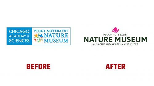
The previous logo was cluttered with its textured typeface and many illustrations. The new logo simplifies the design, focusing on “Nature Museum” while giving secondary roles to the names of the benefactor and the parent organization for better clarity.
The primary typeface, Tonka, features bold weight and subtle flaring stems, conveying a historical and organic feel. The complementary font, New Atten, inspired by Sir David Attenborough’s voice, adds charm and accessibility. Together, these fonts create a confident and inclusive logo.
A charming flower illustration behind the wordmark adds visual interest. Although slightly prominent, the contrast of green, hot pink, and off-white makes the logo readable and striking. The flower icon is versatile, used in patterns, backgrounds, and color accents, maintaining visual interest across various mediums.
The color palette draws from the Illinois prairie, featuring shades like catalpa green, columbine pink, and milkweed cream. These colors reflect nature’s diversity and beauty, creating a vibrant and inviting visual language. The abstract icon evokes butterflies, flowers, and clouds, capturing nature’s wonder.
The identity system allows the logotype to stand alone or integrate dynamically with organic shapes and imagery. This adaptability ensures effective communication in diverse scenarios, from sustainability advisories to educational outreach. The new identity aligns with the museum’s mission to inspire and educate about the natural world.
Span’s redesign extends to the museum’s digital and physical presence, including a clean and intuitive website layout. The new color palette and typography enhance user navigation and interaction.
This rebranding modernizes the museum’s visual representation and reinforces its commitment to environmental education and leadership. The new logo and identity encapsulate the museum’s role as a dynamic and inspiring institution by blending historical elements with contemporary design. Focusing on natural themes and organic shapes ensures the brand remains true to its roots while appealing to a wide audience.


