The Pel-Air logo symbolizes the freedom and opportunities offered by this Australian brand. Its colors and shapes reflect the powerful energy characteristic of flying airplanes. The emblem emphasizes the safety and reliability of air transport, reassuring passengers to choose the company’s services.
Pel-Air: Brand overview
Pel-Air, a regional airline based in Australia, was founded in Sydney in 1984. In its early days, the airline operated a fleet of small commuter aircraft, flying mainly regional routes in New South Wales.
Over the years, the airline expanded its operations to operate scheduled flights to various eastern and northern Australia regions. Pel-Air connected metropolitan areas such as Canberra, Adelaide, and Darwin to remote regional areas using compact turboprop aircraft.
In 2007, a significant change occurred when Regional Express Holdings acquired Pel-Air. This marked a change in strategy for Pel-Air to specialize in regional charter flights as a subsidiary of Regional Express Holdings.
However, Pel-Air’s history is not without turbulence. The airline has experienced several accidents and incidents during its existence. One of the most notable was the fatal Norfolk Island crash in 2009, which resulted in the airline revoking its operating license.
Eventually, safety issues and mounting financial difficulties led Pel-Air to cease operations in April 2015, marking the end of its 31-year run.
During its heyday in the 1990s, Pel-Air operated up to 15 aircraft on various regional routes. Despite its decline in the 2000s and eventual closure due to safety issues, the airline played a critical role in connecting rural and remote areas to major cities.
Meaning and History
What is Pel-Air?
This Australian airline based in Sydney specializes in a wide range of specialized aviation services, including air ambulance, charter flights, firefighting services, and offshore operations. The company operates a diverse fleet of aircraft and helicopters, such as the Beechcraft King Air, IAI Westwind, and AgustaWestland AW139, adapted for specific missions in challenging and often harsh conditions across Australia and nearby regions.
Before 2005
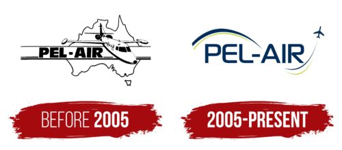
Before 2005, Pel-Air was entirely independent and not part of Regional Express Holdings; thus, it had full control over its logo design. The company favored a stylish and modern design that matched the appearance of its fleet.
One of the logos from that era resembles a simple black-and-white sketch. The brand name, written in bold uppercase letters, conveys a sense of stability, reliability, and confidence. The phrase “PEL-AIR” is placed within a wide horizontal stripe that crosses the silhouette of Australia. The artists included the large continent and the nearby island of Tasmania to indicate that the airline operates charter flights throughout the country.
The most significant element of the logo is a flying airplane. The IAI-1124 Westwind, Pel-Air’s first business jet, began the company’s history. This aircraft symbolizes the brand’s origins and journey towards a successful future.
2005 – today
Until 2005, the Pel-Air logo featured a realistic depiction of an airplane. After that year, the designers opted for a simplified approach with a small silhouette. The airplane is recognizable by its outline, resembling a shadow. This silhouette is dark blue and flanked by wavy stripes at the top and bottom, acting as speed lines. Green lines are included, adding freshness to the emblem. The airline’s name is displayed in a streamlined font between these lines.
The dark blue color evokes reliability and professionalism, which suits an airline. The green lines add a lively and modern touch. The streamlined font used for the airline’s name complements the silhouette and wavy lines, reinforcing the themes of speed and dynamism. This simplified design makes the logo recognizable and adaptable across various platforms, reflecting the company’s focus on aviation.
The dark blue silhouette represents trust and dependability, essential traits for an airline. The green lines symbolize innovation and a forward-looking approach. The wavy stripes enhance the sense of motion and efficiency, which are crucial aspects of the aviation industry.
The airline’s name’s streamlined font ties the design together, adding a contemporary flair that aligns with the simplified silhouette and dynamic lines. This font suggests modernity and precision, reinforcing the airline’s commitment to efficient and reliable services.


