The Peppa Pig logo captures the character of the young four-year-old heroine. The emblem reflects her curiosity and energy and displays her favorite habits. The sign, as part of the cartoon story, serves as an invitation to watch.
Peppa Pig: Brand Overview
The animated television series “Peppa Pig,” created for a preschool audience by Neville Astley and Mark Baker, debuted on Channel 5 in the United Kingdom on May 31, 2004. This British series centers on the charming and playful female pig, Peppa, along with her family and a circle of animal friends. The narrative of each five-minute episode focuses on Peppa as she engages in learning activities, play, and everyday adventures with her younger brother George, Mommy Pig, Daddy Pig, and her friends.
Following its initial launch, “Peppa Pig” rapidly gained international recognition. By 2005, the show was broadcast worldwide and has since been translated into over 40 languages. The immense popularity of the series also boosted the sales of Peppa Pig-related toys, books, and games.
In 2011, the franchise expanded with the opening of its first theme park, “Paultons Park,” in the UK. This expansion continued with the establishment of more theme parks and family entertainment centers globally. Further broadening its reach, a second animated series, “The Adventures of Peppa Pig,” premiered in 2022.
Eighteen years after its inception, “Peppa Pig” continues to produce new episodes and merchandise, marking its status as one of the most successful preschool television properties globally. The series remains a beloved fixture in the lives of children worldwide.
Meaning and History
The logo of the animated series is built on the general principle of all children’s shows. It’s bright, which is a signal to attract a younger audience. At the center is the main character, who elicits sympathy from viewers. The emblem’s creator is likely the story’s illustrator, Phil Davies.
What is Peppa Pig?
It is an animated series about a cheerful pig and her family, created in England in 2004 by animator Mark Baker. The plot of the 5-minute episodes revolves around everyday family events. The cartoon is translated into 40 languages and shown in 180 countries. Many branded products with the story’s characters are produced. The rights to the series have been owned by Hasbro through Entertainment One UK Limited since 2019.
2002 (Pilot)
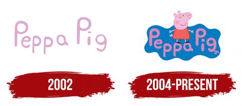
The first episode of Peppa Pig was released in 2002 on the children’s show The Milkshake! A simple yet memorable logo was developed for the pilot release.
The verbal emblem from the series title is executed in pink, matching the hue of the main characters. The story’s creator, Mark Baker, drew inspiration from his childhood spent on a farm.
The letters of the inscription are arranged in the form of a wave.
- This is related to the character of the main heroine, who is active, mobile, and loves to jump. It’s no coincidence that in the modern intro of the cartoon, she is always seen hopping.
- Mom, Dad, Peppa, and her brother are introduced at the beginning of each episode and stand in the picture in such a way that they form a wave by height.
- The cartoon is created for children of different ages, and the dancing letters indicate the company of a variety of kids.
The smooth symbols, without direct clear glyphs, highlight the characters’ youthfulness and the accessibility and ease of the information. The series is educational in nature and teaches little ones about the world. Educational elements are presented in the most understandable form.
2004 – today
Peppa became an independent series with its own emblem, which has remained constant throughout the years of airing.
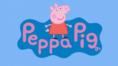
The blue emblem, featuring the pig standing on the letters of the name, is very recognizable. It marks the start of every cartoon episode. The base is designed as a puddle, reflecting the sky since Peppa loves jumping in puddles.
The appearance of the character was conceived and drawn by British artist and illustrator Phil Davies. He mentioned that he chose a red dress because it suits Peppa’s explosive character.
Compared to the pilot version, the letters have become slightly thicker, as all the characters in the cartoon are quite well-fed. The last letter, ‘g,’ got a pig’s tail, complementing the pink curl of Peppa herself. This element adds a cheerful note at the end of the inscription, hinting that at the end of each episode, the characters fall down laughing.
Font and Colors
Pink and blue shades dominate the logo. The colors hint at gender issues and show that the series is liked by both boys and girls. Pink emphasizes the skin color of the heroine, while blue represents water and the sky. The series reflects real life, albeit in fictional anthropomorphic characters. The issues that the characters face are alive and familiar to all kids on Earth. That’s why the series immediately became a hit.
The font is unique and was specially developed for the series. It is named Peppa Pig Medium.
