The Perimeter Aviation logo supports the image of a modern aviation company ready to provide high-quality services to its clients. The sharp lines and shapes reflect the precision that is crucial in the field of air transportation. The chosen color scheme makes the emblem recognizable to the residents of Winnipeg and throughout Canada.
Perimeter Aviation: Brand overview
Perimeter Aviation, a regional airline based in Winnipeg, Manitoba, Canada, began operations in 1960. Initially, the airline operated charter flights and air cab services in the northern regions of Canada.
In the following decades, namely the 1970s and 1980s, Perimeter Aviation expanded its horizons by offering scheduled passenger and cargo services. These flights served isolated industrial and mining sites in northern Manitoba and Nunavut.
In the 1990s, the airline moved to larger aircraft and added new destinations in western Canada. This period established major operating centers in Winnipeg and Thunder Bay.
In 2003, Exchange Income Corporation acquired Perimeter Aviation, paving the way for the airline’s expansion into new regions. Armed with additional capital, Perimeter began offering medical evacuation services and moved into flight training.
Perimeter Aviation now operates a diverse fleet of turboprop and jet aircraft. The airline operates scheduled passenger services, charter flights, specialized cargo services, and medical evacuation services throughout Canada.
Despite its evolution, Perimeter Aviation remains true to its original mission to serve northern Canada by providing essential air transportation services. In addition to its regional specialization, the company offers an expanded range of scheduled and charter flights throughout North America.
Perimeter Aviation has operated for over six decades, growing from a modest charter airline in the north to a key regional carrier in Canada. Known for its reliability and commitment to serving remote areas, the airline has successfully adapted to changes in the marketplace and continues to do so.
Meaning and History
What is Perimeter Aviation?
This is a Canadian regional airline based in Winnipeg, Manitoba, specializing in providing essential air services to remote and northern communities throughout the province. The company operates a diverse fleet of turboprop aircraft, including the Fairchild Metro, Beechcraft King Air, and DHC-8, adapted for operating in harsh weather conditions and landing on short, unprepared airstrips typical of the region.
Before 2009
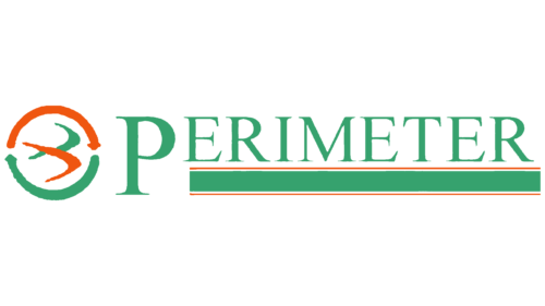
The old Perimeter Aviation logo resembles a flying bird made up of two boomerangs. Judging by the split tail, the designers depicted a swift or a swallow. These birds are known for their endurance, speed, grace, and freedom, making them an apt symbol for an airline.
The logo parallels comfortable passenger transportation and the ease with which a swift or swallow covers great distances. The boomerang evokes the idea of fast flight, giving the wings and tail their distinctive curved shape.
The abstract bird is enclosed in a ring formed by two semicircular arrows. This figure symbolizes the endless cycle, signifying the company’s commitment to continual service for the residents of Winnipeg, transporting them on various routes. In aviation, the ring emphasizes consistency: passengers can be assured that the plane will stay on course and arrive on time. The arrows convey a sense of movement fundamental to air travel.
The first “P” in “PERIMETER” is larger than the other letters despite all being capitalized. This makes the brand name memorable and adds dynamism, as the large “P” directs the eye forward. The remaining letters appear to be in flight, elevated above the baseline. This sense of flight connects the text with the stylized bird, ensuring logo coherence.
The contrasting serif font enhances the dynamism and underscores the company’s commitment to modern technology and innovation, which are continually emerging in the aviation industry. Green is associated with safety, which is especially crucial in passenger transport.
The elevated letters in “PERIMETER” rest on a long rectangle bordered by thin red lines above and below. This elongated shape evokes a runway, aligning the logo perfectly with the brand’s field of activity.
2009 – 2015
In 2009, Manitoba’s largest airline updated its logo to reflect its commitment to growth and progress. The centerpiece of the new logo is the text, which appears dynamic due to its italicized font. The uppercase, cursive letters surge forward, underscoring Perimeter Aviation’s leadership.
The word is now in an olive shade, yet it remains green—a color symbolizing safety, generosity, comfort, and tranquility, all crucial during air travel. Green is present on the flag of Winnipeg, where Perimeter Aviation is based, subtly hinting at the brand’s connection to its home city.
In the background, a diagonal oval with an orange ribbon outline is depicted. This element references the airline’s name, as “perimeter” in geometry means the length of a figure’s boundary. The oval stripe can represent the flight path of an airplane, directly linking to the airline’s operations. Its slanted shape conveys a sense of speed, while the orange emphasizes the warmth with which Perimeter Aviation serves its passengers. Orange contrasts with green, helping to draw attention to the brand.
2015 – today
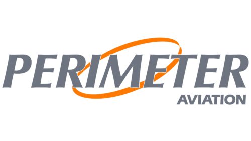
Perimeter Aviation is a local airline serving two Canadian provinces. The airline’s emblem features an orange oval ring, symbolizing unity and stability. This slightly sloping ellipse conveys innovation, forward motion, and dynamism. The emblem stands out due to its vibrant orange color.
In the foreground, the brand name is displayed in gray and split into two lines. Both words are right-aligned and bold, with “PERIMETER” significantly larger than “AVIATION.” The orange ellipse exudes warmth and optimism, qualities favorable for a local airline focused on connecting communities. The gray text provides a subtle contrast, highlighting simplicity and reliability. The different sizes of “PERIMETER” and “AVIATION” emphasize the airline’s specific focus on serving a particular region.
The vibrant orange ellipse symbolizes energy and forward-thinking. Its sloping orientation adds a sense of movement and progress, aligning with aviation’s dynamic nature. The bold gray text stands out, reinforcing solidity and trustworthiness.
The right alignment of the text creates a clean and modern look, ensuring visual balance. Using bold typography for both words signifies strength and confidence, crucial traits for an airline. The larger size of “PERIMETER” draws focus to the airline’s primary area of operation, while “AVIATION” subtly reinforces its industry.


