


 Perplexity Logo PNG
The Perplexity logo is a strict, stylish, and business-oriented representation of the innovative artificial intelligence system and its developers. A stylized book is at the heart of the logo, its pages fanned 360 degrees. This design element symbolizes the smart search engine’s access to many information sources.
Perplexity AI was founded in August 2022 by Johnny Ho, Andy Conway, Denis Yakovenko, and Aravind Srinivas. The company appeared during a period when users were beginning to question the limits of classic search engines. Instead of sending people through pages of links, the founders wanted a system that could understand a question, read the available material, and return a direct answer in natural language.
The founding team brought experience from major technology companies. Srinivas had worked with language models at OpenAI, which shaped the early product vision. Yakovenko contributed machine learning experience from Uber and Google. Conway brought operational knowledge from Facebook (later Meta), while Ho focused on product and business direction.
During its first months, Perplexity focused on the product’s technical foundation. The team built a search system that could process large amounts of data, understand context, and answer complex questions in a conversational format. In December 2022, the company released its first AI-powered search engine, positioning it as a cleaner alternative to traditional web search.
In early 2023, Perplexity improved its algorithms, expanded its knowledge base, and made source links one of the product’s main features. That allowed users to verify answers and continue research from the original materials. In March 2023, the company raised $25.6 million in Series A funding led by NEA, with support from Databricks Ventures, Nat Friedman, Tobias Lütke, and other investors. Through 2023, it hired AI, machine learning, and natural language specialists while building a broader user base.
Meaning and History
What is Perplexity?
Perplexity is a software company that also offers an AI-powered dialog search system and a chatbot for user interaction. It’s a direct competitor to Google’s ChatGPT, but unlike ChatGPT, it provides short, clear answers to questions and offers links to sources. The brand entered the online space in 2022.
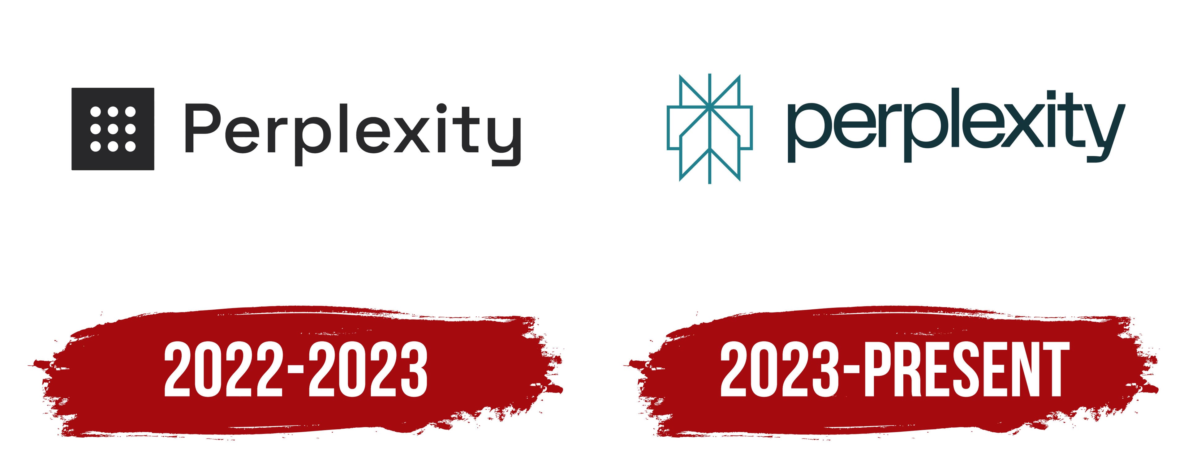
2022 – 2023
The first logo is simple, but within its simplicity lies deep meaning and symbolism. The main element that catches the eye is a square with nine dots arranged in three rows. At first glance, it’s a minimalist design, but behind it lies the idea of order and structure, which perfectly reflects the brand’s essence: focused on data processing and finding solutions in the world of information.
These nine dots can be associated with cells that break down data, illustrating how the company dissects complex information and turns it into clear, accessible results for users. The grid-like design hints at the algorithms at work within the system, organizing everything systematically and bringing order to what was once a state of confusion.
The brand name font is lowercase, making the brand feel more approachable and accessible. The lines of the letters are sharp and smooth, adding a sense of modernity and technological sophistication. In contrast to the icon, the letters appear calm and balanced, emphasizing the system’s reliability and ability to provide precise answers.
Black is a classic choice, symbolizing professionalism and stability. The logo conveys that this is a serious company focused on delivering precise, high-quality results quickly and without unnecessary complexity.
In the end, Perplexity’s visual mark communicates the company’s core mission: to simplify the complex. The simple shape, minimalist style, and clean lines emphasize the brand’s professionalism, reliability, and technological strength, making difficult tasks accessible to everyone.
2023 – today
The Perplexity logo looks fresh and modern while conveying important meanings. The icon and the text are turquoise, and the bright shade and deep tone create an interesting visual contrast.
The first thing that stands out is the symbol to the left of the name. At first glance, it resembles an open book, with pages fanning out in a 360-degree spread. The open book symbolizes the accessibility of information and the ability to process it from various angles, a key element for a brand that deals with artificial intelligence and data analysis. This symbol represents complete transparency and unlimited access to knowledge.
The turquoise color used in the logo is not accidental. This color is associated with clarity of thought and effective communication. It emphasizes that the system is intelligent, well-organized, and capable of delivering results clearly and efficiently. The darker shade of turquoise in the text adds a sense of reliability and professionalism, signaling that the technology is not only cutting-edge but also secure and stable, something you can trust.
All the letters in “perplexity” are lowercase, making the brand feel more approachable and user-friendly. At the same time, the letters are styled clean and precise, with no unnecessary embellishments, adding a sense of accuracy and professionalism. The combination of rounded and angular elements carries a message: the system is both user-friendly and precise, combining simplicity for the user with powerful technology behind the scenes.
In an era when companies strive to showcase their ability to process and analyze vast amounts of data, the company has sought to reflect this in its logo. It conveys that their AI “knows how to calculate” and works with data as if studying it from every angle, identifying the key points, and creating a clear picture for the user.