


 Persona 5 Logo PNG
This role-playing video game associates the Persona 5 logo with accurate calculation, as the letter “P” and the number “5” are harmoniously combined. The full name is also included because the information is easier to remember visually, and gamers tend to focus on details. The brilliant background is not forgotten either: it is provided by the block “R” with shining stars.
Persona 5 is the title of a role-playing video game created with the support of producer Katsura Hashino. It is based on a screenplay by Shinji Yamamoto, Yuichiro Tanaka, and Katsura Hashino. The images were created by Masayoshi Suto and Shigenori Soejima and designed by Naoya Maeda. Yujiro Kosaka did the programming. As a result, the game became the sixth installment in the eponymous series and part of the Megami Tensei franchise. It was released in 2016 for the PlayStation, published by Atlus and Deep Silver. The first was introduced in Japan and North America, and the second was introduced in Europe and Australia.
Persona 5 takes place in Tokyo. At the center of the action is a teenager operating under the pseudonym Joker. He is a high school student who transferred to a new school on probation due to a false assault charge. During his studies, other characters join him, forming the secret society known as the Phantom Thieves of Hearts. Its participants work together to eliminate injustice, explore the supernatural world, and reveal the evil intentions hidden in others’ hearts.
As in the rest of the franchise, the protagonists confront the enemies, fighting the Shadows. To do this, they use the abilities of their psyche and individual physical manifestations. The video game features dungeon-crawl scenes, role-playing situations, and social-simulation episodes. The images of the characters included in the group are based on the literary prototypes of rebels and criminals.
Meaning and History
Persona 5 received critical acclaim and several awards for Best Music, Story, Gameplay, Artwork, and Visuals. Additionally, it is widely regarded as the greatest role-playing game of all time and is the best-selling game in the world. Today’s video game logo is highly recognizable because it belongs to a widespread franchise. The abbreviation was chosen as its basis.
What is Persona 5?
Persona 5 is a Japanese role-playing video game about a high school student nicknamed the Joker who has assembled a secret group, the Phantom Thieves of Hearts. Its representatives fight against injustice and evil. The script was written by Shinji Yamamoto, Yuichiro Tanaka, and Katsura Hashino. Masayoshi Suto and Shigenori Soejima drew the characters, animated by Yujiro Kosaka, designed by Naoya Maeda, and produced by the Katsura Hashino team. The game’s release date is 2016.
2016

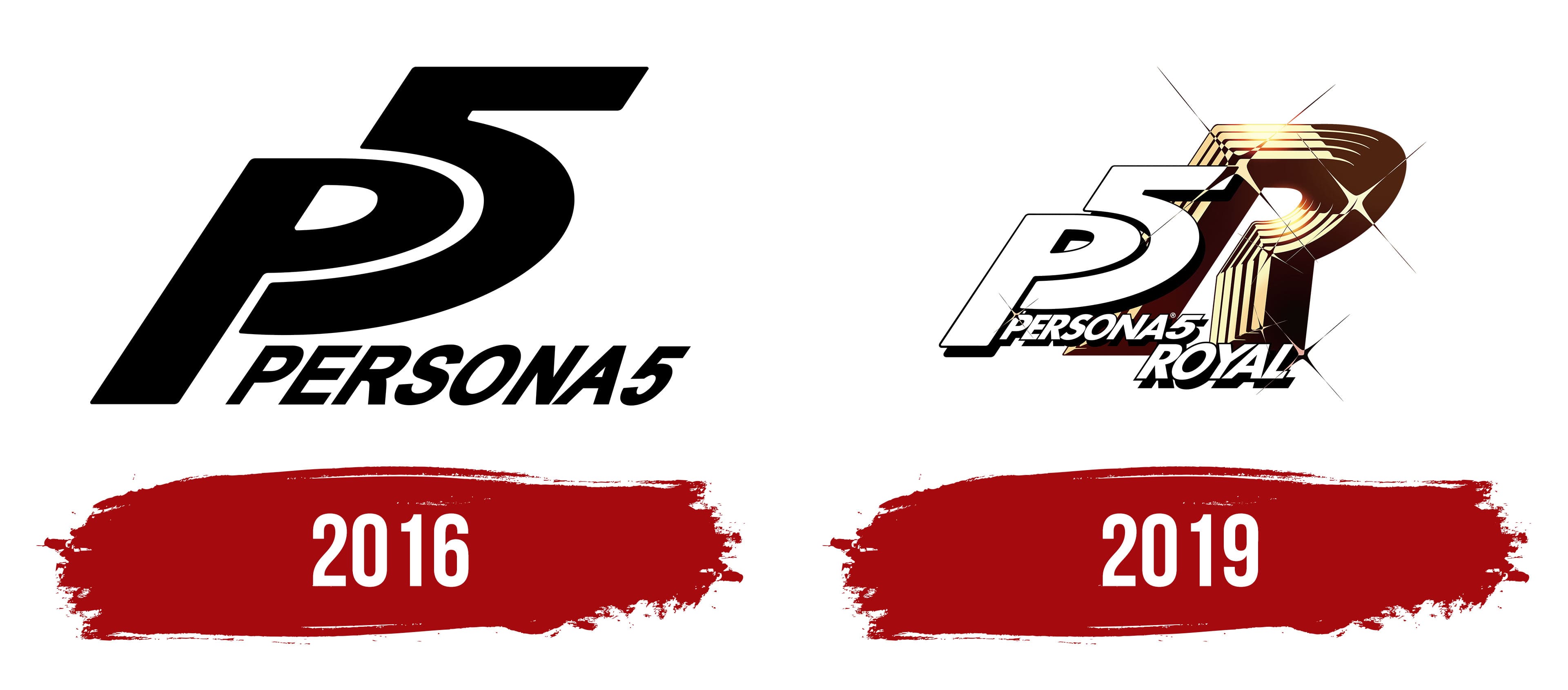
The video game logo is monochrome, featuring a black inscription on a white background with no borders. The central element is the first letter of the name and the ordinal number, denoting the version number. They are typed in italics, so they look slanted. Thanks to a successful design technique, the “P” is perfectly aligned with the “5”: the glyph’s arched ledge fits into the numeral’s recess. The full name is “Persona5”. It is located in uppercase and tilted.
2019
The next version of the logo includes elements already familiar to everyone: italic “P5” and “Persona5”. They are written together. And they have the same font as in the previous case. However, there are now two additions: the word “Royal,” decorated in a similar style, and the letter “R.” It is very large, sparkling, and open, as a small gap is visible between the right and left segments. The golden-brown glyph comprises several layers, each slightly thinner than the previous, resulting in a “ladder” structure. The symbol’s color is non-uniform, with a gradient, a highlight at the top, and shadows on the right. In places of bright glow, four-pointed stars with sharp rays are drawn.
Font and Colors

The evolution of the Persona 5 logo is minor in both quantity and style. The only changes were in color: in the second case, the inscription “P5” is surrounded by a thin black stripe and left hollow inside. Emphasis is placed on the letter “R” to distinguish the new video game version of the same name, which features several additional characters.
The designers chose a simple, sleek sans-serif typeface for the franchise logo. The letters are oblique, chopped, and geometric in style. “P5” and “R” have wide legs, while “Persona5” and “Royal” have narrow legs. The logo palette is restrained, consisting of black, white, and gold with a subtle gradient.