


![]() PetSmart Logo PNG
PetSmart Logo PNG
The designers made the PetSmart logo bright and friendly to match the cheerful mood of the pets for whom the company produces food, medicine, toys, and various accessories. The logo hints at the restless dogs and aquarium fish, but their association is only associative, without using obvious images.
The PetSmart brand is a private chain of stores that sells everything for keeping pets, including small animals. This company also offers services for the care, accommodation, treatment, and training of dogs and cats. It appeared in 1986 and, by 2020, had over 1,650 outlets in the United States, Puerto Rico, and Canada. Its head office is located in Phoenix, Arizona. The founders of the brand are Jim and Janice Dougherty.
In the early 1980s, Dougherty merchants decided to open a warehouse-type store to sell pet food. Phillips-Van Heusen Corporation helped them to realize the idea. As a result, two supermarkets opened in their hometown of Phoenix, where those who wished could buy necessary goods at wholesale prices and at reduced prices, a novelty at the time. The outlets were named PetFood Warehouse. This event is dated 1987.
After 12 months, entrepreneurs founded five more stores, covering services in Arizona, Colorado, and Texas. At the same time, the network owners announced cooperation with representatives of animal protection organizations. Together, they raised funds to support them and sought owners for homeless pets. That is why the simple emblem of this network attracted the attention of many who are not indifferent.
In 1989, the brand changed its name to PetSmart and embarked on a long-term transition from visually obscure warehouses to attractive supermarkets. In parallel, she concentrated on pet overexposure and treatment. Another major shift in her work occurred in 2005. To avoid competition, the company switched to comprehensive dog care, training, and advanced veterinary care.
Meaning and History
![]()
Each stage of change was directly reflected in PetSmart’s visual identity. At first, the brand had a simple, text-only informational logo. Then it became more attractive and better suited for advertising, making it very convenient for a store sign. In the early 2000s, when the chain refocused on animal owners who considered their pets part of the family, it adopted a friendly emblem. She has five in total.
What is PetSmart?
PetSmart is an American supermarket chain that sells everything for pet care. Its main directions are assisting with the selection of pets, the maintenance, training, and treatment of cats and dogs, and the sale of small animals. The first store was opened in 1986. Its founders are Jim and Janice Dougherty. The headquarters is located in Phoenix, Arizona.
1986 – 1988
![]()
The debut logo is a gray rectangle with a black inscription divided into two lines. At the top is the phrase “Pet Food,” and at the bottom – “Warehouse Ltd.” They share a common style and font. All letters are bold and large, with roundings and miniature serifs. The intercharacter spacing is minimal, so the characters almost touch each other.
1988 – 1989
![]()
After the rebrand, the pet food brand owners decided to redesign their products. As a result, a new inscription appeared on the emblem, consisting of three parts. On the left is the word “Pets.” It is the largest and is made in the grotesque. To its right are two lines: at the top, “Mart” is typed, and at the bottom, “Petfoods.” The second word is a fusion of two bases separated in the previous version of the logo. It is placed in a bone contour, usually in dogs. The background of all elements is a light gray rectangle.
1989 – 1992
![]()
Color has appeared in this logo: red is predominant, and blue is additional. In addition, the designers have shifted the emphasis to writing the chain’s name, using the “PETsMART” option. The basic emphasis is on “s”: it is the smallest. Graphically, the size of this letter is played up by the impact of the ball, which, having hit it, flies up. Curved lines convey the trajectory of its flight. The wavy line makes the characters appear to jump, but they are even and smooth. The letters now have right angles, which was not the case before.
1992 – 2005
![]()
The ball is still above the “M,” but the “S” it bounced off is slightly larger than in the previous version. This is the only design change.
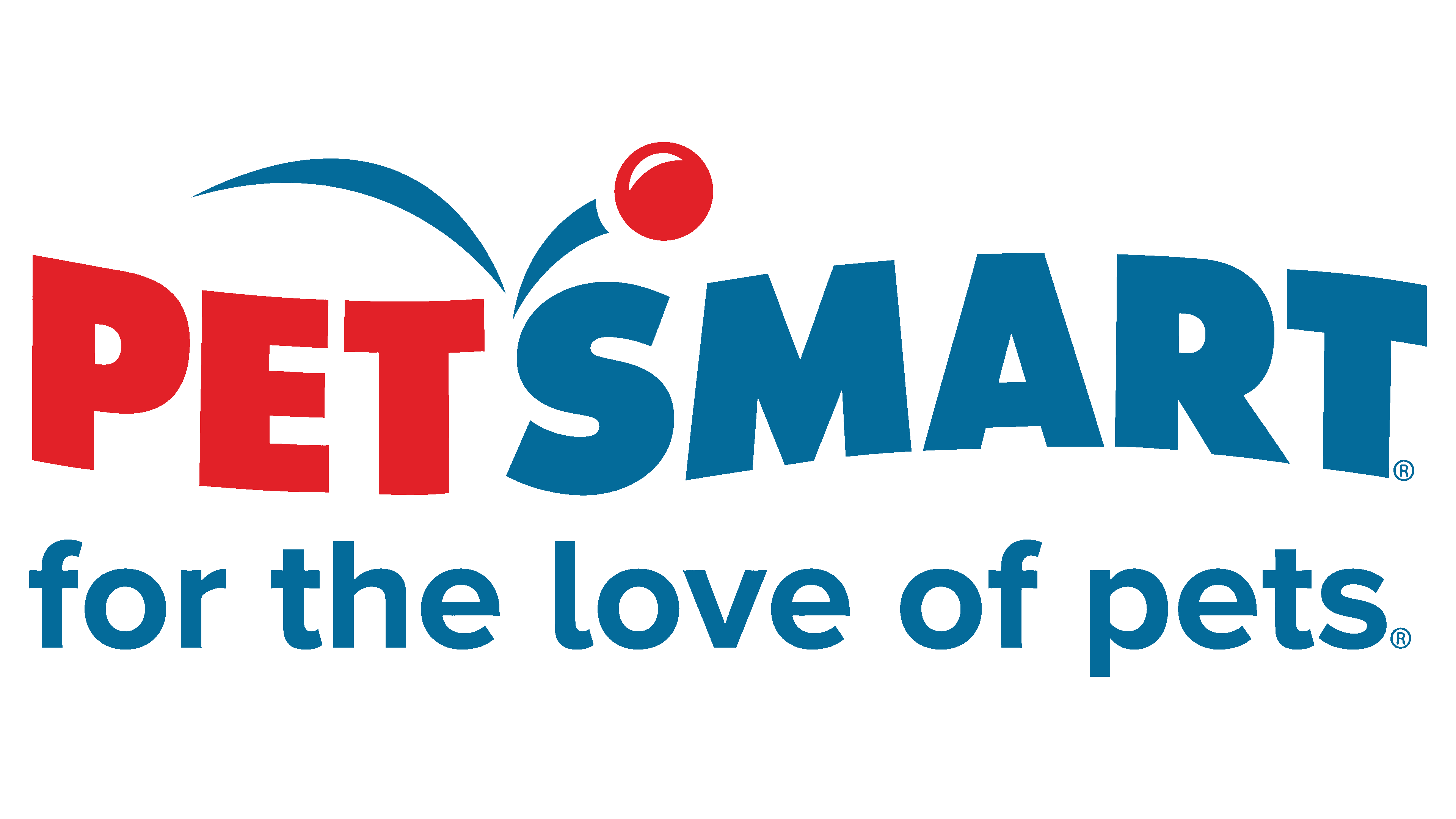
2005 – today
![]()
The logo’s basis is a rethought phrase. Now, it is ungrouped into parts a little differently than before. The first segment is “Pet,” and the second is “Smart.” Each word is indicated by a specific color: blue and red. The separator is also the ball’s flight path, depicted by two curved strokes; its angle lies between “T” and “S.”
Font and Colors
Until 1989, the inscription in the PetSmart logo was strictly horizontal. Then it took a curve, becoming more of an arc. Until 2005, the wave-like form of words was larger; now, it is smaller.

The current version of the logo uses the Futura ExtraBlack typeface. It was not specifically created for this emblem but originated in 1927 and was designed by Paul Renner. This is a sleek, grotesque form from the New Frankfurt project. Its geometric shapes have become design elements of the Bauhaus. The brand’s corporate palette consists of two colors: blue and red.