The primary motifs conveyed in this emblem are the radiance of sports, mastery, and victory. Designers proposed a logo for the Phoenix Suns that directly speaks to what they do: basketball that shines like the sun. It also contains hidden dynamics, propelling athletes to new heights to shine in the professional firmament.
Phoenix Suns: Brand overview
| Founded: | 1968 |
| Founder: | Robert Sarver |
| Headquarters: | Phoenix, Arizona, U.S. |
| Website: | nba.com |
Compared to the flamboyant biographies of their division neighbors, the history of the “Phoenix” sounds quite prosaic. The Phoenix Suns club was established in 1968 in Phoenix, Arizona. That same year, as part of an expansion, it joined the National Basketball Association.
To devise a name for the club, “The Arizona Republic” newspaper in Phoenix organized a team naming contest – “Name the Team.” The winner of the contest was promised $1,000 and a season pass to the team’s home games. Suns scored more points among names such as Scorpions, Rattlers, Thunderbirds, Wranglers, Mavericks, Tumbleweeds, Mustangs, and Cougars. Firstly, this choice was due to Arizona being one of the sunniest states in the USA. Secondly, the name Suns is symbolic because the Arizona flag depicts a star representing the Sun, from which red and yellow stripes emanate like sunlight.
Interestingly, when the team needed to create and develop a logo, the management paid only $200. The Phoenix Suns emblem was created and designed in a print shop in Tucson, Arizona. But before this, the club bosses shelled out $5,000 for the design of a logo by a local artist. However, the team was disappointed with the result and rejected his services. They then turned to the Tucson print shop.
The purple-orange colors, taken in the first season, have remained in the form of the sun. Only in the era of Charles Barkley did designers add black, and in the era of Steve Nash, it was gray. There was also an alternative emblem containing the image of a Phoenix rising from the flames and abbreviations.
The mascot for the “Phoenix Suns” is the gorilla “Suns.”
Meaning and History
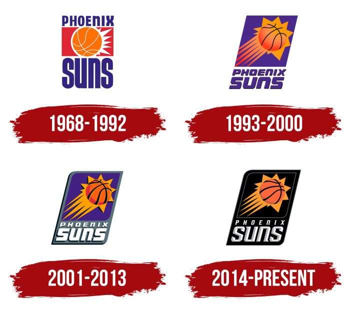
Over 50 years of existence, the Phoenix Suns team has changed four logos. The first version became the basis for all subsequent ones: designers retained the arrangement of elements, only changing the palette and nuances of design. In this respect, the club turned out to be one of the most conservative in the NBA.
What is Phoenix Suns?
The “Phoenix Suns” is the only Pacific Division (NBA) team based outside California. It represents “Phoenix,” and its home stadium is the “Footprint Center.” The franchise appeared in 1968 and has always been known by the same name.
1968 – 1992
In 1968, a new basketball team named Phoenix Suns was born in Phoenix, Arizona. The original Phoenix Suns logo was developed by Stan Fabe, owner of a print shop in Tucson. The club’s management valued the result of his work at $200. The designer placed a red rectangle in the center, depicting the sun as an orange basketball with white rays emanating from the right side. Above the quadrilateral was a blue inscription “PHOENIX,” and on the opposite side was “SUNS.”
1993 – 2000
After nearly a quarter of a century, the team’s management decided to redesign. The development of the new format was entrusted to artist O’Grady, who changed the Phoenix Suns emblem, surrounding the ball with curved rays and adding a tail to the improvised sun. He also turned the red rectangle into a purple parallelogram and moved the word “PHOENIX” down, highlighting it in italics. The modernization process took about six months.
2001 – 2013
In 2001, logo designers placed all elements inside a large gray parallelogram, selectively rounding the corners of the quadrilaterals. They repainted the phrase “PHOENIX SUNS” white, adding black shadows to the letters. The same shadows, but reddish-brown, appeared on the ball, which became more noticeable due to wide black seams. The sun’s tail turned entirely orange: the artists removed the pink gradient from the rays.
2014 – present
Five years ago, the last change to the club’s logo in Arizona occurred. The creators practically didn’t correct anything. On the contrary, they returned to some standards of previous years. In the club’s latest emblem, both parallelograms are black. They are separated only by a thin silver line, which marks the boundary of the inner quadrilateral. The ball acquired a uniform color because the light glints disappeared – only the dark shadows on the left edge remained. The most noticeable change is the font: the developers made the letters voluminous and adorned them with serifs.
Phoenix Suns: Interesting Facts
The Phoenix Suns basketball team started in 1968 and quickly made a name for themselves. They’re known for exciting games, great players, and unforgettable moments.
- First Year: Right from their start in 1968, the Suns played hard. They won 16 games in their first season, showing they were ready to compete.
- 1976 NBA Finals: The Suns made it to the NBA Finals just eight years in. They didn’t win, but one of their games went to triple overtime and is remembered as one of the best games ever.
- “Sunderella” Suns: In 1976, nobody expected the Suns to do so well. Their journey to the Finals was so surprising they were called “Sunderella Suns.”
- Charles Barkley’s Big Year: In 1993, Charles Barkley helped the Suns have their best season and took them to the Finals. He was also named the most valuable player of the year.
- Fast Basketball: In the 2000s, coach Mike D’Antoni and player Steve Nash introduced a quick way of playing that scored many points and changed how basketball is played today.
- Goran Dragić’s Big Game: On February 8, 2014, Goran Dragić scored 40 points in one game, a first for a player from Slovenia.
- The First Mascot: The Suns’ mascot, The Gorilla, started in 1980 and was the first official mascot in the NBA. He’s well-loved by fans everywhere.
- Triple Overtime Game in 1993: In the NBA Finals against the Chicago Bulls, the Suns won a game that went to triple overtime. It was only the second game like this in Finals history.
- Ring of Honor: The Suns honor their best players and important people in the team’s history at their arena, including Charles Barkley and Steve Nash.
- 2021 NBA Finals: With coach Monty Williams and players Devin Booker and Chris Paul, the Suns reached the Finals for the first time since 1993, exciting their fans.
- Helping the Community: The Suns help out in their community a lot through the Phoenix Suns Charities, which started in 1988. They focus on helping kids and families in Arizona.
- Cool Courts: The Suns like to change up their court’s look, including a black design to match their “The Valley” uniforms, showing pride in Arizona.
These points show how the Phoenix Suns have been a big part of basketball, known for their strong spirit, great games, and helping their community.
Font and Colors
The main sign of the Phoenix Suns is the sun, representing a basketball with zigzag rays. Until 1992, it looked quite modest: the rays were white, short, and located only on the right side. Then, designer O’Grady lengthened the lines and rotated the ball to create a sensation of flight.
As envisioned by the team’s leaders, this was to become an allegorical illustration of the rising sun. The drawing style changed several times: over time, shadows and highlights appeared, allowing for a three-dimensional effect.
All Phoenix Suns logos are handcrafted by artists and do not use standard fonts. But the symbols resemble a modified font from the SF TransRobotics family, created by ShyFonts. In the latest version, the letters have italics and serifs. The word “SUNS” looks particularly futuristic due to the light-gray shadows. The primary color of the inscription is white. It contrasts with the black background, orange ball, and golden rays.
Phoenix Suns color codes
| Purple | Hex color: | #1d1160 |
|---|---|---|
| RGB: | 29 17 96 | |
| CMYK: | 98 100 0 43 | |
| Pantone: | PMS 275 C |
| Orange | Hex color: | #e56020 |
|---|---|---|
| RGB: | 229 96 32 | |
| CMYK: | 0 75 100 5 | |
| Pantone: | PMS 159 C |
| Black | Hex color: | #000000 |
|---|---|---|
| RGB: | 6 25 34 | |
| CMYK: | 30 0 0 100 | |
| Pantone: | PMS Black C |
| Gray | Hex color: | #63727a |
|---|---|---|
| RGB: | 99 113 122 | |
| CMYK: | 15 0 0 65 | |
| Pantone: | PMS 431 C |
| Yellow | Hex color: | #f9a01b |
|---|---|---|
| RGB: | 249 160 27 | |
| CMYK: | 0 43 100 0 | |
| Pantone: | PMS 137 C |
| Dark Orange | Hex color: | #b95915 |
|---|---|---|
| RGB: | 185 89 21 | |
| CMYK: | 0 67 100 28 | |
| Pantone: | PMS 1675 C |
| Light Gray | Hex color: | #bec0c2 |
|---|---|---|
| RGB: | 190 192 194 | |
| CMYK: | 0 0 0 29 | |
| Pantone: | PMS Cool Gray 5 C |
FAQ
What is the current Phoenix Suns logo?
The current Phoenix Suns logo, which began to be used in the 2013-2014 season, is a black parallelogram with two rounded corners. It features the same parallelogram but smaller – an area divided by a silvery frame. Inside is a flying basketball with a halo resembling a comet. Below, in slanted white letters, is written PHOENIX SUNS.
When did the “Phoenix Suns” change their logo?
The Phoenix Suns team decided to change the logo design for the 2013-2014 season. They kept the shape and arrangement of elements but changed the font and colors.
How many logos have the “Phoenix Suns” had?
Throughout its history, the “Phoenix Suns” has had four logos. The first appeared in 1968, the second in 1993, the third in 2001, and the fourth in 2014.
What colors are the “Phoenix Suns” logo?
The base of the logo is black (#000000), the basketball is orange (#E56020), the shadows on the ball are dark orange (#B95915), and the surrounding halo is yellow (#F9AD1B). Regarding the inscription, the letters are two-toned: half light-gray (#BEC0C2) and half white (#FFFFFF).


