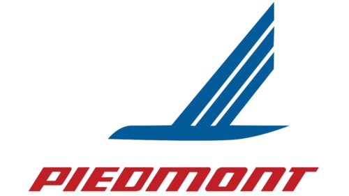
The Piedmont Airlines logo has remained recognizable for decades because it contains its traditional symbols. At the same time, the emblem reflects the brand’s commitment to innovation. It evokes a sense of friendliness and comfort, which is important when choosing an airline.
Piedmont Airlines: Brand overview
With a history spanning more than 70 years, Piedmont Airlines has played a critical role in shaping the American airline industry. From its humble beginnings as Henson Aviation in Hagerstown, Maryland, the company gradually evolved into the iconic Piedmont Airlines.
Richard A. Henson’s vision for Henson Aviation in 1948 laid the foundation for the company’s future success. The company initially focused on charter flights and flight training, but in 1962, it expanded its services to offer scheduled passenger service under the name “Hagerstown Commuter.”
In the late 1960s and early 1970s, Piedmont Airlines embarked on an ambitious expansion plan, acquiring regional carriers such as Britt Airways in 1967 and Empire Airlines in 1985.
The 1987 merger with USAir was a major milestone in Piedmont Airlines’ history. The partnership transformed Piedmont into a wholly owned subsidiary of USAir, raising its status in the industry and opening new opportunities for growth and expansion.
In 1989, following USAir’s rebranding to US Airways, Piedmont Airlines became part of the US Airways Express brand.
The 2013 US Airways and American Airlines merger formed the American Airlines Group, of which Piedmont Airlines became a wholly-owned subsidiary.
Meaning and History
What is Piedmont Airlines?
Founded in 1931, Piedmont Airlines started from humble beginnings. Originally known as Henson Flying Service, a fixed-base operator based in Hagerstown, Maryland, the airline has grown significantly to become a major regional operator in the United States. Now headquartered in Salisbury, Maryland, the airline is part of the renowned American Airlines Group and operates under the American Eagle brand.
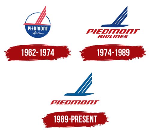
1962 – 1974
The most recognizable symbol of Piedmont Airlines is a bird formed by simple geometric shapes. Three diagonal lines of different lengths create the wing, and one horizontal stripe represents the body, head, and tail. This primitive design is easily understood by people from various linguistic and cultural backgrounds, making the logo universally and globally comprehensible.
The minimalist style conveys accessibility, reliability, and stability, instilling trust in the airline’s customers. The abstract bird silhouette resembles a flying airplane, aligning the emblem with the aviation industry. The red color adds dynamism, highlighting the carrier’s activity and drive for growth. It catches the eye, ensuring that Piedmont Airlines remains visible.
The bird plane flies against a circular background, symbolizing the sun, which stands for optimism, joy, and vitality. In navigation, the sun is often used as a guide, emphasizing the airline’s ability to transport passengers along desired routes. The emblem designers depicted a stylized interpretation of the sun rather than a classical one. The circle is divided into two halves:
- A white top with a blue outline
- A blue bottom with the white inscription “PIEDMONT Airlines.”
The text uses different fonts with no commonality. The first word is in a confident, bold, grotesque font with rounded corners, while the second is in a cursive script with thin, pointed lines. This visual contrast showcases the company’s versatility and flexibility, highlighting its readiness to adapt to modern demands.
The circle, a symbol of infinity and cyclicity, indicates the carrier’s continuous operation and stability. It is associated with the globe, emphasizing Piedmont Airlines’ global presence. The blue color, traditionally linked with the sky and sea, enhances the sense of global reach.
1974 – 1989
The stylized bird now resembles a boat with raised oars due to the significant changes in its shape. The horizontal part of the design is noticeably thickened, resembling a sharp blade. The three diagonal feathers have uniform, straight cuts at the ends.
The new emblem still symbolizes an airplane but appears more dynamic than the previous version. Sharp angles and smooth curves make the design visually active. The asymmetry gives the image a sense of acceleration, which is associated with rapid flight.
The abstract bird is now dark blue, symbolizing the sky while conveying the airline’s reliability, professionalism, and stability. To balance its static calmness, designers added another color—red. This color conveys the energy that helps Piedmont Airlines grow, expand its route network, and offer passengers comfortable travel conditions.
Red is used exclusively for the brand name, highlighting its expression. The slanted letters with wide diagonal strokes harmonize with the shape of the abstract bird. This font style evokes a sense of confidence, strength, and stability, overcoming the usual perception of italics as unstable. The company successfully addresses this stereotype.
1989 – today
The Piedmont Airlines logo has a unique design that identifies the airline. It features four blue stripes of varying widths, resembling a bird in flight. This image conveys movement, lightness, and the ability to navigate the air. The stripes are staggered, with the right edges cut precisely. The fourth stripe is larger and pointed at both ends, enhancing the dynamic feel. Below the symbol, the company name appears in red geometric italicized letters, balancing rounded and straight edges.
The blue stripes symbolize the sky and trust, which are important aspects of the aviation industry. Their arrangement and varying widths suggest aerodynamics and motion. The red lettering of the company name creates a striking contrast, drawing attention and emphasizing the brand’s presence. The geometric, italicized font speaks to modernity and dynamism, aligning with contemporary design principles. This color and style choice appeals to the general public and aviation professionals, ensuring broad recognition and relevance.
The overall design reflects the airline’s core values and industry standards. The blue stripes convey trustworthiness and reliability. The red geometric lettering adds energy and innovation, making the logo eye-catching and memorable. Combining abstract and geometric elements enhances the visual appeal, effectively communicating the airline’s identity and mission.
The Piedmont Airlines logo represents the brand well. It combines movement, trust, and modernity to create a distinctive image. The design is visually appealing and meaningful, making it an effective symbol for the airline.
