



Founded in 1916, Piraeus Bank has long been a major player in the Greek financial system. With the largest distribution network in Greece, it is the nation’s top bank, offering a wide range of financial products and services to about 6 million customers. The bank has unveiled a new corporate identity that reflects innovation, client service, and economic growth, as part of its continued commitment to supporting the Greek economy.
The updated logo preserves the original’s essence while adding contemporary elements that represent advancement and forward motion. The three stripes from the old logo, symbolizing boat oars and emphasizing Piraeus’ importance as a port city, have been retained but redesigned. The stripes now tilt forward, suggesting movement and progress. The spiky serifs in the stripes repeat in the wordmark, creating a unified visual language.
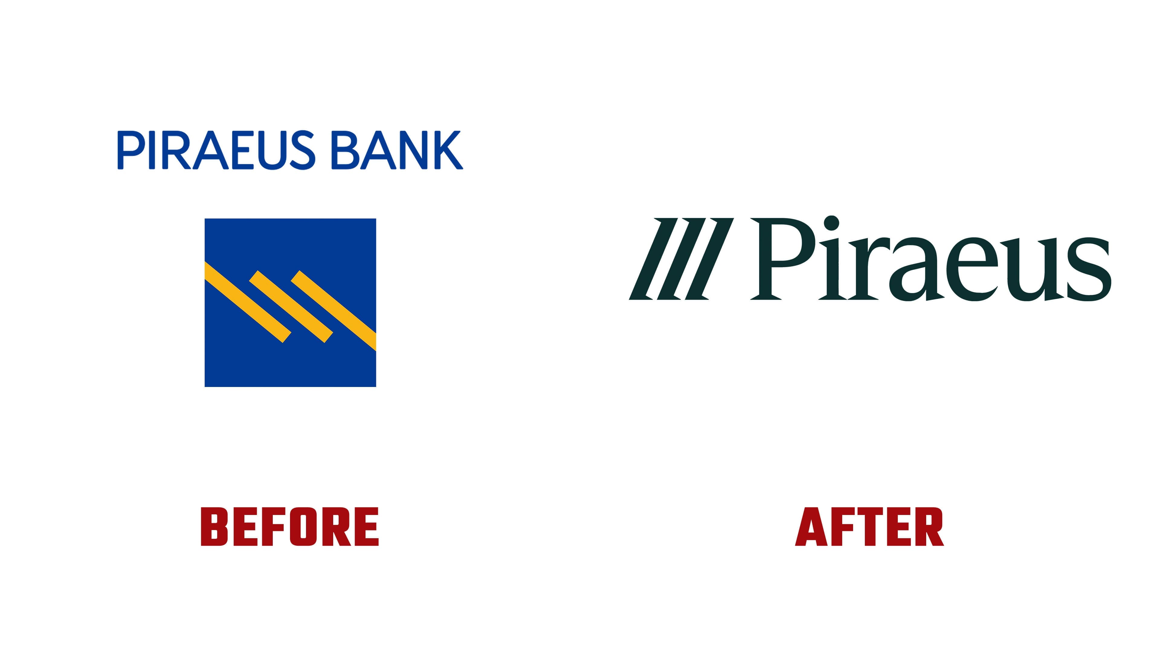
Although the updated logo is sophisticated and modern, it may not feel appropriate for a financial company. The new emblem is more open and abstract than the more conventional emblems of banks like Chase or HSBC, which often include a shield or holding shape. This design decision pays homage to the bank’s past while highlighting its dedication to innovation and modernity.
The new identity is built on a flexible font family that supports the Latin and Greek alphabets and includes both serif and sans-serif styles. This type family reinforces the bank’s solid foundation and ensures consistency across all communications. The new branding uses this family to emphasize the bank’s flexibility and ability to serve a wide range of clients.

The new brand identity heavily relies on illustrations influenced by the popular Corporate Memphis aesthetic. These illustrations are masterfully done and highlight the best features of this visual method. They add a human touch, making the brand feel more approachable and relatable. Another unique feature is the speech-bubble motif, inspired by the logo’s spiky serifs. This motif appears subtly across applications, giving the overall design a lighthearted yet polished feel.
The new identity’s color scheme is chic and contemporary. Its taupe backgrounds provide a soothing, neutral foundation for subtle yellow and broad blue-green accents. Together, these hues give the brand a lively, energetic feel while projecting a trustworthy, professional image.
The updated branding is used across various media, including printed materials, online resources, and physical locations. The layouts are neat and professionally done, focusing on how the graphics and logo work together. Some layouts combine silhouetted illustrations with an enlarged icon to create a visually striking, captivating effect.
The bank has taken a significant step forward with its new identity. It skillfully balances a serious, professional appearance with a lighthearted touch that humanizes the company. Striking this balance is essential for a financial institution to instill client trust and show it is not a faceless, impersonal organization.
The new brand identity positions the bank strongly for the future by adopting contemporary design concepts while staying true to its historical roots. The updated logo, adaptable font family, elegant color scheme, and captivating graphics create a unified, compelling brand image. The bank’s new brand reflects its current goals and principles and sets the stage for future expansion and success.