The desire to take care of all the automotive industry’s products merged with the Pirelli logo. The fact is that Pirelli chose the emblem with an elongated “P,” the upper part of which goes beyond the traditional framework and reaches the end of the name. So it covers the entire inscription as if the letters are under a makeshift roof representing security.
Pirelli: Brand overview
| Founded: | 1872 |
| Founder: | Giovanni Battista Pirelli |
| Headquarters: | Milan, Italy |
| Website: | pirelli.com |
Pirelli is the Italian leader in the global tire industry with a 150-year history. The company has 15,000 distributors in 160 countries. The concern’s profit is over 42 million. The Pirelli logo is a symbol of constancy and reliability. Since 2015, the main owner of the brand has been the Chinese concern China National Chemical Corp.
Since 1872, the Giovanni Pirelli company has been producing rubber products, then cables, glasses, clothing, investing in real estate, and the Internet. The concern focused only on tires in 2010. And in 2015, it was sold to Chinese investors for 7.1 billion euros. Offers products for cars, bicycles, and motorcycles, sponsors racing, football, and hockey competitions.
Meaning and History
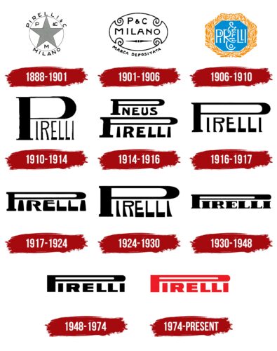
Pirelli is one of those brands that changes its logo regularly. Some options lasted no more than 1-2 years. The visual sign is a reflection of the enthusiastic spirit of the owners, who knew how to find profit in any direction they took. Interestingly, the very idea of the logo remained constant for many years. The changes concerned only the thickness, duration of the lines, and color.
What is Pirelli?
A major tire concern headquartered in Milan. Products are manufactured at 19 factories and distributed in Europe, North and Latin America, the former USSR, and the Asia-Pacific region.
1888 – 1901
Pirelli was a chemist and trained in rubber technology. Starting with various rubber products, by 1888, he, along with his assistants, was able to develop and patent (1894) a unique durable compound from which bicycle tires were made.
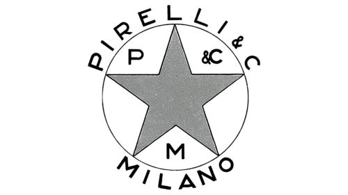
All company products were marked with a special round logo resembling a brand. It consisted of a circle with a thin rim, hinting at wheel products. In the center was a star – a symbol of leadership and excellent quality. Between its rays, the first letters of the name of the company and the city of the foundation are Pirelli & C and Milano. The same words were written outside the circle. The choice shows that Giovanni was very proud of his homeland. In addition, he needed to distinguish his products from competitors. And for the logo, the main points that the buyer had to remember were used: Pirelli from Milan makes tires of the best quality.
1901 – 1906
The company begins to spread around the world. By 1902, the first factory outside of Italy (in Spain) was built, and a patent for rubber for cars was received.
The logo of the period resembled a wrought-iron sign. If the first version of the emblem was more intended for branding on products, then this one was suitable for fixing over new opening offices.
The oval shape with four scroll-like edges hinted at the company’s patents. In the center is a large Milano inscription, and from the company’s name, only capital letters are on top. Interestingly, the logo emphasized not the Pirelli company but the city where the production appeared. This showed the special patriotism of the owner and perhaps the desire to emphasize abroad that the company is foreign, from Italy. A similar inscription also pointed to the political life of Giovanni, who served as an adviser in his native city and did a lot for its prosperity.
Under the inscription Milano, there is a compass needle looking to the West and East. She demonstrated the spread of the company in different parts of the world.
The logo’s outline was followed by an inscription in Italian: Marca Depositata (registered mark). She personified the owner’s pride that his products are not a handicraft but made using special technologies and patented.
1906 – 1910
In 1904, Giovanni’s two sons, Alberto and Piero, joined the management along with their father. Since 1905, a special company division has been engaged in producing tires for cars and motorcycles. And in 1906, the next factory was opened in Romania. In addition, Pirelli sponsored races and enjoyed team victories with his tires. In this regard, the owner considered it necessary to change the logo. It became the brightest and most colorful in the history of the company.
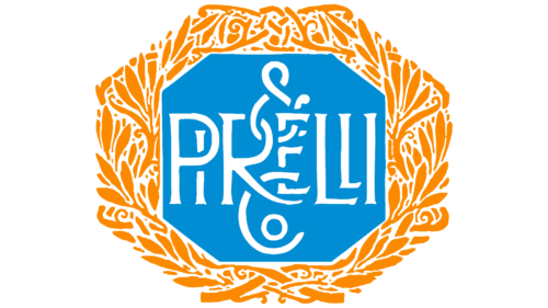
The emblem resembled an award badge, a badge. It consisted of a blue octahedron entwined in a circle with a golden laurel crown. The color scheme showed the fulfillment of desires, victories, and accomplishments. He demonstrated great pride in the achievements of the company.
Inside the blue figure, the name “Pirelli” is written in white monograms. Its central letters are intertwined with the signs & and Co-located above and below the main inscription. Such a composition seemed to be trying to “seal” the castle and keep the company’s luck.
1910 – 1914
A new period begins in the life of the corporation. She sold all other productions and focused entirely on tires. This was reflected in a radical modification of the logo, which became the basis for all subsequent visual signs.
The new symbol did not have much pretentiousness and consisted only of the brand name. Its feature was the shape of the letter P, which, like a shield, covered the rest of the letters. She showed the dominance of the Pirelli headquarters and his patronage of the rest of the branches. It personified the significance and historical value of the surname for the country. After all, Alberto Pirelli took part in many undertakings of the Italian government and was a figure at the international level.
1914 – 1916
The emblem became two-level. The word Pneus was added to the surname a row above – tires. Since the company was engaged in diversified activities and periodically strayed from the main direction, the additional word indicated exactly which branch of the concern in question. The composition created the impression of a pyramid – based on Pirelli, new floor directions are added. However, the company itself is invariably “wider” and more global than just tires.
1916 – 1917
In the new version, only the name of the founder remained. However, the idea of stepping was preserved in the letter E and the dominance of the capital P over all other letters.
1917 – 1924
In the visual sign, the font changes slightly. The letters expand downward as if showing growth on a solid foundation.
1924 – 1930
The font of the emblem was changed again, although the idea of more massive letters at the bottom was preserved.
1930 – 1948
For the inscription, a newspaper font with serifs was used. It is reminiscent of the headline on the front page and represents the corporation’s ability to create news through its developments and victories. Plus, Alberto Pirelli participated in the negotiations for the First World War and then became the company’s vice president. Therefore, the surname flashed in the newspapers very often.
1948 – 1974
The founder’s son Alberto takes over the management of the company. Under his leadership, the corporation sponsors Formula 1 tires, which brings it special fame. New products are being developed. The Pirelli tower is being built on the site of the father’s first factory to perpetuate the name of Pirelli. Another rebranding marked a new era of government.
The font of the inscription has been changed. The serifs are gone. He became straight and fat. The emblem itself has increased in height, and the space inside the letter P has expanded. All this pointed to the growing power of the firm. Her movement is in step with the times and lifting the business to new heights.
1974 – today
In 1971, the founder’s son died, who ran the business with his father and then independently for many years. This was the beginning of the end of the empire. In 1978, the headquarters moved to the building of the second factory, once opened by Giovanni, and the famous skyscraper was sold. A whole era of famous and great people has gone. The company logo has changed. He became brighter.
The letters of the inscription have grown a little. The red color of the name symbolizes a new fire, the appearance of renewed energy to move forward. Marks the beginning of the next period in the history of the company.
Under the direction of the new owners, since 2017, Pirelli has once again focused exclusively on tires. According to the purchase agreement, starting from 2023, the owner will have the right to sell, divide and combine the company’s capacities at his own discretion.
Font and Colors
The main color of the Pirelli logo is black. This is the color of tires, rubber, and asphalt. It also symbolizes market dominance.
The font resembles House Sans Heavy with a modified R.
Pirelli color codes
| Pigment Red | Hex color: | #ee1c24 |
|---|---|---|
| RGB: | 238 28 36 | |
| CMYK: | 0 88 85 7 | |
| Pantone: | PMS Bright Red C |

