


![]() Pittsburgh Panthers Logo PNG
Pittsburgh Panthers Logo PNG
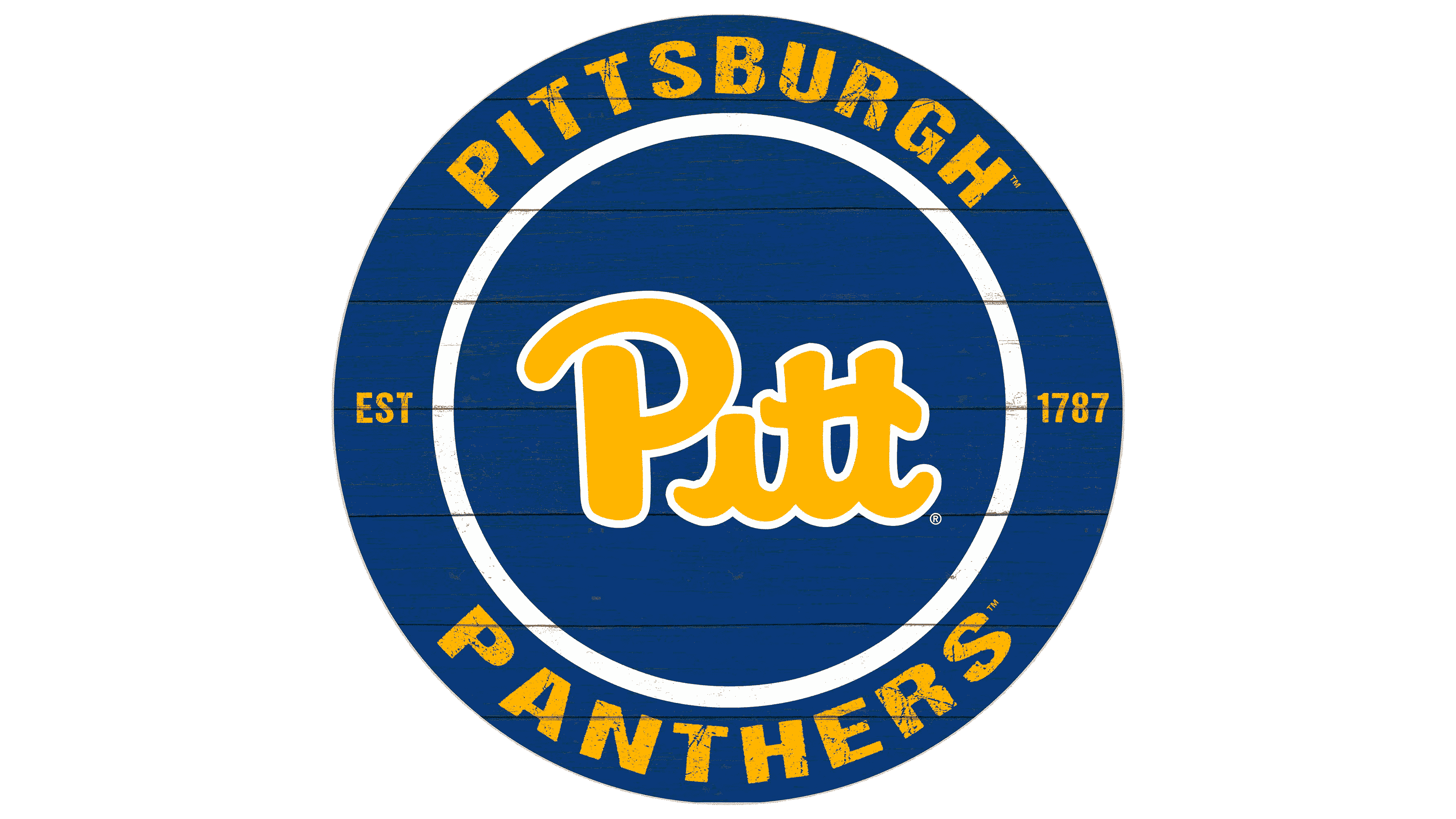
The minimalist logo of the Pittsburgh Panthers does not contain extra details, thus symbolizing the team’s bravery and confidence. It strengthens the connection with the university and its community, emphasizing pride in belonging to this educational institution. The emblem is associated with strength, energy, and activity.
The University of Pittsburgh’s athletic program began in 1869, when students started playing baseball. Football followed in 1889 under coach Alf Hemmet, and basketball was added in 1905. Before the Panthers’ name was adopted, the teams were known as the Wups, a nickname based on the school’s former name, Western University of Pennsylvania, or WUP.
By 1908, Pitt had become a familiar short name for the university’s teams among students and fans. In November 1909, the art editor of the student newspaper selected the panther as the mascot. The animal was associated with Pittsburgh and gave the athletic program a new public identity, leading to the name Pitt Panthers.
In the early 20th century, football became one of Pitt’s main sports under coach Glenn “Pop” Warner, who led the team to several national championships. Basketball developed during the same period under coach “Doc” Carlson, whose team won national championships in 1928 and 1930. Football had another strong period in the 1950s and 1960s under John Michelosen, then won the 1976 national title under Johnny Majors with Tony Dorsett on the roster.
Over the years, Pitt competed in the Big East conference before joining the Atlantic Coast Conference (ACC) in 2013. The university produced athletes such as Dan Marino and Mike Ditka, linking the Panthers to professional football history. Petersen Events Center became part of Pitt basketball culture. At the same time, the old live panther mascot tradition was replaced by Roc, the costumed mascot.
Meaning and History
![]()
The Pittsburgh Panthers teams periodically change their logos to find the right visual image. However, they don’t always succeed: many symbols have been remembered by fans for the wrong reasons. The most controversial was the 1997 emblem, created under director Steve Pederson and unofficially nicknamed Dino Cat. It lasted until 2005, when a brief wordmark replaced it. In 2014, Pederson unexpectedly left his position and was succeeded by Scott Barnes. The new athletic director had to correct his predecessor’s mistakes. He decided to revive the so-called Pitt Script, a logo created in 1973 by order of then-football coach John Terrell Majors. Fans enthusiastically welcomed the return to old traditions.
What is the Pittsburgh Panthers?
The Pittsburgh Panthers represent the University of Pittsburgh in the Atlantic Coast Conference and compete at the NCAA Division I level. According to CBS Sports, they are considered among the best in college sports. They have won numerous championships in football and basketball. Their official colors are gold and blue.
1947 – 1955
![]()
A dark blue panther creeps to the right as if about to attack an opponent. Its menacing snarl indicates readiness to fight to the victorious end. This nods to athletes who demonstrate their strength and bravery during competitions. The artists did not detail the silhouette but added white spots to highlight the claws, teeth, nose, eyes, and ears pressed to the head.
1955 – 1966
![]()
Now, the panther is facing the viewer and looking straight at it. Its back and its paws bulge with muscles, and its tail is raised and curved like a question mark. The animal’s eyes glow a deep yellow. The same color is used for numerous spots covering the dark blue body, which emphasize its disproportionality.
1966 – 1972
![]()
In the late 1960s, the logo featured the head of a roaring puma. It is designed in a simple cartoon style but is more detailed than the Panthers on previous emblems. The artists depicted fur near the ear, wrinkles on the nose, whiskers, and other small elements that make the drawing complete. Sharp fangs remind us that this is a dangerous predator. The top part of the head is orange; the bottom is white. Shadows and outlines are drawn in black, the tongue and nose are pink, and the eyes are brown.
1972 – 1974
![]()
The logo features the university’s abbreviated name, Pitt. The largest is the yellow letter “P,” outlined in wide blue contours. The following “I” and two “T”s are very small and entirely blue. A yellow panther carefully steps over them. The glyphs have different serif shapes: the “P” has rectangular serifs, while the “I” and both “T”s have triangular ones.
1974 – 1987
![]()
The designers refined the emblem, harmonizing all the letters in color and shape. The inscription is in bold font with rectangular serifs and yellow with blue outlines. The animal’s tail has been elongated, and its tip extends beyond the “P.”
1987 – 1997
![]()
This logo is known as Pitt Script. Its history dates back to 1973 when John Majors took the football coach position. Taking over a team that had lost many games, he decided to change its image. Majors started with the uniform, as the Pittsburgh Panthers’ dark blue and gold colors strongly resembled those of the Notre Dame Fighting Irish. The coach changed the shades to royal blue and mustard yellow. He also wanted a memorable emblem on the football helmets, similar to the “UCLA” inscription of the University of California, Los Angeles players. Thus, the wordmark “Pitt,” drawn by an unknown artist, was created.
1997 – 2005
![]()
In 1996, Steve Pederson became the athletic director. His tenure is remembered for creating a logo officially called “steel-cut Panther,” but unofficially known as Dino Cat. This pixelated image of a roaring animal’s head resembles something between a dog and a Tyrannosaurus rex. White teeth and an eye stand out among the gold and blue spots. Below is an arched “Pittsburgh” inscription in capital letters with rectangular serifs and trimmed corners.
2005 – 2016
![]()
In 2005, the teams discarded Dino Cat in favor of a concise wordmark with the inscription “Pitt.” All letters are uppercase, with dark blue and gold outlines and wide black shadows. They are arranged in an arc, which looks harmonious thanks to the capital font with rectangular serifs.
2016 – 2019
![]()
The new athletic director, Scott Barnes, once again made Pitt Script the primary logo of the Pittsburgh Panthers (previously, it was used only by the football team). The colors were changed to dark blue and old gold university-wide.
2019 – today
![]()
Nike Global Identity Group rebranded the sports teams. The emblem was restored to the colors proposed by John Majors in the 1970s. The shape of the inscription remains unchanged: there is still no dot over the “i,” and a wavy line connects the two “t”. As before, the letters are slightly tilted to the left.
Font and Colors
Pitt Script mimics a handwritten font, with each element having its own shape. The initial “P” is in uppercase and separated from the main part of the inscription. The remaining letters are lowercase and connected.
The logo uses only two colors: royal blue and mustard yellow. They correspond to the university’s graphic traditions.
 pitt logo