


![]() Pittsburgh Steelers Logo PNG
Pittsburgh Steelers Logo PNG
The Pittsburgh Steelers logo reflects the history of the city and the club. It is based on the United States Steel Corporation’s emblem, symbolizing the main components of the steel industry and the club’s close connection to the city.
The Pittsburgh Steelers are part of the AFC North division of the National Football League, with roots dating back to the local club, the JP Rooneys, founded by Art Rooney in 1921, which was known as the Hope-Harvey Football Club and Majestic Radios.
In 1933, as restrictions on Sunday sports were about to be lifted, Rooney secured an NFL franchise for $2,500 on May 19. The team entered the league as the Pittsburgh Pirates, borrowing its name from the city’s baseball club.
In 1940, a public contest organized with the Pittsburgh Post-Gazette led to the name “Steelers”, selected by a group headed by Joe Bach. The name referenced the city’s steel industry, and winners received small cash prizes and season access.
Wartime conditions disrupted rosters. In 1943, the team merged with the Philadelphia Eagles to form the “Steagles”. In 1944, a second merger with the Chicago Cardinals created “Card-Pitt”. The original identity returned in 1945.
Ownership shifted through complex exchanges. In 1941, Rooney sold the franchise to Alexis Thompson for 160,000 dollars, then acquired a share of the Eagles from Bert Bell. On April 3, 1941, both sides swapped teams, with Rooney and Bell bringing the Eagles’ structure to Pittsburgh as the Steelers.
Control remained within the Rooney family. Art Rooney led the club for decades, followed by Dan Rooney from 1988, and Art Rooney II from 2017.
Meaning and History
![]()
The Pittsburgh Steelers logo boasts an incredibly interesting history intertwined with the club’s history itself. From 1933 to 1944, the team changed its name several times, leading to a change in the logo. In the team’s history, the name “Pittsburgh Steelers” has not changed, but the “Steelers” logo has been updated 5 times. Almost every logo featured black and gold, the franchise’s official colors. This color palette was borrowed from the black-gold tri-color flag of Pittsburgh.
What is Pittsburgh Steelers?
The Pittsburgh Steelers are a franchise in the northern part of the AFC, formerly known as the Pittsburgh Pirates, the Phil-Pitt “Steagles,” and the Card-Pitt. Among its achievements are six Super Bowl championships and over 20 divisional championships. The team played its first season in 1933.
1933 – 1939
![]()
The debut logo of the “Pittsburgh Pirates” was the city’s coat of arms. It looked like a complex heraldic shield in the form of an “expanded hide” with a three-towered castle at the top. The shield also housed three golden bezants with eagles rising on wings. These were symbolic elements of the Great Seal of the United States, denoting magnanimity, dominion, and authority. The middle of the shield was trimmed with a wide horizontal band featuring a blue-and-white checkered pattern. The background was black.
1940 – 1942
![]()
After changing its name to the “Pittsburgh Steelers,” the club had to update its logo. The new “Steelers” emblem was elliptical, resembling an American football. The emblem depicted steel mills with smoking pipes, a foundry, and a steelworker. The images were blurry and schematic. The ellipse was trimmed with a white border that housed the word mark, set in black letters. The inscriptions “Pittsburgh Steelers” and “Football Club,” written in capital letters, were placed at the top and bottom, respectively.
1943
![]()
In 1943, the team merged with the “Philadelphia Eagles” and was renamed the “Phil-Pitt Eagles.” This was the first time the franchise changed its color palette, abandoning gold. The 1943 emblem featured a black eagle flapping its wings with a black helmet in its talons. The inner contours were outlined with uneven white lines. The oppressive palette and imagery conveyed the heavy mood of World War II.
1944
![]()
Another merger occurred in 1944. After the “Chicago Cardinals” joined the “Pittsburgh Steelers” franchise, it was renamed “Card-Pitt.” The new name became the key element of the logo: a dark red inscription, “Card-Pitt,” on a white background. The words, typed in capital letters, were written in a bold old-fashioned font with wide perpendicular serifs at the ends of all characters except “C.”
1945 – 1961
![]()
In 1945, the club became independent again. It reverted to its previous name, “Pittsburgh Steelers,” and the 1940-1942 logo. The “Pittsburgh Steelers” logo featured a geometric ball that combined themes of football and Pittsburgh’s steel industry.
1962 – 1968
![]()
The next logo was introduced in 1962. The complex composition was replaced by a steelworker deflecting a football. The Pittsburgh Steelers logo featured a caricatured steelworker dressed in construction attire: boots, a shirt, overalls, and a protective helmet. The smiling character stood on one bent leg, balancing on a steel I-beam, arms spread to the sides. The second leg was extended forward to deflect a football. The yellow-golden image was outlined in black.
1969 – 2001
![]()
In 1969, the Cleveland-based Republic Steel suggested that the “Pittsburgh Steelers” use the American Iron and Steel Institute’s logo as an emblem. The Pittsburgh-based U.S. Steel developed the emblem and originally featured its name. Still, the franchise’s owners did everything possible to get permission from AISI to add “ers” to “Steel.” The inscription was placed in the center. On the right were three four-pointed asteroid stars hypocycloids (yellow, blue, and red) in the form of curved diamonds with sharp angles. They signified that steel would shine through hard work and rest, and expand the possibilities of the surrounding world. All elements were taken into a silver ring.
2002 – today
![]()
The 2002 Pittsburgh Steelers logo remained virtually the same: the colors became more saturated, and the dark gray ring was outlined in black. The asteroids represent the raw materials used in steel production: bright yellow (coal), red (iron ore), and blue (scrap metal). These are standard designations in the steel industry. The Astroid logo turned out to be the brightest, as its design was influenced by the city of Pittsburgh itself, widely known for its abundance of steel mills.
Font and Colors
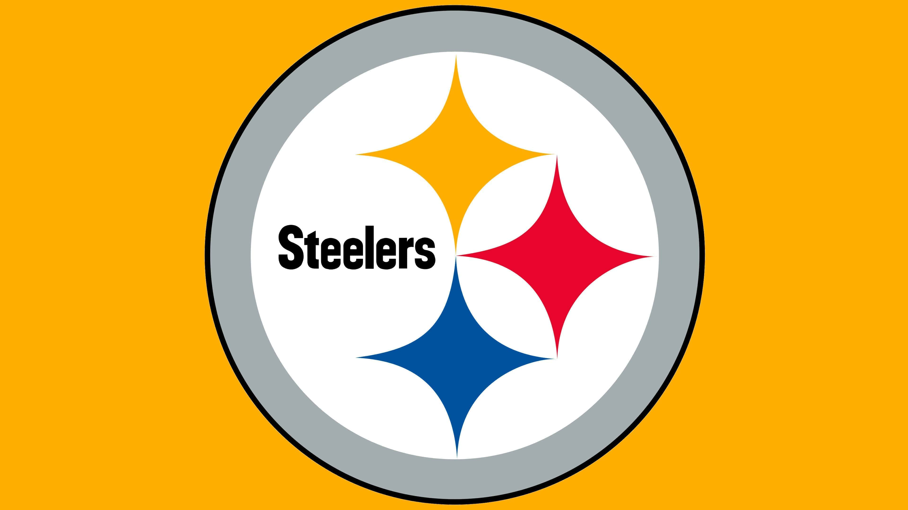
The modern emblem of the Pittsburgh Steelers features its nickname and three four-pointed stars within a white circle, enclosed by a light gray ring. It is a replica of the American Iron and Steel Institute’s emblem, developed by U.S. Steel. The football team first used this symbol in 1969 at the recommendation of the Cleveland company Republic Steel. It did not change the original design; it only added the letters “ers” to the existing word “Steel.”
The inscription is located on the left side. On the right are the rhombuses of the hypocycloids, with concave sides and pointed angles. Each element symbolizes Pittsburgh as a center of the steel industry, as the city is home to some of the largest steel mills in the USA.
The word “Steelers,” depicted inside the silver ring, is written in a sans-serif font. One of its distinctive features is the slanted top part of the letter “t.” The spacing between characters is minimal. The black inscription stands out brightly against the white background. Next to it are asteroid stars in blue, red, and yellow.
Each shade represents a type of raw material used to make steel. Blue symbolizes scrap metal; red represents iron ore, and yellow, accordingly, coal. These are universally accepted designations known to everyone working in the steel industry.
FAQ
What does the Pittsburgh Steelers logo represent?
The graphic sign that served as the Pittsburgh Steelers’ logo was created for the United States Steel Corporation. Therefore, all elements symbolize the steel industry and its main components. The blue hypocycloid represents steel scrap, the orange one iron ore, and the yellow one metallurgical (coking) coal.
What is the “Steelers” logo called?
There is no official name for the Pittsburgh Steelers’ emblem. But the emblem it was based on is called Steelmark. The owner of this symbol is the American Iron and Steel Institute.
What diamonds are depicted on the “Steelers” emblem?
The Steelers’ emblem does not depict diamonds but rather hypocycloids with four protrusions. By their shape, the four-pointed figures most resemble asteroids.
What was the first logo of the “Steelers”?
Initially, the team used the city of Pittsburgh’s coat of arms as its logo. It was a black heraldic shield with three eagles taken from the Great Seal and a blue-white checkerboard pattern. At the top was a castle with three towers.