


![]() Playhouse Disney Jr Logo PNG
Playhouse Disney Jr Logo PNG
The Playhouse Disney logo is like a monumental creation, its letters towering like skyscrapers before the viewer. The image of a beloved character animates the emblem, giving it a playful and friendly tone.
Playhouse Disney grew from a clear gap in the children’s TV market of the 1990s. Nickelodeon’s Nick Jr. had already become a strong preschool block with recognizable educational shows and recurring characters. At the same time, Disney still lacked a separate space for children under five. Disney Channel, launched in 1983, was mostly aimed at school-age children and teenagers by the mid-1990s.
In 1997, Disney tested a morning block for very young viewers. It used calm pacing, age-appropriate series, and puppet hosts such as Clay, who appeared between programs and gave the block a warmer rhythm. In 1999, the format received the Playhouse Disney name and a house-shaped logo, separating it from the main channel and making it easier for parents to identify preschool content.
The block grew through a mix of puppetry, animation, and early learning formats. Bear in the Big Blue House, produced with the Jim Henson Company, became a key title and won an Emmy in the preschool category. Rolie Polie Olie from Nelvana added a soft computer-animated style. At the same time, Stanley, JoJo’s Circus, and PB&J Otter focused on animals, play, social habits, and basic problem-solving.
In 2006, Mickey Mouse Clubhouse brought classic Disney characters into a fully computer-animated preschool series. It became one of the block’s strongest licensed properties. In February 2011, Disney announced the move from Playhouse Disney to Disney Junior, with the U.S. transition completed on February 28, 2012. After Disney+ launched in November 2019, many shows from the Playhouse era moved to streaming.
Meaning and History
![]()
The history of the Playhouse Disney logo is closely connected to the Disney Branded Television channels, as the block was a part of their programming. Each change in the emblem of the managing Disney Channel led to an update of the Playhouse logo. However, original details were always added to the block’s identity to differentiate the subsidiary brand from the main one.
What is Playhouse Disney?
A morning program block that aired from 1997 to 2011 on Disney-branded television channels, targeting children aged 2 to 7 years. In 2011, it was relaunched as Disney Junior.
1999 – 2001
![]()
The first emblem included two of Disney’s most famous symbols, Mickey Mouse’s head and Winnie the Pooh’s figure from The New Adventures of Winnie the Pooh, which aired from 1988.
Mickey’s head was transformed into a television, inviting children to watch Disney programs on the blue screen. Winnie the Pooh held his favorite honey pot and waved his paw in greeting to the kids.
The image corresponded to the visual sign of the Disney Channel, adopted in 1997. However, in the original sign, it was Mickey, not Winnie, on the television screen.
The famous Disney logo, used for the entire brand’s production, was placed in the center of the screen.
Above the television image, the original block’s name, Playhouse, was in a yellow cloud. The letters of the inscription resembled modeling clay. Their colors alternated between blue, red, purple, and green.
The cartoon characters and bright emblem shades immediately indicated that the programs were designed for a young audience.
2000 – 2011
![]()
In 2000, the block received its logo, which was designed by the children’s book illustrator company Beehive. The emblem consisted of a yellow cloud with a clearer multicolored inscription inside.
The symbols seemed unable to sit still and were bouncing. The mobility and bright colors hint at the character and individuality of the young viewers, who cannot concentrate for long and love to run and jump.
Below is the Disney logo.
Removing all additional drawings made the block’s name clearer. If the first emblem, filled with visual imagery, was intended to be memorable for kids who couldn’t read, the second was intended to build recognition among parents.
2001 – 2002
![]()
In 2001, the managing company Disney Channel, Inc. was renamed ABC Cable Networks Group, and there was a change in the promo director of the American Playhouse block. This was followed by a series of program rebrandings with new additions.
Among other plans, there was an intention to transform the block into a separate channel named Playhouse Disney Channel. For this purpose, the same design agency, Beehive, developed a new logo.
The emblem retained the Disney Channel image, depicted as a television with Mickey Mouse ears. It completely replicated the main channel’s logo, which was used from 1999 to 2002. The only difference was the television’s black color, instead of the original purple.
The blue screen with concentric circles, symbolizing viewer attraction, the central Disney logo, and the black Channel inscription below the image were also repeated.
The familiar yellow cloud with the Playhouse name was at the top, slightly in the background. This was practically the only image of the logo.
However, creating a separate channel was not realized, and the emblem was quickly changed.
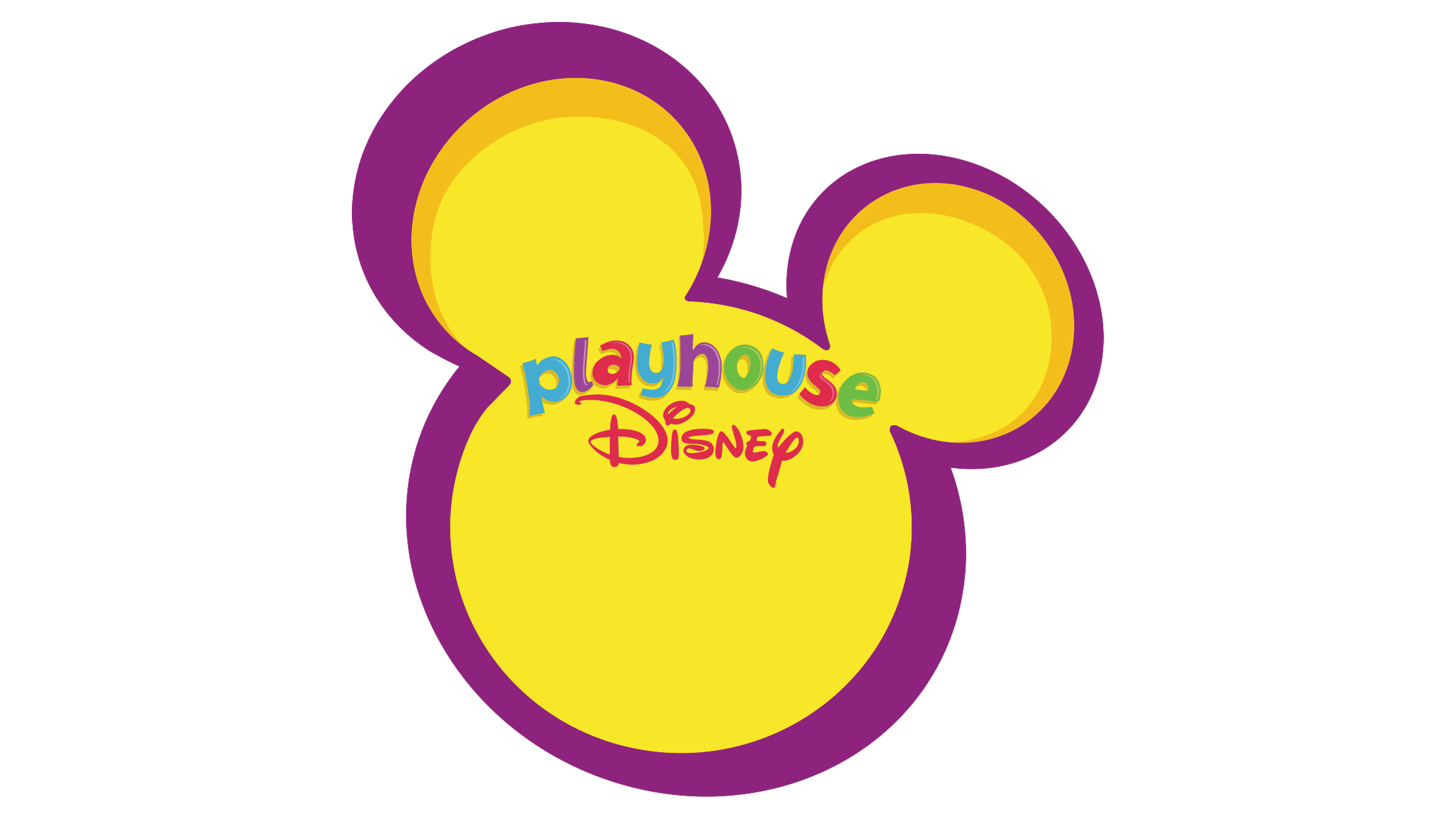
2002 – 2011
![]()
In 2002, the main Disney Channel underwent another rebranding, which changed the logos of all its programming blocks. Several agencies worked on the Playhouse emblem, including Beehive, Primal Screen, and CA Square. The result was an image that remained unchanged for many years.
In the picture, Mickey or Toodles from Mickey Mouse Clubhouse peeked out from the corner. The viewer could only see two ears and part of the head. The yellow background and purple outline made it look more like the assistant than the mouse character.
The partially visible character symbolizes the curiosity characteristic of small children. The figure seemed to call into the unknown, forward to adventures.
Toodles’ role was educational. His items developed children’s understanding of the world. Therefore, his presence on the screen indicated the educational role of the Playhouse programs.
The block’s name and the Disney brand logo were placed in the center of the emblem.
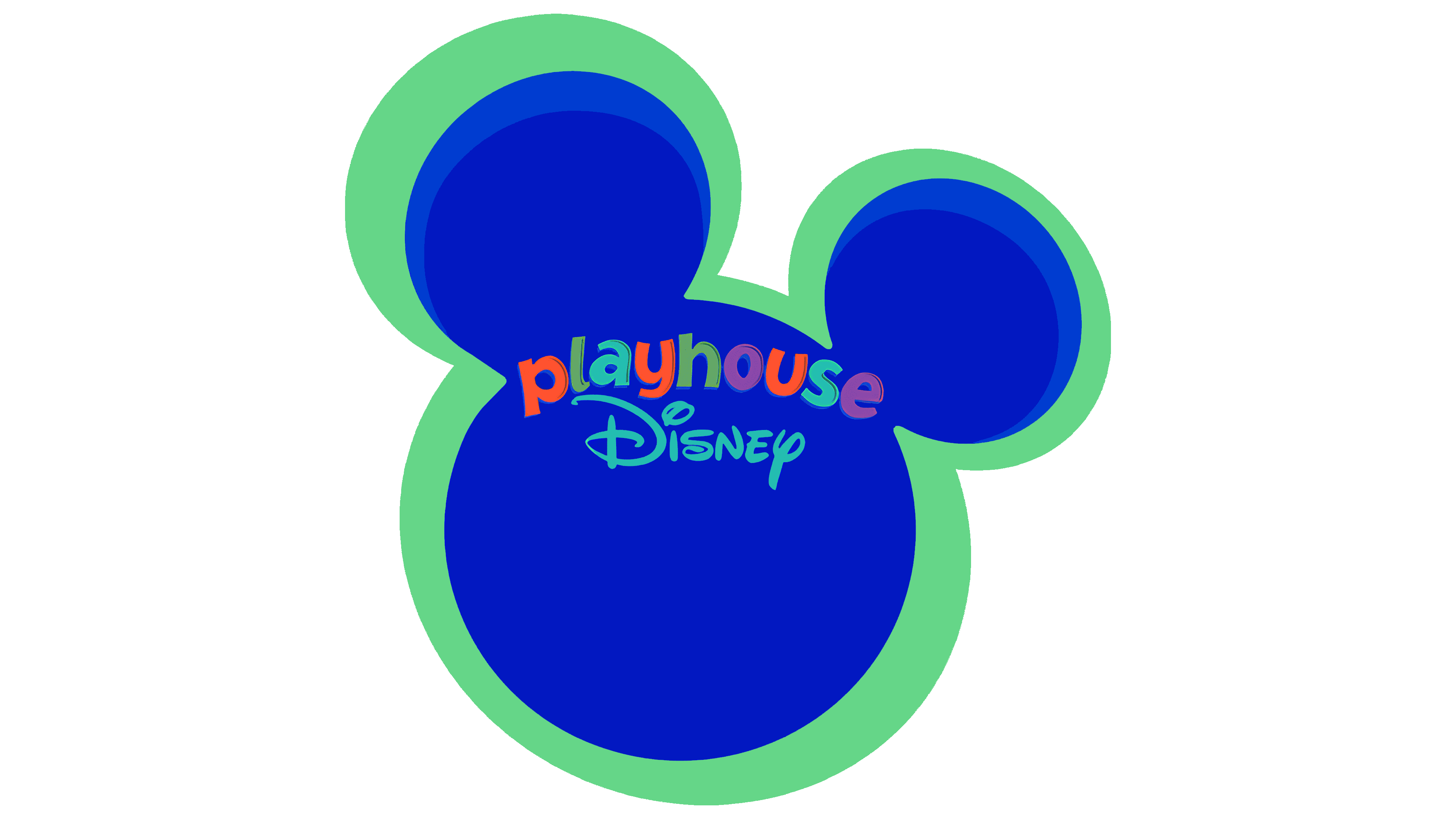
2010 – 2011
![]()
In 2010, following the Disney Channel again, the block added a yellow square TV screen to the background of the main logo. At a glance, it seemed that the curious ears were peeking out of the television. The bright colors distinguished the Playhouse emblem from the blue outline of the parent channel.
2011 – today
![]()
In 2011, the last episode of Playhouse Disney aired, and the next day, Disney Junior launched. It was an updated version of the previous block, inheriting well-known series and programs. It became the Disney Channel brand for satellite and cable channels in the U.S. and abroad.
The block’s emblem was completely different from the familiar version. “Junior” was written in large, red, voluminous letters. The letter “i” was stylized to resemble the famous mouse, with its top painted black. Against the red background were two white buttons, like on Mickey’s shorts, and a schematic representation of Mickey Mouse’s head in place of the dot.
To the left at the top was the famous black Disney inscription. The agency designed the logo We Are Royale.
2020 – 2024
![]()
In 2020, some details of Mickey’s image were refined to better reflect the character’s true likeness. The agency that created the emblem, We Are Royale, carried out the work.
2024 – today
![]()
The Disney Jr. logo has been updated to a new look that retains the brand’s signature style while featuring a simplified, modern design. The animated characters have been removed, making the design more universal and suitable for various platforms.
The fully redesigned version was first introduced in promotional materials for the new series, Ariel, and during the stage show Disney Jr. Live on Tour: Let’s Play! in May 2024. The official launch of the updated brand took place on June 1, 2024.
The main change is the shortening of the word “Junior” to “Jr.,” making the text more compact and visually streamlined. The entire name is now placed in a single line, creating a balanced composition without unnecessary elements.
The typography remains recognizable. The word “Disney” is presented in the brand’s signature calligraphic style, associated with the classic company logo. Subtle curves, dynamic strokes, and smooth transitions between letters give the text a relaxed and approachable feel.
The emblem’s colors have also changed: “Disney” is now in a blue gradient, while “Jr.” is in a bold red, creating a strong contrast. Even the period after “Jr.” is in blue, maintaining a color connection with the first part of the name.
These updates reflect the channel’s effort to align with its young audience’s tastes, making the visual identity more modern, vibrant, and optimized for digital use.
Font and Colors
The Playhouse logo underwent several changes before adopting its final red-and-black design. This color combination reflects Mickey Mouse, an iconic Disney character who inspired the company’s artists. The black represents the character’s ears and silhouette, while the red recalls his recognizable clothing. This contrast captures both the playful nature of the content and the thoughtful approach to creating children’s programming.
The original version of the logo debuted in 1999, using the Jacoby Black typeface. Paired with the traditional hand-drawn “Disney” inscription, this style remained in use until a full brand update in 2011. The new version introduced the word “Junior,” set in a three-dimensional version of Futura Extra Bold, emphasizing the brand’s energy and vibrancy.
![]()